Wikipedia:Graphics Lab/Photography workshop/Archive Dec 2015 Source: en.wikipedia.org/wiki/Wikipedia:Graphics_Lab/Photography_workshop/Archive_Dec_2015
The Busy Corner
[edit]-
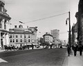 Corner of Genesee and Bleecker Streets, Utica, New York

- Article(s)
- Utica, New York
- Request
- Improvements similar to the copyrighted image seen here. A 158.9 MB TIFF file is here for your convenience. Anyone willing to take this request, thank you in advance. -- Buffaboy talk 16:38, 4 December 2015 (UTC)
- Graphist opinion(s)
![]() Done It may take a while to show up though. Carl Henderson (talk) 07:39, 5 December 2015 (UTC)
Done It may take a while to show up though. Carl Henderson (talk) 07:39, 5 December 2015 (UTC)
- Carl Henderson, thanks a lot. Buffaboy talk 21:20, 5 December 2015 (UTC)
David II
[edit]-
 Signature taken from this charter.

- Article(s)
- David II of Kakheti
- Request
- Please SVG vectorize this signature. Jaqeli 16:35, 5 December 2015 (UTC)
- @Carl Henderson: Can you help? Jaqeli 13:11, 5 January 2016 (UTC)
- @FOX 52: @Carnby: Can you please help with this one if you can? Jaqeli 19:31, 16 January 2016 (UTC)
- @Carl Henderson: Can you help? Jaqeli 13:11, 5 January 2016 (UTC)
- Graphist opinion(s)
- @Jaqeli: Perhaps you should post this at the Illustration Workshop, where they deal specifically with vectorization. nagualdesign 21:50, 16 January 2016 (UTC)
- @Nagualdesign: Illustration workshop get way less attention. Jaqeli 16:02, 20 January 2016 (UTC)
- It's been here for over 6 weeks now, so I call streetlight effect. You're unlikely to find a florist in a fish market no matter how busy it is.
 nagualdesign 01:59, 21 January 2016 (UTC)
- It's been here for over 6 weeks now, so I call streetlight effect. You're unlikely to find a florist in a fish market no matter how busy it is.
- @Nagualdesign: Illustration workshop get way less attention. Jaqeli 16:02, 20 January 2016 (UTC)
Andrzej Duda
[edit]-

-
 Derivative version w/o mic


- Article(s)
- pl:Andrzej Duda
- Request
I would ask you to remove the microphone from this photo -- TharonXX (talk) 22:27, 5 December 2015 (UTC)
- Graphist opinion(s)
Not possible without essentially painting a section of his face in Photoshop or Gimp. That would very likely look quite fake unless there is a professionally skilled artist available here. I would suggest looking for a better source photo. Carl Henderson (talk) 04:22, 6 December 2015 (UTC)
 Done..? I had a pop at it, just for fun. I couldn't resist the temptation to see if I was a professionally skilled artist. He does look like he's pursing his lips in a peculiar way, and it's definitely unencyclopedic, but I don't think it looks too bad actually. 6 out of 10, I'd say. nagualdesign 17:12, 6 December 2015 (UTC)
- ...After further fiddling I'm quite happy with the result. I replaced the microphone (without occluding his face) as I think it puts his expression into context and renormalizes it. 7/10. nagualdesign 20:38, 6 December 2015 (UTC)
- Added my attempt as new "Derivative" version to pick from in gallery above. Centpacrr (talk) 17:47, 6 December 2015 (UTC)
- Wow, Nagualdesign, that is amazing work. I'm never going to tell someone "not possible" here again! Carl Henderson (talk) 06:07, 1 January 2016 (UTC)
- Thanks. I guess I'll mark this as resolved then. nagualdesign 03:12, 2 January 2016 (UTC)
Crop and clone, both simple
[edit]-
 Old church
 -
 Wheat fields


- Article(s)
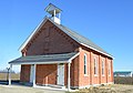
- Liberty Township, Mercer County, Ohio
- Request
- As usual, just requesting correction of errors I made when taking these pictures. The wheat fields picture just needs a little lossless cropping to remove my car's mirror at bottom right. The church probably shouldn't just be cropped, because you'd remove part of the overhanging part of the building at bottom left. Could you crop part of the left-edge blur and then clone the sky to resolve what can't easily be cropped? Thanks as always. Nyttend (talk) 13:47, 6 December 2015 (UTC)
- Graphist opinion(s)
- Done - Fallschirmjäger ✉ 19:51, 6 December 2015 (UTC)
Grigol Orbeliani
[edit]-

-
 PNG
PNG


- Article(s)
- Grigol Orbeliani
- Request
- Please PNG oval crop the image and upload it as seperate file. Oval crop around should be transparent. Jaqeli 14:33, 6 December 2015 (UTC)
- Graphist opinion(s)
![]() Done - Fallschirmjäger ✉ 19:20, 6 December 2015 (UTC)
Done - Fallschirmjäger ✉ 19:20, 6 December 2015 (UTC)
- Thank you. Jaqeli 19:33, 6 December 2015 (UTC)
Improving quality of the picture
[edit]-
 Teresia Sampsonia by van Dyck.

- Article(s)
- Teresia Sampsonia
- Request
- Excuse me, I'm not well versed regarding the various options the great editors here are able to make, but I believe image enhancements/improvments can also be done here? If so, I would like this image to be "sharpened/improved". How to put it correctly, heh. This is the original in the museum for example. If it could already look more like this one, it would be great, for example. Bests -- LouisAragon (talk) 04:09, 8 December 2015 (UTC)
- @Hohum:; thank you! That's a great improvment. (PS: which of the three versions do you like the most yourself? Heh) - LouisAragon (talk) 07:46, 10 December 2015 (UTC)
- Graphist opinion(s)
![]() Done Uploaded smaller but sharper version with better colour reproduction. (Hohum @) 02:45, 9 December 2015 (UTC)
Done Uploaded smaller but sharper version with better colour reproduction. (Hohum @) 02:45, 9 December 2015 (UTC)
Image improvement (2)
[edit]-
 Feyzullah Mirza Qajar
 -
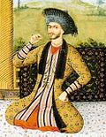 Suleiman I of Persia
 -
 S. Pahlavi


- Request
- Would an image improvement be possible for all these three pictures? F.e the first one has some background letters that could be removed apart from a perhaps possible resolution improvement (?) - LouisAragon (talk) 08:13, 10 December 2015 (UTC)
- Graphist opinion(s)
I was able to make some improvements in the Feyzullah Mirza Qajar image; mostly getting rid of the type bleedthrough in the background. I can't do anything for the others. Perhaps someone else can. Carl Henderson (talk) 07:59, 12 December 2015 (UTC)
Borgo Vecchio and Borgo Nuovo, Rome
[edit]-
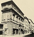
 The destroyed road of Borgo Vecchio in Rome, 1930 ca.
 -
 Portal of the palazzo dei Convertendi along the destroyed road of Borgo Nuovo, 1930 ca.
 -
 The Palazzo Jacopo da Brescia and the destroyed Borgo Nuovo road in Rome, 1930 ca.


- Article(s)
- Borgo Vecchio (Rome), Borgo Nuovo (Rome)
- Request
- If it is possible, please remove the watermarks, thanks! Alex2006 (talk) 18:27, 13 December 2015 (UTC)
- Graphist opinion(s)
The first photo, BorgoVecchio1930.JPG, has been done and replaced. Carl Henderson (talk) 05:29, 19 December 2015 (UTC)
The third photo, BorgoNuovoPalazzoIacopoDaBrescia1930.JPG, has been done and replaced. Carl Henderson (talk) 07:10, 21 December 2015 (UTC)
Domenica del Corriere
[edit]-
 Surrender of the Turkish garrison in Rhodes to the Italian general Ameglio near Psithos

- Article(s)
- Italo-Turkish War
- Request
- Would it be possible to remove the foxing? Thanks, Alex2006 (talk) 06:46, 17 December 2015 (UTC)
- Graphist opinion(s)
- Done Centpacrr (talk) 17:36, 1 January 2016 (UTC)
- Thanks a lot! Alex2006 (talk) 07:56, 7 January 2016 (UTC)
Eurico Gaspar Dutra
[edit]-

-
 Signature of Eurico Gaspar Dutra, President of Brazil
- Article(s)
- Eurico Gaspar Dutra
- Request
- Please vectorize the signature -- Vinícius94 (talk) 04:17, 19 December 2015 (UTC)
- Graphist opinion(s)
![]() Done Carl Henderson (talk) 05:26, 19 December 2015 (UTC)
Done Carl Henderson (talk) 05:26, 19 December 2015 (UTC)
- Thank you! Vinícius94 (talk) 05:35, 19 December 2015 (UTC)
- @Carl Henderson: This has got some white areas instead of transparent too. (Hohum @) 03:31, 20 December 2015 (UTC)
- Thank you. I've fixed that now. Carl Henderson (talk) 06:06, 21 December 2015 (UTC)
- @Carl Henderson: This has got some white areas instead of transparent too. (Hohum @) 03:31, 20 December 2015 (UTC)
- Thank you! Vinícius94 (talk) 05:35, 19 December 2015 (UTC)
The Twelve Days of Christmas
[edit]-
 The image

- Article(s)
- The Twelve Days of Christmas (song)
- Request
- Please Restore this image. -- 109.79.55.118 (talk) 20:16, 24 December 2015 (UTC)
- Graphist opinion(s)
- I have reduced most of the distortion and restored a little of the lost detail on some of the lettering. However to further replace the letters will require quite a bit of work and result in the image being heavily modified. Regards, Fallschirmjäger ✉ 16:38, 28 December 2015 (UTC)
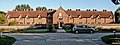
Almhouses
[edit]-
 Almhouses
 -
 Almhouses

- Article(s)
- Farncombe
- Request
- Anyway of removing the shadows which cover these two photos? Thanks. - Surrey101 (talk) 15:42, 27 December 2015 (UTC)
- Graphist opinion(s)
- I had a stab at them. The results aren't very good in my opinion. Feel free to overwrite with something better. nagualdesign 02:33, 30 December 2015 (UTC)
- I was the photographer. Thanks for the interest in improving them. I am not greatly interested in the techie stuff. Trees in the line of light were a problem; I had already gone back after several days to get the best time of day. What is now needed is for someone to go back at a better time of year when the sun is higher in the sky and maybe when there is softer light. If User:Surrey101 you require pics for Farncombe articles please ping me as I may be able to help. I now have some better kit, but no better skills. SovalValtos (talk) 00:59, 31 December 2015 (UTC)
- I do have Nikon Export Format (NEF) versions of the files User:Nagualdesign if that would help, but as I recall they cannot be uploaded to commons. SovalValtos (talk) 01:17, 31 December 2015 (UTC)
- If you can convert them to DNG files and upload them to Dropbox or similar I'd be happy to process them, and the result will undoubtedly look better. nagualdesign 01:43, 31 December 2015 (UTC)
- A file conversion would be a problem for me, and dropbox a worse one. Having looked at the use being made of the images I think that they already provide 90% of what is needed for the new editor's article and I will leave it for now unless there is a vital need, which I doubt. A better initial pic will arrive in due course via some route! Thanks again for your efforts SovalValtos (talk) 02:04, 31 December 2015 (UTC)
- If you can convert them to DNG files and upload them to Dropbox or similar I'd be happy to process them, and the result will undoubtedly look better. nagualdesign 01:43, 31 December 2015 (UTC)
- I do have Nikon Export Format (NEF) versions of the files User:Nagualdesign if that would help, but as I recall they cannot be uploaded to commons. SovalValtos (talk) 01:17, 31 December 2015 (UTC)
- I was the photographer. Thanks for the interest in improving them. I am not greatly interested in the techie stuff. Trees in the line of light were a problem; I had already gone back after several days to get the best time of day. What is now needed is for someone to go back at a better time of year when the sun is higher in the sky and maybe when there is softer light. If User:Surrey101 you require pics for Farncombe articles please ping me as I may be able to help. I now have some better kit, but no better skills. SovalValtos (talk) 00:59, 31 December 2015 (UTC)
Prudente de Morais
[edit]- Article(s)
- Prudente de Morais
- Request
- Please vectorize the signature (if it's possible) -- Vinícius94 (talk) 04:09, 31 December 2015 (UTC)
- Graphist opinion(s)
![]() Done--Carnby (talk) 15:51, 20 January 2016 (UTC)
Done--Carnby (talk) 15:51, 20 January 2016 (UTC)
- Thank you! -- Vinícius94 (talk) 20:43, 20 January 2016 (UTC)