Wikipedia:Graphics Lab/Photography workshop/Archive/Sep 2018 Source: en.wikipedia.org/wiki/Wikipedia:Graphics_Lab/Photography_workshop/Archive/Sep_2018
 | This page, part of the Graphics Lab Wikiproject, is an archive of requests for 2018. Please do not edit the contents of this page. You can submit new requests here. |

sombrero
{{resolved}}


- Article(s)
- sombrero
- Request
- please create new png file, background and shading removed, named File:sombrero.png, which is available… -- Kintetsubuffalo (talk) 22:00, 29 September 2018 (UTC)
- Graphist opinion(s)
![]() Done PawełMM (talk) 04:36, 30 September 2018 (UTC)
Done PawełMM (talk) 04:36, 30 September 2018 (UTC)
- Thank you!--Kintetsubuffalo (talk) 18:06, 30 September 2018 (UTC)
Quechan
{{resolved}}
- Article(s)
- Quechan
- Request
- please remove background… -- Kintetsubuffalo (talk) 22:06, 29 September 2018 (UTC)
- Graphist opinion(s)
![]() Done PawełMM (talk) 04:43, 30 September 2018 (UTC)
Done PawełMM (talk) 04:43, 30 September 2018 (UTC)
- Thank you!--Kintetsubuffalo (talk) 18:05, 30 September 2018 (UTC)
Doris Mackinnon
{{resolved}}

- Article(s)
- Doris Mackinnon
- Request
- please trim below bordering… -- Kintetsubuffalo (talk) 04:04, 30 September 2018 (UTC)
- Graphist opinion(s)
![]() Done Centpacrr (talk) 04:40, 30 September 2018 (UTC)
Done Centpacrr (talk) 04:40, 30 September 2018 (UTC)
- Thank you Centpacrr, that's significantly better!
- Also, since this is a 91-year old photo, does anyone know why it shouldn't be public domain by now?--Kintetsubuffalo (talk) 18:05, 30 September 2018 (UTC)
- @Kintetsubuffalo: From the description of the file: "Subject died in 1956, unlikely to be any free images yet." PawełMM (talk) 20:42, 30 September 2018 (UTC)
- Also, since this is a 91-year old photo, does anyone know why it shouldn't be public domain by now?--Kintetsubuffalo (talk) 18:05, 30 September 2018 (UTC)
Robert Underwood Johnson
{{resolved}}

- Article(s)
- Robert Underwood Johnson
- Request
- please remove excess white framing… -- Kintetsubuffalo (talk) 08:45, 1 October 2018 (UTC)
- Graphist opinion(s)
![]() Done PawełMM (talk) 10:19, 1 October 2018 (UTC)
Done PawełMM (talk) 10:19, 1 October 2018 (UTC)
- Thank you!--Kintetsubuffalo (talk) 18:07, 1 October 2018 (UTC)
Request: Jochem Bobeldijk
-
 Jochem Bobeldijk

- Article(s)
- Jochem Bobeldijk
- Request
- Please remove tape down right & name top right -if possible. Vysotsky (talk) 12:18, 1 October 2018 (UTC)
- Graphist opinion(s)
![]() Done PawełMM (talk) 12:45, 1 October 2018 (UTC)
Done PawełMM (talk) 12:45, 1 October 2018 (UTC)
- Also
 Done It looks like Paweł beat me to it. You can check the thumbs down below the main preview to see which version you like better and revert as necessary. ᛗᛁᛟᛚᚾᛁᚱPants Tell me all about it. 13:22, 1 October 2018 (UTC)
- IMHO @MPants at work: version is better. Regards PawełMM (talk) 14:04, 1 October 2018 (UTC)
- In all honesty, both of our tape removals are obvious on close inspection, but neither are obvious at typical viewing size. With that in mind, I strongly suspect you did yours in 1/10th the time I did, which evinces a keen artistic eye. Also, did you notice the evidence of airbrushing near the top right? I'm always amused to see an image I'm working on has been worked before, especially by hand. ᛗᛁᛟᛚᚾᛁᚱPants Tell me all about it. 14:19, 1 October 2018 (UTC)
- I like them both! Thank you both, Vysotsky (talk) 14:09, 1 October 2018 (UTC) {{resolved}} (and image used immediately): Jochem Bobeldijk Vysotsky (talk) 14:12, 1 October 2018 (UTC)
- IMHO @MPants at work: version is better. Regards PawełMM (talk) 14:04, 1 October 2018 (UTC)
Peggy Sue
{{resolved}}

- Article(s)
- Peggy Sue
- Request
- please rotate to straight… -- Kintetsubuffalo (talk) 16:23, 3 October 2018 (UTC)
- Graphist opinion(s)
- Done ᛗᛁᛟᛚᚾᛁᚱPants Tell me all about it. 16:27, 3 October 2018 (UTC)
- That was fast, thank you!--Kintetsubuffalo (talk) 02:23, 4 October 2018 (UTC)
Nineveh Plain Forces
{{resolved}}
- Article(s)
- Nineveh Plain Forces
- Request
- please trim to shield… -- Kintetsubuffalo (talk) 02:23, 4 October 2018 (UTC)
- Graphist opinion(s)
![]() Done PawełMM (talk) 04:07, 4 October 2018 (UTC)
Done PawełMM (talk) 04:07, 4 October 2018 (UTC)
- Thank you!--Kintetsubuffalo (talk) 03:32, 5 October 2018 (UTC)
Request: Wills & Jacobs

- Article(s)
- David Jacobs (gymnast)
- Request
- Please remove scratches (if possible). Vysotsky (talk) 13:53, 4 October 2018 (UTC)
- Graphist opinion(s)
![]() Done PawełMM (talk) 15:21, 4 October 2018 (UTC)
Done PawełMM (talk) 15:21, 4 October 2018 (UTC)
- Thanks. Looks good! Vysotsky (talk) 20:00, 4 October 2018 (UTC) {{resolved}}
Request: Emmy Verhey
-
 Emmy Verhey
(Moscow, 1966)

- Article(s)
- Emmy Verhey
- Request
- Please clean-up, if possible. Vysotsky (talk) 20:00, 4 October 2018 (UTC)
- Graphist opinion(s)
![]() Done Centpacrr (talk) 20:12, 4 October 2018 (UTC)
Done Centpacrr (talk) 20:12, 4 October 2018 (UTC)
![]() Done second version. Revert as needed. ᛗᛁᛟᛚᚾᛁᚱPants Tell me all about it. 20:35, 4 October 2018 (UTC)
Done second version. Revert as needed. ᛗᛁᛟᛚᚾᛁᚱPants Tell me all about it. 20:35, 4 October 2018 (UTC)
- Great. Thank you both. What a beauty! Vysotsky (talk) 21:57, 4 October 2018 (UTC) {{resolved}}
Request: Kees van Bruggen
-
 Kees van Bruggen

- Article(s)
- Kees van Bruggen
- Request
- Please remove number (top right), if possible. Vysotsky (talk) 21:54, 4 October 2018 (UTC)
- Graphist opinion(s)
![]() Done Centpacrr (talk) 01:52, 5 October 2018 (UTC)
Done Centpacrr (talk) 01:52, 5 October 2018 (UTC)
- Looks good. Thanks, Vysotsky (talk) 21:35, 5 October 2018 (UTC) {{resolved}}
Acoma Pueblo
{{resolved}}
.jpg)
- Article(s)
- Acoma Pueblo
- Request
- please remove border… -- Kintetsubuffalo (talk) 03:31, 5 October 2018 (UTC)
- Graphist opinion(s)
![]() Done PawełMM (talk) 05:14, 5 October 2018 (UTC)
Done PawełMM (talk) 05:14, 5 October 2018 (UTC)
- Thank you!--Kintetsubuffalo (talk) 17:51, 5 October 2018 (UTC)
Who Do You Love?
{{resolved}}

- Article(s)
- Who Do You Love?
- Request
- please rotate slightly to straight… -- Kintetsubuffalo (talk) 03:48, 5 October 2018 (UTC)
- Graphist opinion(s)
![]() Done PawełMM (talk) 05:23, 5 October 2018 (UTC)
Done PawełMM (talk) 05:23, 5 October 2018 (UTC)
- Thank you!--Kintetsubuffalo (talk) 21:06, 5 October 2018 (UTC)
Request: Eurovision Song Festival Netherlands
-
 Bonnie St. Claire

- Article(s)
- Bonnie St. Claire
- Request
- Please remove black smudge, if possible. Vysotsky (talk) 21:55, 5 October 2018 (UTC)
- Graphist opinion(s)
![]() Done PawełMM (talk) 05:16, 6 October 2018 (UTC)
Done PawełMM (talk) 05:16, 6 October 2018 (UTC)
- Tnanks. Looks better. Vysotsky (talk) 10:51, 6 October 2018 (UTC) {{resolved}}
University of Paris
{{resolved}}

- Article(s)
- University of Paris
- Request
- please trim off unwikilike top caption-the description in the file should be enough… -- Kintetsubuffalo (talk) 21:04, 5 October 2018 (UTC)
- Graphist opinion(s)
![]() Done PawełMM (talk) 04:32, 6 October 2018 (UTC)
Done PawełMM (talk) 04:32, 6 October 2018 (UTC)
- Thank you!--Kintetsubuffalo (talk) 17:12, 6 October 2018 (UTC)
Request: André Beaufre
-
 André Beaufre, Adolf Heusinger and others

- Article(s)
- André Beaufre
- Request
- Please remove numer (down right), if possible. Vysotsky (talk) 16:12, 6 October 2018 (UTC)
- Graphist opinion(s)
![]() Done PawełMM (talk) 17:42, 6 October 2018 (UTC)
Done PawełMM (talk) 17:42, 6 October 2018 (UTC)
- Thanx. Vysotsky (talk) 18:49, 6 October 2018 (UTC) {{resolved}}
Request: Paul Martin
{{resolved}}

- Article(s)
- Paul Martin (illustrator); via ref. #46
- Request
RE File:Girl-Scouts-Competion-Letter.jpg.
Hello. I uploaded this 1931 Girl Scouts letter, about six months ago. The original was in very poor shape, especially along the sides, and beyond repair. Nonetheless, no text was affected (except ending of last word "Division".) It's important to save, as contains original info which would be otherwise lost to history. It backs up detail in the Wikipedia article "Paul Martin (illustrator)." The letter is reachable there through reference #46.
Anyway, I was hoping that someone at "Commons" can lighten it up while maintaining its focus. The letter looks too dark. I think it would look more presentable if lightened up. (Convert to gray scale?) I don't have the ability to make any proper correction with my basic image editor. I can lighten it up, but then unfortunately, the text also becomes lighter. Thanks. Jim Percy (talk) 05:04, 19 September 2018 (UTC)
- Graphist opinion(s)
-
- @Centpacrr: I appreciate your effort (and the straightening it out which wasn't even requested), but why are the words in lower right on light side. Can't those words be made darker to blend in with rest of letter, which would also be truer to the original. Namely, "Cordially yours, Harry L. Gilchriese Secretary, Public Relations Divisi" (also signature and date "Feb. 9, 1931", but those are not as important.) Okay. Thanks. -- Jim Percy (talk) 04:55, 22 September 2018 (UTC) PS. Maybe by lowering the brightness level on the lower half or third. The top portion seems to be about the right brightness level (or at least in the way my mind thinking).
- @JimPercy: I took a stab at it. ᛗᛁᛟᛚᚾᛁᚱPants Tell me all about it. 16:39, 26 September 2018 (UTC)
- @MPants at work: I'm dealing with this copy: https://vgy.me/5JV0ih.jpg (I only blanked out street address & lowered size a spec.) There are age and distance factors, that make getting a better copy to work with, not possible. Your fix might be good enough. I'll keep it in place. I know another editor at Commons worked on it several days ago, and appreciated that person's efforts. But, a few bogus partial-letters in the farthest upper right of letterhead shouldn't have been there. Also, the strength of typing was seemingly compromised, by the lightening of the item. I just thought it would look more presentable &/or natural if not so bright. Hence, re-uploaded the image a couple so days ago. I was able to position the item so that the entire word "Division" in far lower right was included (instead of just the Divis" part). I had to blank out a tiny spec of the middle right edge letterhead for that to work though. One has to look real closely to notice that. Jim Percy (talk) 19:01, 26 September 2018 (UTC)
- @JimPercy:I might be able to do a better job with that full color version. Do me a favor and leave a message on my talk page so I'll notice it when I get to my home computer tonight. I might be able to focus, straighten, clean and enhance the color version way better than I did the greyscale one. ᛗᛁᛟᛚᚾᛁᚱPants Tell me all about it. 20:05, 26 September 2018 (UTC)
- @MPants at work: I sent you an email around 7:45 PM on Wednesday. Hope it went through. Jim Percy (talk) 03:04, 27 September 2018 (UTC)
- It sure did, and I responded. I'll be done soon. ᛗᛁᛟᛚᚾᛁᚱPants Tell me all about it. 03:42, 27 September 2018 (UTC)
- Done That should be perfectly legible. ᛗᛁᛟᛚᚾᛁᚱPants Tell me all about it. 04:05, 27 September 2018 (UTC)
- @MPants at work: I'm dealing with this copy: https://vgy.me/5JV0ih.jpg (I only blanked out street address & lowered size a spec.) There are age and distance factors, that make getting a better copy to work with, not possible. Your fix might be good enough. I'll keep it in place. I know another editor at Commons worked on it several days ago, and appreciated that person's efforts. But, a few bogus partial-letters in the farthest upper right of letterhead shouldn't have been there. Also, the strength of typing was seemingly compromised, by the lightening of the item. I just thought it would look more presentable &/or natural if not so bright. Hence, re-uploaded the image a couple so days ago. I was able to position the item so that the entire word "Division" in far lower right was included (instead of just the Divis" part). I had to blank out a tiny spec of the middle right edge letterhead for that to work though. One has to look real closely to notice that. Jim Percy (talk) 19:01, 26 September 2018 (UTC)
Request: Paul Martin 2: Electric boogaloo
{{resolved}}

- Article(s)
- Paul Martin (illustrator); via ref. #60 & 217
- Request
I received assistance from this workshop four days ago, which was much appreciated. However, there is one more of my uploads in somewhat dire need of imaging assistance.
I uploaded this 1932 Foreign Service letter, about six months ago. The original camera shot was in sub-par shape. Nonetheless, I felt important to save, as contains original info which would be otherwise lost to history. It backs up detail in the Wikipedia article "Paul Martin (illustrator)." The letter is reachable there through references #60 & 217.
I uploaded every image in the following category. The painting turned into poster turned into magazine referred to in this letter, can be viewed under the heading "Composite Illustration no. 2" at https://commons.wikimedia.orghttps://demo.azizisearch.com/lite/wikipedia/page/Category:Paul_Martin_(illustrator)
Here is how it looks in its original state, with bright yellow camera date and folded back corners: https://vgy.me/ODtczj.jpg
- IMPORTANT IMPORTANT Today, I did clean up to a degree, three of the sides (lower right too difficult or best left as-is) and along the margins, but not the dimensions or anything else. I think this would be the one that someone at The Workshop, would find easiest to work with: https://vgy.me/W1pe8J.jpg
Anyway, I was hoping that someone at "Commons" can lighten it up while maintaining its focus (too dark). Also, the alignment and/or dimensions are off, due to the (wrongly angled) original camera shot. Outline of edges needs to be leveled out. The size is 3,000 x 4000 pixels, which reckon should be lowered to 1693 x 2161 pixels or less. General detail: I received it on a CD mailed cross country, hence, not possible to retake the image. Thanks. Hope not overly time consuming. Jim Percy (talk) 19:54, 1 October 2018 (UTC)
- Graphist opinion(s)
 Request taken. I've got much of the work I did to fix the other one stored as actions in Photoshop, so I should be able to handle this one fairly quickly. Uhh, once I get home, that is (I'll still take a crack at it at work ;) ). ᛗᛁᛟᛚᚾᛁᚱPants Tell me all about it. 19:58, 1 October 2018 (UTC)
- Done If you like, I can revisit it when I get home, but I think GIMP did a decent job, if I say so myself. ᛗᛁᛟᛚᚾᛁᚱPants Tell me all about it. 20:20, 1 October 2018 (UTC)
@MPants at work: In my post of earlier today, I had links to three different images of the same. It seems that there was enough to work with, in my upload of July 7, 2018. Yes, today's fix-up is an improvement. Lighter and even darker text. Thanks. Jim Percy (talk) 21:19, 1 October 2018 (UTC)
- Okay, I've lightened the background again, but the text is about as dark as it's gonna get without becoming blurry. ᛗᛁᛟᛚᚾᛁᚱPants Tell me all about it. 21:28, 1 October 2018 (UTC)
@MPants at work: I meant to type, "Yours is lighter and even darker text."
- Ha! Oops. Feel free to revert back, then. ᛗᛁᛟᛚᚾᛁᚱPants Tell me all about it. 21:38, 1 October 2018 (UTC)
@MPants at work: I did lighten up your effort a little, while trying not to lose much in text darkness. I suppose this is closer to what I had in mind. However, reckon what counts is the preference of Commons. It can always be changed back to the previous one. I only have a basic (free) desktop image editor to work with. I figured there's a slight tear in the original, hence, it should stay in rather than compromise the integrity. Jim Percy (talk) 00:47, 2 October 2018 (UTC)
- Get the GIMP at https://www.gimp.org/. It's almost as powerful as Photoshop, and actually better for some purposes (inking pencil drawings, for example). ᛗᛁᛟᛚᚾᛁᚱPants Tell me all about it. 01:19, 2 October 2018 (UTC)
@MPants at work: Oh, maybe better than my IrfanView, that have had for many years. Jim Percy (talk) 01:33, 2 October 2018 (UTC) 01:32, 2 October 2018 (UTC)
- @JimPercy: Ha! I used to have IrfanView on my original Pentium machine. The one with the 56k modem and a whole stack of AOL "free trial" CDs that I used to use to get on the BBSes and talk about the latest episode of The X-Files.
- But yeah, the GIMP is way more powerful than that. It'll take some learning to really take advantage of the power, but there are plenty of tutorials online for it. ᛗᛁᛟᛚᚾᛁᚱPants Tell me all about it. 01:44, 2 October 2018 (UTC)
Francis Nash
{{resolved}}

- Article(s)
- Francis Nash
- Request
- please remove border-a separate image does not need made… -- Kintetsubuffalo (talk) 18:01, 7 October 2018 (UTC)
- Graphist opinion(s)
![]() Done PawełMM (talk) 05:45, 8 October 2018 (UTC)
Done PawełMM (talk) 05:45, 8 October 2018 (UTC)
- Thank you!--Kintetsubuffalo (talk) 07:45, 8 October 2018 (UTC)
Request: Whaling
-
 Wahling 1947
 -

-


- Article(s)
- Jan P. Strijbos
- Request
- Please remove numbers (if possible). Vysotsky (talk) 22:30, 7 October 2018 (UTC)
- Graphist opinion(s)
![]() Done PawełMM (talk) 06:10, 8 October 2018 (UTC)
Done PawełMM (talk) 06:10, 8 October 2018 (UTC)
- Thanks! Vysotsky (talk) 10:19, 8 October 2018 (UTC) {{resolved}}
Creed Bratton
{{resolved}}

- Article(s)
- Creed Bratton
- Request
- please trim to focus on Creed, a new image does not need made… -- Kintetsubuffalo (talk) 04:05, 9 October 2018 (UTC)
- Graphist opinion(s)
![]() Done PawełMM (talk) 05:11, 9 October 2018 (UTC)
Done PawełMM (talk) 05:11, 9 October 2018 (UTC)
- Better, thank you!--Kintetsubuffalo (talk) 07:39, 9 October 2018 (UTC)
Richard Wagner
{{resolved}}

- Article(s)
- Richard Wagner
- Request
- please trim to photo-a separate image does not need created… -- Kintetsubuffalo (talk) 18:28, 10 October 2018 (UTC)
- Graphist opinion(s)
![]() Done PawełMM (talk) 18:42, 10 October 2018 (UTC)
Done PawełMM (talk) 18:42, 10 October 2018 (UTC)
- thank you!--Kintetsubuffalo (talk) 04:42, 11 October 2018 (UTC)
Rats of Tobruk
{{resolved}}

- Article(s)
- Rats of Tobruk
- Request
- please fix perspective-new image does not need created-if it looks weird, we can revert… -- Kintetsubuffalo (talk) 04:55, 11 October 2018 (UTC)
- Graphist opinion(s)
![]() Done PawełMM (talk) 05:36, 11 October 2018 (UTC)
Done PawełMM (talk) 05:36, 11 October 2018 (UTC)
- Very nice, thank you!--Kintetsubuffalo (talk) 19:25, 11 October 2018 (UTC)
Request: Soldier of Orange
-
 Soldier of Orange

- Article(s)
- Doorwerth Castle
- Request
- Please remove yellow fever, if possible. Vysotsky (talk) 08:21, 11 October 2018 (UTC)
- Graphist opinion(s)
![]() Done PawełMM (talk) 09:00, 11 October 2018 (UTC)
Done PawełMM (talk) 09:00, 11 October 2018 (UTC)
- Thanks. Vysotsky (talk) 09:40, 11 October 2018 (UTC) {{resolved}}
Request: Ben Peeters
-
 Ben Peeters
,_Bestanddeelnr_921-6432.jpg)
- Article(s)
- Feyenoord
- Request
- Please remove irregularities, if possible. Vysotsky (talk) 22:10, 11 October 2018 (UTC)
- Graphist opinion(s)
![]() Done PawełMM (talk) 05:11, 12 October 2018 (UTC)
Done PawełMM (talk) 05:11, 12 October 2018 (UTC)
- Nice job. Thanks. Vysotsky (talk) 07:39, 12 October 2018 (UTC) {{resolved}}
Fortunate Son

{{resolved}}
- Article(s)
- Fortunate Son
- Request
- please rotate to straight… -- Kintetsubuffalo (talk) 04:41, 11 October 2018 (UTC)
- Graphist opinion(s)
![]() Done PawełMM (talk) 05:07, 11 October 2018 (UTC)
Done PawełMM (talk) 05:07, 11 October 2018 (UTC)
- Thank you!--Kintetsubuffalo (talk) 16:28, 12 October 2018 (UTC)
penny
{{resolved}}

- Article(s)
- penny
- Request
- please rotate to straight and remove background… -- Kintetsubuffalo (talk) 19:02, 11 October 2018 (UTC)
- Graphist opinion(s)
![]() Done PawełMM (talk) 04:53, 12 October 2018 (UTC)
Done PawełMM (talk) 04:53, 12 October 2018 (UTC)
- Thank you!--Kintetsubuffalo (talk) 16:29, 12 October 2018 (UTC)
She's a Beauty

{{resolved}}
- Article(s)
- She's a Beauty
- Request
- please rotate to straight… -- Kintetsubuffalo (talk) 01:55, 12 October 2018 (UTC)
- Graphist opinion(s)
![]() Done PawełMM (talk) 05:02, 12 October 2018 (UTC)
Done PawełMM (talk) 05:02, 12 October 2018 (UTC)
- Thank you!--Kintetsubuffalo (talk) 16:30, 12 October 2018 (UTC)
Charles Lee
{{resolved}}
-
 Charles Lee Esq'r. - Americanischer general-major.jpg
 -
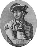 Charles Lee Esq'r. - Americanischer general-major (cropped).jpg
 -
 File:general Charles Lee.jpg - A file with this name already exists.

.jpg)

- Article(s)
- Charles Lee
- Request
- please make new variant, trimmed to oval, named File:general Charles Lee… -- Kintetsubuffalo (talk) 02:16, 2 October 2018 (UTC)
- Graphist opinion(s)
![]() Done PawełMM (talk) 05:01, 2 October 2018 (UTC)
Done PawełMM (talk) 05:01, 2 October 2018 (UTC)
- Thank you PawełMM! Since he wasn't German, can you please shorten the name to File:Charles Lee Esq'r?--Kintetsubuffalo (talk) 16:25, 3 October 2018 (UTC)
- @Kintetsubuffalo: I suggest, however, to keep the original name as given by the original file loading. In this way, the coincidence will be preserved with the original. PawełMM (talk) 16:38, 3 October 2018 (UTC)
- Thank you PawełMM! Since he wasn't German, can you please shorten the name to File:Charles Lee Esq'r?--Kintetsubuffalo (talk) 16:25, 3 October 2018 (UTC)
- @Kintetsubuffalo: IMHO resolved. PawełMM (talk) 08:30, 13 October 2018 (UTC)
Selina Siggins
{{resolved}}

- Article(s)
- Selina Siggins
- Request
- please clean up some of the streaking around her face… -- Kintetsubuffalo (talk) 07:57, 14 October 2018 (UTC)
- Graphist opinion(s)
![]() Request taken by Centpacrr (talk) 08:53, 14 October 2018 (UTC).
Request taken by Centpacrr (talk) 08:53, 14 October 2018 (UTC).
![]() Done Centpacrr (talk) 09:24, 14 October 2018 (UTC)
Done Centpacrr (talk) 09:24, 14 October 2018 (UTC)
- That's great, thank you Centpacrr! (and PawełMM, the requester should be the one to mark them completed)--Kintetsubuffalo (talk) 08:31, 16 October 2018 (UTC)
Tim Robards
{{resolved}}
-
 Tim Robards and Anna Heinrich
 -
 Tim Robards
.jpg)

- Article(s)
- Tim Robards, List of Neighbours characters (2018)
- Request
- Could a crop of Tim's head and shoulders be created for potential use in an infobox? -- JuneGloom07 Talk 17:17, 14 October 2018 (UTC)
- Graphist opinion(s)
![]() Done PawełMM (talk) 19:48, 14 October 2018 (UTC)
Done PawełMM (talk) 19:48, 14 October 2018 (UTC)
- That's excellent, thank you PawełMM! - JuneGloom07 Talk 22:44, 14 October 2018 (UTC)
Twilight of the Gods
{{resolved}}
.jpg)
- Article(s)
- Twilight of the Gods (Clapham and Miller novel)
- Request
- Please crop the white spaces or upload a file without the. If you do the former, just use the original file and shrink that down rather than use the one already there. Thanks in advance -- 109.79.245.133 (talk) 22:25, 14 October 2018 (UTC)
- Graphist opinion(s)
![]() Done PawełMM (talk) 04:35, 15 October 2018 (UTC)
Done PawełMM (talk) 04:35, 15 October 2018 (UTC)
Request: Baba Sy (draughts)


- Article(s)
- Baba Sy
- Request
- Please remove white stains (if possible). Vysotsky (talk) 21:20, 16 October 2018 (UTC)
- Graphist opinion(s)
![]() Done PawełMM (talk) 05:55, 17 October 2018 (UTC)
Done PawełMM (talk) 05:55, 17 October 2018 (UTC)
- Thanks! Vysotsky (talk) 07:28, 17 October 2018 (UTC) {{resolved}}
Request: Teddy Scholten
-
 Teddy Scholten (1)
 -
 Teddy Scholten (2)
 -
 Teddy Scholten (3)


- Article(s)
- Teddy Scholten
- Request
- Please remove white stains, if possible. Vysotsky (talk) 08:41, 17 October 2018 (UTC)
- Graphist opinion(s)
![]() Done PawełMM (talk) 09:20, 17 October 2018 (UTC)
Done PawełMM (talk) 09:20, 17 October 2018 (UTC)
- Thanks once more! Vysotsky (talk) 11:16, 17 October 2018 (UTC) {{resolved}}
Request: Horace Silver
-
 Horace Silver Quintet (1959-1)
 -
 Horace Silver Quintet (1959-2)
 -
 Horace Silver Quintet (1959-3)


- Article(s)
- Horace Silver
- Request
- Please remove white stains (if possible). Vysotsky (talk) 23:11, 17 October 2018 (UTC)
- Graphist opinion(s)
![]() Done PawełMM (talk) 05:49, 18 October 2018 (UTC)
Done PawełMM (talk) 05:49, 18 October 2018 (UTC)
- Thanks! Vysotsky (talk) 08:13, 18 October 2018 (UTC) {{resolved}}
Request: Horace Silver (end)
-
 Horace Silver Quintet (4)
 -
 Horace Silver Quintet (5)
 -
 Horace Silver Quintet (6)


- Article(s)
- Junior Cook
- Request
- Please remove white stains (if possible). Vysotsky (talk) 08:12, 18 October 2018 (UTC)
- Graphist opinion(s)
![]() Done PawełMM (talk) 13:09, 18 October 2018 (UTC)
Done PawełMM (talk) 13:09, 18 October 2018 (UTC)
- Thanks, as ever. Vysotsky (talk) 20:14, 18 October 2018 (UTC) {{resolved}}
Request: Cilli Wang (1)
-
 Cilli Wang (1)
 -
 Cilli Wang (2)
 -
 Cilli Wang (3)


- Article(s)
- Cilli Wang
- Request
- Please remove labels (if possible). Vysotsky (talk) 07:29, 19 October 2018 (UTC)
- Graphist opinion(s)
![]() Done PawełMM (talk) 08:00, 19 October 2018 (UTC)
Done PawełMM (talk) 08:00, 19 October 2018 (UTC)
- Great! Vysotsky (talk) 08:27, 19 October 2018 (UTC) {{resolved}}
Request: Cilli Wang (2)
-
 Cilli Wang (4)
 -
 Cilli Wang (5)
 -
 Cilli Wang (6)


- Article(s)
- Cilli Wang
- Request
- Please remove watermarks, if possible. Vysotsky (talk) 08:26, 19 October 2018 (UTC)
- Graphist opinion(s)
![]() Done PawełMM (talk) 09:21, 19 October 2018 (UTC)
Done PawełMM (talk) 09:21, 19 October 2018 (UTC)
- Thanks. Vysotsky (talk) 10:30, 19 October 2018 (UTC) {{resolved}}
Request: Russian chess
-
 Kuindzhy

- Article(s)
- World Junior Chess Championship
- Request
- Please remove irregularities (face, left). Vysotsky (talk) 10:32, 19 October 2018 (UTC)
- Graphist opinion(s)
![]() Done PawełMM (talk) 11:01, 19 October 2018 (UTC)
Done PawełMM (talk) 11:01, 19 October 2018 (UTC)
- Applause! Vysotsky (talk) 11:17, 19 October 2018 (UTC) {{resolved}}
Request: Cili Wang (cont.)
-
 Cilli Wang (7)
 -
 Cilli Wang (8)
 -
 Cilli Wang (9)


- Article(s)
- Cilli Wang
- Request
- Please remove watermarks, if possible. Vysotsky (talk) 10:46, 19 October 2018 (UTC)
- Graphist opinion(s)
![]() Done PawełMM (talk) 11:17, 19 October 2018 (UTC)
Done PawełMM (talk) 11:17, 19 October 2018 (UTC)
Request: Cilli Wang (cont.)
-
 Cilli Wang (10)
 -
Cilli Wang (11)
-
 Cilli Wang (12)


- Article(s)
- Cilli Wang
- Request
- Please remove watermarks, if possible. Vysotsky (talk) 11:21, 19 October 2018 (UTC)
- Graphist opinion(s)
![]() Done PawełMM (talk) 11:55, 19 October 2018 (UTC)
Done PawełMM (talk) 11:55, 19 October 2018 (UTC)
- Great! Vysotsky (talk) 13:40, 19 October 2018 (UTC) {{resolved}}
Annie Smith Peck
{{resolved}}

- Article(s)
- Annie Smith Peck
- Request
- please remove dark strip at bottom… -- Kintetsubuffalo (talk) 01:46, 19 October 2018 (UTC)
- Graphist opinion(s)
![]() Done PawełMM (talk) 06:42, 19 October 2018 (UTC)
Done PawełMM (talk) 06:42, 19 October 2018 (UTC)
- Thank you--Kintetsubuffalo (talk) 17:23, 19 October 2018 (UTC)
Request: Cili Wang (cntd)
-
 Cilli Wang (13)
 -
 Cilli Wang (14)
 -
 Cilli Wang (15)


- Article(s)
- Cilli Wang
- Request
- Please remove watermarks, if possible. Vysotsky (talk) 13:45, 19 October 2018 (UTC)
- Graphist opinion(s)
![]() Done PawełMM (talk) 15:30, 19 October 2018 (UTC)
Done PawełMM (talk) 15:30, 19 October 2018 (UTC)
- Thanks@! Vysotsky (talk) 14:11, 20 October 2018 (UTC) {{resolved}}
Request: Petula Clark


- Article(s)
- Petula Clark
- Request
- Please remove watermarks, if possible. Vysotsky (talk) 14:09, 20 October 2018 (UTC)
- Graphist opinion(s)
![]() Done PawełMM (talk) 14:36, 20 October 2018 (UTC)
Done PawełMM (talk) 14:36, 20 October 2018 (UTC)
- Thanks! Vysotsky (talk) 16:18, 20 October 2018 (UTC) {{resolved}}
Request: Cilli Wang (last)
-
 Cilli Wang (16)
 -
 Cilli Wang (17)
 -
 Cilli Wang (18)


- Article(s)
- Cilli Wang
- Request
- Please remove watermarks, if possible. Vysotsky (talk) 14:16, 20 October 2018 (UTC)
- Graphist opinion(s)
![]() Done PawełMM (talk) 15:21, 20 October 2018 (UTC)
Done PawełMM (talk) 15:21, 20 October 2018 (UTC)
- Thanks! Vysotsky (talk) 16:19, 20 October 2018 (UTC) {{resolved}}
Request: Gerry Mulligan


- Article(s)
- Gerry Mulligan
- Request
- Please remove white stains, if possible. Vysotsky (talk) 00:07, 21 October 2018 (UTC)
- Graphist opinion(s)
![]() Done PawełMM (talk) 06:25, 21 October 2018 (UTC)
Done PawełMM (talk) 06:25, 21 October 2018 (UTC)
- Thanks. Vysotsky (talk) 10:38, 21 October 2018 (UTC) {{resolved}}
farthing
{{resolved}}

- Article(s)
- farthing
- Request
- please remove cropped shading… -- Kintetsubuffalo (talk) 21:17, 22 October 2018 (UTC)
- Graphist opinion(s)
![]() Done PawełMM (talk) 05:13, 23 October 2018 (UTC)
Done PawełMM (talk) 05:13, 23 October 2018 (UTC)
- Thank you!--Kintetsubuffalo (talk) 07:54, 23 October 2018 (UTC)
George Coulthard
{{resolved}}

- Article(s)
- George Coulthard
- Request
- please trim to oval… -- Kintetsubuffalo (talk) 22:06, 22 October 2018 (UTC)
- Graphist opinion(s)
![]() Done PawełMM (talk) 05:20, 23 October 2018 (UTC)
Done PawełMM (talk) 05:20, 23 October 2018 (UTC)
- Thank you!--Kintetsubuffalo (talk) 07:55, 23 October 2018 (UTC)
Southfields
{{resolved}}


- Article(s)
- Southfields
- Request
- please split to separate images, named File:Pulborough Road Southfields 1907 and File:Pulborough Road Southfields 1912 … -- Kintetsubuffalo (talk) 02:34, 24 October 2018 (UTC)
- Graphist opinion(s)
![]() Done PawełMM (talk) 05:15, 24 October 2018 (UTC)
Done PawełMM (talk) 05:15, 24 October 2018 (UTC)
- Thank you!--Kintetsubuffalo (talk) 09:06, 24 October 2018 (UTC)
Tenterfield-Boilerplate do not create a new image as it is not needed.
{{resolved}}

- Article(s)
- Tenterfield
- Request
- please remove border; Boilerplate do not create a new image as it is not needed.… -- Kintetsubuffalo (talk) 09:06, 24 October 2018 (UTC)
- Graphist opinion(s)
- Done ᛗᛁᛟᛚᚾᛁᚱPants Tell me all about it. 13:09, 24 October 2018 (UTC)
- Thank you!--Kintetsubuffalo (talk) 18:44, 24 October 2018 (UTC)
Baumkuchen
{{resolved}}

- Article(s)
- Baumkuchen
- Request
- please remove promotional background and trim to photos only… -- Kintetsubuffalo (talk) 22:43, 22 October 2018 (UTC)
- Graphist opinion(s)
![]() Done PawełMM (talk) 06:07, 23 October 2018 (UTC)
Done PawełMM (talk) 06:07, 23 October 2018 (UTC)
- Thank you--Kintetsubuffalo (talk) 15:10, 25 October 2018 (UTC)
Charles de Gaulle
{{resolved}}

- Article(s)
- Charles de Gaulle
- Request
- please rotate slightly to straight… -- Kintetsubuffalo (talk) 15:14, 25 October 2018 (UTC)
- Graphist opinion(s)
![]() Done PawełMM (talk) 17:04, 25 October 2018 (UTC)
Done PawełMM (talk) 17:04, 25 October 2018 (UTC)
- Thanks, PawełMM can you snug up the edges a bit, as it now shows the new tilt?--Kintetsubuffalo (talk) 17:13, 25 October 2018 (UTC)
- @Kintetsubuffalo: Done as requested. PawełMM (talk) 18:13, 25 October 2018 (UTC)
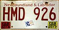
Vehicle registration plates of Massachusetts Boilerplate do not create a new image as it is not needed.
{{resolved}}
-

-

-

-

-

-

-

-

-

-

-

-

-

-

-

-

-

-

-

-

-

-

-

-

-

-
 should be 1:2 ratio
 -

-

-

-
-

-

-

-

-

-

-
-

-


- Article(s)
- Vehicle registration plates of Massachusetts
- Request
- please fix perspective and trim to plate … Boilerplate do not create a new image as it is not needed.-- Kintetsubuffalo (talk) 18:48, 25 October 2018 (UTC)
- Graphist opinion(s)
![]() Done PawełMM (talk) 14:44, 26 October 2018 (UTC)
Done PawełMM (talk) 14:44, 26 October 2018 (UTC)
- Fantastic! Thanks for your hard work!--Kintetsubuffalo (talk) 00:09, 27 October 2018 (UTC)
The Way You Look Tonight
{{resolved}}
_label.jpg)
- Article(s)
- The Way You Look Tonight
- Request
- please rotate to straight… -- Kintetsubuffalo (talk) 07:48, 26 October 2018 (UTC)
- Graphist opinion(s)
![]() Done PawełMM (talk) 08:11, 26 October 2018 (UTC)
Done PawełMM (talk) 08:11, 26 October 2018 (UTC)
- Thank you!--Kintetsubuffalo (talk) 00:07, 27 October 2018 (UTC)
Green Corn Ceremony
{{resolved}}


- Article(s)
- Green Corn Ceremony
- Request
- please create new image, trimmed to oval, named File:Green Corn Ceremony - Minatarrees… -- Kintetsubuffalo (talk) 00:06, 27 October 2018 (UTC)
- Graphist opinion(s)
![]() Done PawełMM (talk) 05:37, 27 October 2018 (UTC)
Done PawełMM (talk) 05:37, 27 October 2018 (UTC)
- Thank you!--Kintetsubuffalo (talk) 13:29, 27 October 2018 (UTC)
Your advice is requested at Talk:Trypophobia
{{resolved}}

Trypophobia is a rare phobia in which an image of a pattern of holes can elicit strong feelings of discomfort or repulsion in some people. The image you see here is an example. There is an Rfc going on currently at Talk:Trypophobia, about whether to keep the image at the top of the article, collapse it, or move it down, where presumably phobic individuals would be less likely to see it.
I see a possibly better alternative, but I don't know if it's a reasonable one, technically speaking, and I need your help and advice. I would like to propose a 5-phase progressive gif based on the lotus image, where the disturbing part within the circle (or perhaps the whole image) starts off quite blurry, sufficiently to prevent the distress in those who are phobic, and then progressively sharpens after 3- or 5-second intervals, giving the phobic individual sufficient time to bail out before the distressing effect becomes acute. (We have at least two individuals on board at the discussion who have the phobia and could be queried about how blurry is blurry enough to start. For non-phobes, the caption ideally would have a link which would jump to the fully-sharp image.)
My first question is, would it be possible to create a progressively sharpening gif based on this image? (I'm not asking for it yet, and it would be a waste of time to create one, if the consensus of the Rfc doesn't go in that direction.) Secondly, could you go to the Rfc and comment about whether this sort of image would be possible, and if so, how to request it?
There is already a long discussion going on about the image placement problem. The best place to comment on this would be at the Rfc discussion location here. (Other links: Rfc begin, Rfc survey, Rfc discussion.) Any advice you could offer on the feasibility of a progressive gif of this nature would be appreciated; feedback requested --> here. Thanks, Mathglot (talk) 06:50, 27 October 2018 (UTC)
.gif)
@Mathglot: Animation proposal in gif format. PawełMM (talk) 09:10, 27 October 2018 (UTC)
- Wow, PawełMM, that's awesome! I'll link to the image from the discussion there. (P.S. I meant awesome in its original sense, not its newer, slangy sense, but actually both apply; thanks again!) Mathglot (talk) 09:15, 27 October 2018 (UTC)
Australian Film Commission Boilerplate do not create a new image as it is not needed.
{{resolved}}
- Article(s)
- Australian Film Commission
- Request
- please trim to logo Boilerplate do not create a new image as it is not needed.… -- Kintetsubuffalo (talk) 18:39, 27 October 2018 (UTC)
- Graphist opinion(s)
![]() Done PawełMM (talk) 02:56, 28 October 2018 (UTC)
Done PawełMM (talk) 02:56, 28 October 2018 (UTC)
- Thank you!--Kintetsubuffalo (talk) 08:15, 28 October 2018 (UTC)
Waumegesako Council Boilerplate do not create a new image as it is not needed.
{{resolved}}

- Article(s)
- Waumegesako Council
- Request
- please remove background and trim to object Boilerplate do not create a new image as it is not needed.… -- Kintetsubuffalo (talk) 07:58, 29 October 2018 (UTC)
- Graphist opinion(s)
![]() Done PawełMM (talk) 09:03, 29 October 2018 (UTC)
Done PawełMM (talk) 09:03, 29 October 2018 (UTC)
- Thank you!--Kintetsubuffalo (talk) 18:26, 29 October 2018 (UTC)
Request: Job de Ruiter
-
 Job de Ruiter

- Article(s)
- Job de Ruiter
- Request
- Please remove scratches, if possible. Vysotsky (talk) 21:05, 29 October 2018 (UTC)
- Graphist opinion(s)
![]() Done PawełMM (talk) 05:54, 30 October 2018 (UTC)
Done PawełMM (talk) 05:54, 30 October 2018 (UTC)
- Great. Thanks! Vysotsky (talk) 08:38, 30 October 2018 (UTC) {{resolved}}
Request: Tony Miles
-
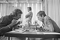 Miles vs. Van Wijgerden
_tegen_Van_Wijgerden,_Bestanddeelnr_929-2564.jpg)
- Article(s)
- Tony Miles
- Request
- Please remove or soften black stains, if possible. Vysotsky (talk) 21:25, 29 October 2018 (UTC)
- Graphist opinion(s)
![]() Done PawełMM (talk) 06:50, 30 October 2018 (UTC)
Done PawełMM (talk) 06:50, 30 October 2018 (UTC)
- Nice job. Thanks! Vysotsky (talk) 08:38, 30 October 2018 (UTC) {{resolved}}