Wikipedia:Graphics Lab/Photography workshop/Archive/Oct 2016 Source: en.wikipedia.org/wiki/Wikipedia:Graphics_Lab/Photography_workshop/Archive/Oct_2016
Red Fort
[edit].jpg)
- Article(s)
- Red Fort
- Request
- please remove unencyclopedic frame… -- Kintetsubuffalo (talk) 16:38, 25 September 2016 (UTC)
- Graphist opinion(s)
 Done—Quibik (talk) 12:05, 2 October 2016 (UTC)
- Fantastic and seems more vivid, thank you!--Kintetsubuffalo (talk) 03:14, 3 October 2016 (UTC)--Kintetsubuffalo (talk) 03:14, 3 October 2016 (UTC)
watermark
[edit].jpg)
.jpg)
- Request
- please remove watermark… -- Kintetsubuffalo (talk) 15:52, 27 September 2016 (UTC)
- Graphist opinion(s)
![]() Done–Quibik (talk) 13:29, 2 October 2016 (UTC)
Done–Quibik (talk) 13:29, 2 October 2016 (UTC)
- Great! Magic, thank you!--Kintetsubuffalo (talk) 03:11, 3 October 2016 (UTC)
Rock-Olga
[edit]
- Article(s)
- Rock-Olga
- Request
- please remove wavy yellow pattern… -- Kintetsubuffalo (talk) 00:57, 28 September 2016 (UTC)
- Graphist opinion(s)
Should be ![]() Done –Quibik (talk) 13:28, 2 October 2016 (UTC)
Done –Quibik (talk) 13:28, 2 October 2016 (UTC)
- Looks great, thanks! It's been quiet around here...--Kintetsubuffalo (talk) 03:10, 3 October 2016 (UTC)
The Boys of Summer by DJ Sammy
[edit]-
UK vinyl front cover
- Article(s)
- The Boys of Summer (song)
- Request
- I think I need image improvement to lessen the risks of violating US laws. I uploaded the image just locally because the UK jurisdiction considers this original enough and above the level of the Edge logo. -- George Ho (talk) 08:17, 7 June 2016 (UTC)
- Graphist opinion(s)
Seán Lemass
[edit]-
Seán Lemass (center)
- Article(s)
- Seán Lemass, Taoiseach, etc
- Request
- Please, create a crop image of Lemass out of this pic. -- Sundostund (talk) 17:23, 25 June 2016 (UTC)
- Graphist opinion(s)
- Image is too small to be useful if cropped. Centpacrr (talk) 14:15, 29 June 2016 (UTC)
Frederick William Beckley
[edit].jpg)
- Article(s)
- Frederick William Kahapula Beckley Sr.
- Request
- Please restore. Thanks.-- KAVEBEAR (talk) 07:51, 3 July 2016 (UTC)
- Graphist opinion(s)
 Request taken by Centpacrr (talk) 13:04, 3 July 2016 (UTC).
![]() Done Centpacrr (talk) 13:42, 3 July 2016 (UTC)
Done Centpacrr (talk) 13:42, 3 July 2016 (UTC)
Watermarks remove
[edit]-
 Watermark and bottom description
 -
 Watermark
 -
 Watermark
 -
 Watermark


- Article(s)
- Timeline of Basel, History of Basel
- Request
- Please remove the watermarks and in the first image airbrush the bottom description without cropping any of the images please. In the last image, the image looks skewed if you look at the upper two corners, if that could be corrected as well. Thank you very much. -- Gryffindor (talk) 10:41, 4 July 2016 (UTC)
- Graphist opinion(s)
- Done Centpacrr (talk) 13:37, 4 July 2016 (UTC)
Plácido de Castro
[edit]
- Article(s)
- Plácido de Castro
- Request
- please trim excess space/center bust… -- Kintetsubuffalo (talk) 23:31, 17 July 2016 (UTC)
- Graphist opinion(s)
Stretch photo of a painting
[edit]-
 Sampson Eardley, Tory MP (1770–1802)
 -
 High quality alternative


- Article(s)
- Sampson Eardley, 1st Baron Eardley
- Request
- Is it possible to stretch/re-arrange this photo so that the painting appears more "flat?" -- bender235 (talk) 22:05, 19 July 2016 (UTC)
- Graphist opinion(s)
I can, but there is a high quality alternative already. (Hohum @) 22:25, 19 July 2016 (UTC)
Daniel Portman
[edit]
- Article(s)
- Daniel Portman
- Request
- This request is very different than my normal ones… I don't know what they are, but I know there are repositories of open use images that Wikipedia can download and use freely (sorry don't know terms). Can someone please find a better free image without the shades hiding half his face? Thanks-- Kintetsubuffalo (talk) 06:13, 23 July 2016 (UTC)
- Graphist opinion(s)
Stamford Raffles
[edit]
- Article(s)
- Stamford Raffles
- Request
- png version, no text, neutral background, please… -- Kintetsubuffalo (talk) 03:38, 30 July 2016 (UTC)
- Graphist opinion(s)
There is a clearer version of the image from the National Portrait Gallery in London here. However, there is a potential legal issue for NPG images. (See the explanation on the commons page for the file). As I am in the UK, I would open myself to potential legal issues by uploading it. People located elsewhere may have less exposure. (Hohum @) 12:15, 30 July 2016 (UTC)
1875 Stereograms
[edit]-
 Copy 1
 -
 Copy 2
 -
 Restoration

,_d._1901.png)

- Article(s)
- Lexington High School (Massachusetts)
- Request
- These two images are scans of the same stereogram, which depicts Lexington, Massachusetts's high school in 1875. Unfortunately, both images have scratches and markings on them that are particularly noticeable when viewing in 3D. Between the two scans, and the two views in each scan, there should be enough source material to create a high-quality composite image. Please create such a composite image, possibly with color correction, as a new file. -- Djkauffman (talk) 17:50, 3 August 2016 (UTC)
- Graphist opinion(s)
- Request taken by Centpacrr (talk) 17:53, 3 August 2016 (UTC).
![]() Done Centpacrr (talk) 18:46, 3 August 2016 (UTC)
Done Centpacrr (talk) 18:46, 3 August 2016 (UTC)
- I'm wondering if he meant; make a cleaner stereogram. (Hohum @) 13:45, 5 August 2016 (UTC)
Clock
[edit]
- Request
- @Centpacrr: Please transparent the background that is now white in color. Can you or some other image editor like Kaldari help me. --VarunFEB2003 I am Offline 17:53, 13 August 2016 (UTC)
Cassette cover of Love Takes Time
[edit]
- Article(s)
- Love Takes Time
- Request
- Someone wants it digitally remastered or something. Angle perspective needs to be fixed. Not sure about brightness and/or contrast. Maybe make it... film-like? -- George Ho (talk) 02:05, 19 August 2016 (UTC)
- Graphist opinion(s)
- Done Centpacrr (talk) 05:25, 19 August 2016 (UTC)
Nevill Ground pavilion
[edit]-
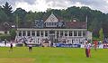 Nevill Ground Pavilion

- Article(s)
- Nevill Ground, Tunbridge Wells Cricket Club
- Request
- Can we have a zoom and enlargement on the pavilion (the building with the clock) please? The C of E God Save the Queen! (talk) 19:10, 22 August 2016 (UTC)
- Graphist opinion(s)
- Done Centpacrr (talk) 22:17, 22 August 2016 (UTC)
SVG requests
[edit]-malformed request Um... so these two files would look a LOT better in SVG (they're in PNG):
Can anyone's who reading this convert them (duh)? Thanks! Esmost πк 19:53, 1 September 2016 (UTC)
La Famille Royale de Tahiti
[edit]

Individual crops
[edit]-
 1
1 -
 2
2 -
 3
3 -
 4
4 -
 5
5 -
 6
6 -
 7
7 -
 8
8 -
 9
9 -
 10
10 -
 11
11 -
 12
12 -
 13
13 -
 14
14 -
 15
15 -
 16
16 -
 17
17 -
 18
18 -
 19
19 -
 20
20 -
 21
21 -
 22
22 -
 23
23 -
 24
24 -
 25
25


Article(s): Pōmare Dynasty
- Request
- Please, perform these tasks below:
- 1. Oval crop File:La Famille Royale de Tahiti.jpg (it is not perfect since there is a little bit that is off on the bottom left)
- 2. Oval crop and upload a new image for every one of the figures in the original
- 3. Use the previous version as reference in identifying who is who).
- 4. Or created them File:La Famille Royale de Tahiti, Te Papa Tongarewa1.jpg, File:La Famille Royale de Tahiti, Te Papa Tongarewa2.jpg, File:La Famille Royale de Tahiti, Te Papa Tongarewa3.jpg, etc. or something shorter and I can go back and rename them individually.
- Thanks!-- KAVEBEAR (talk) 19:35, 18 September 2016 (UTC)
- Graphist opinion(s)
- Here's an attempt at just the full image crop, removing the worst pen/pencil marks only.
- I've started the individual crops - I will do a couple at a time as and when I get the chance... -- Begoon 12:30, 3 October 2016 (UTC)
- They look beautiful! Thanks!--KAVEBEAR (talk) 17:39, 3 October 2016 (UTC)
- Ok, that's all of them cropped now, ready for you to rename etc. -- Begoon 13:55, 4 October 2016 (UTC)
- Thanks!--KAVEBEAR (talk) 18:05, 4 October 2016 (UTC)
José de San Martín
[edit]12:54, 8 October 2016 (UTC)
.jpg)

- Article(s)
- José de San Martín
- Request
- please downplay the plastic and crackling… -- Kintetsubuffalo (talk) 14:02, 28 July 2016 (UTC)
- Ah, it's not plastic, it's a huge Argentine flag, see here https://argentoria.files.wordpress.com/2015/08/151.jpg . In that case, either trim down to de-emphasize, or capture the whole painting without frame, please.--Kintetsubuffalo (talk) 03:44, 30 July 2016 (UTC)
- Graphist opinion(s)
- Done Centpacrr (talk) 19:01, 28 July 2016 (UTC)
- @Centpacrr:I've overwritten File:Retrato más canónico de José de San Martín.jpg with the full version so as not to overwrite your hard work. Can you remove the frame but leave the whole painting? That's closer to what I am looking for. Thanks!--Kintetsubuffalo (talk) 13:30, 3 October 2016 (UTC)
- @Offnfopt:-not resolved-if you can remove the frame on image 2, it would be resolved. Thanks!--Kintetsubuffalo (talk) 12:13, 8 October 2016 (UTC)
- Sorry missed that comment, Done Offnfopt(talk) 12:42, 8 October 2016 (UTC)
- Sorry missed that comment,
- @Offnfopt:-not resolved-if you can remove the frame on image 2, it would be resolved. Thanks!--Kintetsubuffalo (talk) 12:13, 8 October 2016 (UTC)
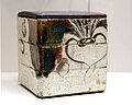
Nabeshima plate
[edit]- Article(s)
- Nabeshima ware
- Request
- Please crop to square size, remove the two lower feet of the wooden stand and the shadow at the bottom. There might also be some tint of the glass that is over the dish for protection. The background colour and texture can be kept. Basically it should appear like this File:Floral Plate Nabeshima.JPG. Second image has a very yellow-beige tint, please remove. Image can also be a square, which means you would have to add some space at the top and bottom. Thank you. -- Gryffindor (talk) 08:01, 3 September 2016 (UTC)
- Graphist opinion(s)
- Done Centpacrr (talk) 21:40, 13 September 2016 (UTC)
- Sorry, the second one is still yellowish. The white of the porcelain should be just that. Could we give it another try please? The dimensions of the image should also be 3x4. Gryffindor (talk) 13:02, 19 September 2016 (UTC)
- That's much better, thank you. Could you also increase the space around the vessel a little so that the image is a 4:3 aspect ratio? Gryffindor (talk) 17:21, 21 September 2016 (UTC)
- Sorry, the second one is still yellowish. The white of the porcelain should be just that. Could we give it another try please? The dimensions of the image should also be 3x4. Gryffindor (talk) 13:02, 19 September 2016 (UTC)
- Extended background to give 4:3 aspect ratio, per your request. -- Begoon 14:58, 4 October 2016 (UTC)
Remove background of image
[edit]-
 Coin
Coin

- Article(s)
- Monarchy of New Zealand
- Request
Please remove the blue background and colour black or white. Preferably not to detract from the coins. Thanks in advance. -- Hazhk (talk) 23:09, 4 September 2016 (UTC)
- Graphist opinion(s)
- Done Centpacrr (talk) 21:15, 13 September 2016 (UTC)
Perspective adjustment
[edit]-
 Arreton church

- Article(s)
- Arreton
- Request
- Is it possible to adjust the perspective on this to make the building look a bit more "square on"? (A little bit of retained "looking up" perspective would be OK. Sometimes if everything is made too square the results can be unnatural, though I leave this to the judgement of the experts.) Mypix (talk) 20:58, 11 September 2016 (UTC)
- Graphist opinion(s)
- Done Centpacrr (talk) 21:13, 13 September 2016 (UTC)
- Thanks very much. However, the colours seem to have changed. The original colours were rich and contrasty; now the picture looks more washed out. I wonder why that would have happened? Why would adjusting the perspective change the colours? Mypix (talk) 17:51, 16 September 2016 (UTC)
- Increased color saturation; agma. Centpacrr (talk) 20:48, 16 September 2016 (UTC)
- I don't know what you mean by "agma", but anyway, whatever has happened, sorry, I don't like the new colours. Is it possible to do the perspective adjustment without changing the colours? If not, I think I'll just stick with the original, in which case sorry for wasting your time. Mypix (talk) 01:35, 17 September 2016 (UTC)
- Redone from original image file. Centpacrr (talk) 21:03, 19 September 2016 (UTC)
- I don't know what you mean by "agma", but anyway, whatever has happened, sorry, I don't like the new colours. Is it possible to do the perspective adjustment without changing the colours? If not, I think I'll just stick with the original, in which case sorry for wasting your time. Mypix (talk) 01:35, 17 September 2016 (UTC)
- Thanks very much. However, the colours seem to have changed. The original colours were rich and contrasty; now the picture looks more washed out. I wonder why that would have happened? Why would adjusting the perspective change the colours? Mypix (talk) 17:51, 16 September 2016 (UTC)
William Lawies Jackson
[edit]-
 William Lawies Jackson

- Article(s)
- William Jackson, 1st Baron Allerton
- Request
- @Centpacrr: Could this watermark be removed and the left side of the frame be cropped so that it is the same with the right side?--The Traditionalist (talk) 21:00, 1 October 2016 (UTC)
- Done –Quibik (talk) 13:52, 2 October 2016 (UTC)
Victoria School, Singapore
[edit]-

-

-
 Retouched version
- Article(s)
- Victoria School, Singapore
- Request
- please remove frame and straighten… -- Kintetsubuffalo (talk) 06:32, 27 September 2016 (UTC)
- Graphist opinion(s)
![]() Done - Offnfopt(talk) 21:04, 9 October 2016 (UTC)
Done - Offnfopt(talk) 21:04, 9 October 2016 (UTC)
- Thanks again! Wow, that frame was really hiding how scratchy the photo is!--Kintetsubuffalo (talk) 23:38, 9 October 2016 (UTC)
Seiichiro Furuta
[edit]

- Article(s)
- Seiichiro Furuta
- Request
- For some reason, the outside of the image is nice and crisp, but the inside is washed out-can anything be done? Thanks… -- Kintetsubuffalo (talk) 17:12, 28 September 2016 (UTC)
- Graphist opinion(s)
- Done File:Seiichiro Furuta with Cub Scouts ca. 1924.png best I could do without getting too drastic with the edit. Offnfopt(talk) 16:16, 9 October 2016 (UTC)
- Thanks, that's much better! That one poor kid is just not going to have much of a face. :(--Kintetsubuffalo (talk) 23:32, 9 October 2016 (UTC)
Egyptian Federation for Scouts and Girl Guides
[edit]_1930s.png)
- Article(s)
- Egyptian Federation for Scouts and Girl Guides
- Request
- please make background transparent and rotate slightly… -- Kintetsubuffalo (talk) 06:21, 5 October 2016 (UTC)
- Graphist opinion(s)
![]() Done - Offnfopt(talk) 14:08, 10 October 2016 (UTC)
Done - Offnfopt(talk) 14:08, 10 October 2016 (UTC)
- @Offnfopt: I'm so sorry for being unclear, can you remove the oval? Thanks!--Kintetsubuffalo (talk) 01:42, 11 October 2016 (UTC)
- I don't usually like to do these intricate type of cutout because I'm usually not happy with the end result. When you cut objects out in pictures you usually have a chance to feather the edges when you're integrating the picture into a new background, but when you are cutting a object out and not integrating it into a new background you don't get a chance to merge it with with the new setting, so the edges can look a bit sharp and unpleasant. I went ahead and did it anyway though, feel free to revert the edit. Offnfopt(talk) 02:57, 11 October 2016 (UTC)
- @Offnfopt: No, that's almost perfect, great, what I was looking for! There is a little bit off the bottom corner of the right arm, if it's not a bother could you grab that? If it's a pain, this is great and I will mark it resolved, thanks!--Kintetsubuffalo (talk) 03:15, 11 October 2016 (UTC)
- @Offnfopt: I refreshed my cache, still shows the clip missing at about 3:00, right at the edge.--Kintetsubuffalo (talk) 03:54, 11 October 2016 (UTC)
- I don't guess I'm following your description. Do you have a image editor so you could use a pencil tool to point out the error? Such as mspaint on Windows or you could use a online editor like https://pixlr.com/editor/. You could do a temporary upload of the edited image to imgur.com so I could get a better idea of what problem you're talking about. Offnfopt(talk) 04:19, 11 October 2016 (UTC)
- @Offnfopt: That was cool, didn't know I could do that! It's at http://imgur.com/a/sDyNc , and thanks for being patient with this!--Kintetsubuffalo (talk) 04:52, 11 October 2016 (UTC)
- How is the recent upload? Offnfopt(talk) 05:17, 11 October 2016 (UTC)
- I don't usually like to do these intricate type of cutout because I'm usually not happy with the end result. When you cut objects out in pictures you usually have a chance to feather the edges when you're integrating the picture into a new background, but when you are cutting a object out and not integrating it into a new background you don't get a chance to merge it with with the new setting, so the edges can look a bit sharp and unpleasant. I went ahead and did it anyway though, feel free to revert the edit. Offnfopt(talk) 02:57, 11 October 2016 (UTC)
- Perfect, thank you so much!--Kintetsubuffalo (talk) 05:21, 11 October 2016 (UTC)
Esther Welmoet Wijnaendts Francken-Dyserinck
[edit]

- Article(s)
- Esther Welmoet Wijnaendts Francken-Dyserinck
- Request
- please create png version, trimmed to subject, named File:Esther Welmoet Wijnaendts Francken-Dyserinck.png… -- Kintetsubuffalo (talk) 08:45, 11 October 2016 (UTC)
- Graphist opinion(s)
![]() Done - Offnfopt(talk) 14:17, 11 October 2016 (UTC)
Done - Offnfopt(talk) 14:17, 11 October 2016 (UTC)
- Thank you!--Kintetsubuffalo (talk) 15:05, 11 October 2016 (UTC)
Jacques Sevin
[edit].jpg)
.png)
- Article(s)
- Jacques Sevin
- Request
- please create png trimmed to oval… -- Kintetsubuffalo (talk) 03:39, 13 October 2016 (UTC)
- Graphist opinion(s)
![]() Done - Offnfopt(talk) 18:15, 13 October 2016 (UTC)
Done - Offnfopt(talk) 18:15, 13 October 2016 (UTC)
- Thank you again!--Kintetsubuffalo (talk) 18:22, 13 October 2016 (UTC)
John Macqueen
[edit]

- Article(s)
- John Macqueen
- Request
- png version with bottom text removed, please… -- Kintetsubuffalo (talk) 05:09, 13 October 2016 (UTC)
- Graphist opinion(s)
![]() Done - There are two revisions to the file in case you want to revert to the version with less editing done to it. Offnfopt(talk) 13:48, 14 October 2016 (UTC)
Done - There are two revisions to the file in case you want to revert to the version with less editing done to it. Offnfopt(talk) 13:48, 14 October 2016 (UTC)
- I finally got it after looking for a while, I like the newer one with less blemishes, thanks!--Kintetsubuffalo (talk) 13:52, 15 October 2016 (UTC)
Guy de Larigaudie
[edit]

- Article(s)
- Guy de Larigaudie
- Request
- png version with no border, please… -- Kintetsubuffalo (talk) 18:03, 13 October 2016 (UTC)
- Graphist opinion(s)
![]() Done - Offnfopt(talk) 13:07, 14 October 2016 (UTC)
Done - Offnfopt(talk) 13:07, 14 October 2016 (UTC)
- Thank you again!--Kintetsubuffalo (talk) 14:00, 15 October 2016 (UTC)
Ben Duckett
[edit]-
 Zoomed out picture of Duckett celebrating
 -


.jpg)
- Article(s)
- Ben Duckett
- Request
- Hi, please could the above picture be cropped from his waist to the top of the bat, and then up loaded as a separate image? It is for an infobox but can't be too closely cropped as it would be blurry. Thanks, Gaia Octavia Agrippa Talk 18:12, 16 October 2016 (UTC)
- Graphist opinion(s)
File:Ben Duckett celebrates a half-century (crop-retouch).jpg - I cropped a bit higher than the waist, and even so you will barely see his face in an infobox. -- Begoon 06:55, 17 October 2016 (UTC)
- Thanks a lot! It's the only image of him that I could find, so this is the best option. The crop from the waist up was to show the different colours of his kit but that's not that important. Gaia Octavia Agrippa Talk 21:56, 17 October 2016 (UTC)
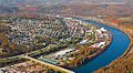
Quick crop
[edit]-
 Aerial view of Burke's Garden, Virginia

- Article(s)
- Burke's Garden, Virginia
- Request
- Could you crop this to get rid of all three pieces of text, and also get rid of the whitespace at both sides? The important part of the image is below the top text and above both bottom texts, so cropping won't make the image less useful at all. Nyttend (talk) 11:37, 8 October 2016 (UTC)
- Graphist opinion(s)
![]() Done - Offnfopt(talk) 12:03, 8 October 2016 (UTC)
Done - Offnfopt(talk) 12:03, 8 October 2016 (UTC)
Quick crop, part two
[edit]-
 Aerial view of Donora, Pennsylvania

- Article(s)
- es:Niebla tóxica de Donora
- Request
- Offnfopt, ditto the previous request. Note that the text overlaps the bridge at the bottom, but this isn't hugely important. Thanks for your help! Nyttend (talk) 12:31, 8 October 2016 (UTC)
- Graphist opinion(s)
![]() Done - Offnfopt(talk) 12:51, 8 October 2016 (UTC)
Done - Offnfopt(talk) 12:51, 8 October 2016 (UTC)
Remove addition
[edit]-
 Ingrid Haebler

- Article(s)
- Ingrid Haebler and several other articles
- Request
- If possible, remove the numbers -down under (right). (Not by cropping the photograph.) -- Vysotsky (talk) 09:44, 12 October 2016 (UTC)
- Graphist opinion(s)
![]() Removed -- Begoon 10:59, 12 October 2016 (UTC)
Removed -- Begoon 10:59, 12 October 2016 (UTC)
Removal of number stamps
[edit]-
 Jan Campert Prize 1956
 -
 Van Deyssel & Bomans playing chess
 -
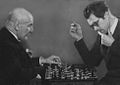
-
 Bachtiar


- Article(s)
- Already in use.
- Request
- If possible: remove number stamps. -- Vysotsky (talk) 11:14, 12 October 2016 (UTC)
- Graphist opinion(s)
![]() All three done. The second one I also converted to b/w with additional retouching, as an alternative. (There's also a version of that with the retouching, but before b/w conversion, in the history of that file: [1]). -- Begoon 14:12, 12 October 2016 (UTC)
All three done. The second one I also converted to b/w with additional retouching, as an alternative. (There's also a version of that with the retouching, but before b/w conversion, in the history of that file: [1]). -- Begoon 14:12, 12 October 2016 (UTC)
Removal of numbers (cont.)
[edit]-

-

-
 Jacob Vincent


- Article(s)
- Already used in several articles.
- Request
- If possible: remove numbers. -- Vysotsky (talk) 20:43, 12 October 2016 (UTC)
- Graphist opinion(s)
![]() All three done. -- Begoon 04:01, 13 October 2016 (UTC)
All three done. -- Begoon 04:01, 13 October 2016 (UTC)
Removal of numbers (cont.)
[edit]


- Article(s)
- Images are used in several articles.
- Request
- If possible: remove numbers or irregularities. Vysotsky (talk) 12:13, 13 October 2016 (UTC)
- Graphist opinion(s)
![]() All three done. -- Begoon 03:59, 14 October 2016 (UTC)
All three done. -- Begoon 03:59, 14 October 2016 (UTC)
File:14-inbetoki.jpg
[edit]-
 1
1 -
-
2
-
 3
3 -
4


- Article(s)
- Bizen ware, Ando Cloisonné Company, Kyo ware
- Request
- Image 1 looks it was photographed rather than scanned, please correct skew, brightness, crop, etc., same with image 2. Image 3 the object is too close to the edges of the image, it's overcropped, please increase the distance and keep the background colour scheme, ratio can also be kept. Thank you. -- Gryffindor (talk) 12:46, 13 October 2016 (UTC)
- Graphist opinion(s)
- I expanded the background on [3] as much as I was comfortable - any more was starting to look artificial because it has to be created. -- Begoon 14:44, 13 October 2016 (UTC)
- With [2], there was so much reflection/distortion going on in the b/g that I just perspective adjusted and cut him out on a soft gradient. -- Begoon 15:26, 13 October 2016 (UTC)
- ...and with [1], I just did the best I could - someone may do better. -- Begoon 16:25, 13 October 2016 (UTC)
- Would you mind doing image 4 as well, correct skew, crop? Gryffindor (talk) 09:33, 14 October 2016 (UTC)
- Done - No problem at all, but I nearly missed that you'd added this request: File:????? (9) retouch.jpg
... and if you want it without the red 'text' there's a version in the file history you can revert to: [2], along with black & white versions of both: [3], [4] -- Begoon 13:57, 14 October 2016 (UTC)- Perfect, thank you very much for your help. Gryffindor (talk) 15:38, 14 October 2016 (UTC)
- Would you mind doing image 4 as well, correct skew, crop? Gryffindor (talk) 09:33, 14 October 2016 (UTC)
Removal of numbers (cont.)
[edit]


- Article(s)
- Images are used in several articles.
- Request
- If possible: remove numbers or irregularities. Vysotsky (talk) 07:35, 14 October 2016 (UTC)
- Graphist opinion(s)
![]() All three done. -- Begoon 09:47, 14 October 2016 (UTC)
All three done. -- Begoon 09:47, 14 October 2016 (UTC)
Removal of numbers (cont.)
[edit]


- Article(s)
- Images are used in several articles.
- Request
- If possible: remove numbers or irregularities. Vysotsky (talk) 09:40, 14 October 2016 (UTC)
- Graphist opinion(s)
![]() All three done. The last one I could only crop the damage out. -- Begoon 12:30, 14 October 2016 (UTC)
All three done. The last one I could only crop the damage out. -- Begoon 12:30, 14 October 2016 (UTC)
Removal of numbers (cont.)
[edit]-
 Feyenoord - Manchester United 1959
 -

-
 War Monument Delft


- Article(s)
- The photographs are used in several articles.
- Request
- If possible: please remove numbers or irregularities. Vysotsky (talk) 20:41, 14 October 2016 (UTC)
- Graphist opinion(s)
![]() All three done. -- Begoon 07:35, 15 October 2016 (UTC)
All three done. -- Begoon 07:35, 15 October 2016 (UTC)
File:WLA haa Dish Mukozuke attributed to Ogata Kenzan.jpg
[edit]-
 1
1 -

-
 2
2 -

-
 3
3 -

-
 4
4 -


- Article(s)
- Kyo ware, Seto ware, Oribe ware
- Request
- Very strong yellow or rose tint of the light, would it be possible to remove it in 1 and 2? In 3, please clean up background (white is fine), but try to leave shadow of vessel on the background on the right side so it doesn't look artificial. Please also increase overall space between vessels to edges of picture, it's cropped a little too much. -- Gryffindor (talk) 09:55, 15 October 2016 (UTC)
- Graphist opinion(s)
1
[edit]- For [1], that's tricky without a point of reference. Is File:WLA haa Dish Mukozuke attributed to Ogata Kenzan retouch.jpg in the right direction? -- Begoon 10:22, 15 October 2016 (UTC)
- If you look at his other ceramic works in the Commons or on the net, his glazes tend to be white or off-white. I would still try to remove some more pinkish tint. Gryffindor (talk) 10:30, 15 October 2016 (UTC)
- In that case, tell me how it is now - that's adjusting object and background independently. I also extended the background. -- Begoon 13:43, 15 October 2016 (UTC)
- 1 and 3 look good, thank you. Gryffindor (talk) 20:06, 15 October 2016 (UTC)
- In that case, tell me how it is now - that's adjusting object and background independently. I also extended the background. -- Begoon 13:43, 15 October 2016 (UTC)
- If you look at his other ceramic works in the Commons or on the net, his glazes tend to be white or off-white. I would still try to remove some more pinkish tint. Gryffindor (talk) 10:30, 15 October 2016 (UTC)
2
[edit]- With [2], again I need a pointer. I've taken the yellow cast out of the background, but not done much at all to the pot yet, apart from brighten its midtones, because I don't know how it should look. This one is supposed to be yellow, isn't it? A visual indication of what to aim at would be ideal. It's masked now in my working file, so I can adjust the object independently. -- Begoon 14:34, 15 October 2016 (UTC)
- Something is off, it's too grey or dark. It should look colourwise something like these [5], [6], I don't know if that helps. Gryffindor (talk) 20:05, 15 October 2016 (UTC)
- I did some colour adjustment to the pot. Is that closer, or did I go too far? -- Begoon 01:35, 16 October 2016 (UTC)
- I like it, much better. The dark background part at the top is a bit unfortunate, because the lid almost blends in with it when seen as a thumb. Is there anything that can be done with the background? Sorry for the trouble. Gryffindor (talk) 23:25, 16 October 2016 (UTC)
- I recreated the top of the background and lightened the rest of it. That should be better. -- Begoon 04:14, 17 October 2016 (UTC)
- I found the reference file after a search, I am sorry about not finding it earlier [7]. I will do better research ahead in the next submission in order to spare you time and effort. The background can also be the same type if possible? Gryffindor (talk) 20:58, 17 October 2016 (UTC)
- OK - but in this case I reversed the gradient for the background because we don't want to darken the lid area any more. -- Begoon 01:24, 18 October 2016 (UTC)
- This is great, thank you very much. Gryffindor (talk) 12:12, 18 October 2016 (UTC)
- OK - but in this case I reversed the gradient for the background because we don't want to darken the lid area any more. -- Begoon 01:24, 18 October 2016 (UTC)
- I found the reference file after a search, I am sorry about not finding it earlier [7]. I will do better research ahead in the next submission in order to spare you time and effort. The background can also be the same type if possible? Gryffindor (talk) 20:58, 17 October 2016 (UTC)
- I recreated the top of the background and lightened the rest of it. That should be better. -- Begoon 04:14, 17 October 2016 (UTC)
- I like it, much better. The dark background part at the top is a bit unfortunate, because the lid almost blends in with it when seen as a thumb. Is there anything that can be done with the background? Sorry for the trouble. Gryffindor (talk) 23:25, 16 October 2016 (UTC)
- I did some colour adjustment to the pot. Is that closer, or did I go too far? -- Begoon 01:35, 16 October 2016 (UTC)
- Something is off, it's too grey or dark. It should look colourwise something like these [5], [6], I don't know if that helps. Gryffindor (talk) 20:05, 15 October 2016 (UTC)
4
[edit]May I add file 4, it has the same issue with this yellow tint. See [8] as reference file. Thank you very much. Gryffindor (talk) 20:12, 15 October 2016 (UTC)
- I've tried to adjust the bowls toward that example. Let me know what you think. -- Begoon 09:12, 16 October 2016 (UTC)
- I like it, maybe just a little bit brighter overall? The lighting in general seems a bit dark. Gryffindor (talk) 23:23, 16 October 2016 (UTC)
- I put a bit more brightness in the midtones, but you're in danger of washing out the highlights if you go much further - the original is not sparkling quality... -- Begoon 02:30, 17 October 2016 (UTC)
- Excellent, thank you. Gryffindor (talk) 20:44, 17 October 2016 (UTC)
- I put a bit more brightness in the midtones, but you're in danger of washing out the highlights if you go much further - the original is not sparkling quality... -- Begoon 02:30, 17 October 2016 (UTC)
- I like it, maybe just a little bit brighter overall? The lighting in general seems a bit dark. Gryffindor (talk) 23:23, 16 October 2016 (UTC)
Alda H. Wilson
[edit]-
 Alda Wilson
 -


- Article(s)
- Alda Heaton Wilson
- Request
- It there a way that this image can be sharpened? The original was located here: [9] and as can be seen is muddy even before I cropped the subject. Thank you for any assistance that you might be able to render. -- SusunW (talk) 20:18, 11 October 2016 (UTC)
- Graphist opinion(s)
I made an attempt to do something which might at least look better in the article, but without a better original I'm afraid what I could do from that image isn't very good. Someone else may do better. I couldn't find a better image of this lady, just her sister, Elmina, which doesn't help much. -- Begoon 04:28, 12 October 2016 (UTC)
- Thanks for trying Begoon. I couldn't find another one of Alda either. (Well there is a passport photo but it isn't able to be loaded to commons, I don't think.) I'm going to do an article on Elmina too, so if you can make a decent photo of Elmina that'd be great. Appreciate the effort. SusunW (talk) 05:07, 12 October 2016 (UTC)
- @SusunW: I uploaded two revisions to the retouched file, check the files revision history and revert to the one you think would work best for the article. Offnfopt(talk) 05:32, 12 October 2016 (UTC)
- Offnfopt, I think I like the on that is least busy [10] but I don't know how to get to the "use this file" link to see if at article size that I still think that. I am not very technically inclined. How do I try it? And thanks, truly appreciate it! SusunW (talk) 06:10, 12 October 2016 (UTC)
- You'll have to click the revert link first before you can try it out. If you change your mind you can just revert the image again to a different revision. Offnfopt(talk) 06:13, 12 October 2016 (UTC)
- @SusunW: If you don't see the revert link, you'll need to click the link near the top right where it says "View on Commons" then you should see the revert links near the revision history.Offnfopt(talk) 06:58, 12 October 2016 (UTC)
- Offnfopt, I think I like the on that is least busy [10] but I don't know how to get to the "use this file" link to see if at article size that I still think that. I am not very technically inclined. How do I try it? And thanks, truly appreciate it! SusunW (talk) 06:10, 12 October 2016 (UTC)
- @SusunW: I uploaded two revisions to the retouched file, check the files revision history and revert to the one you think would work best for the article. Offnfopt(talk) 05:32, 12 October 2016 (UTC)
- Thanks for trying Begoon. I couldn't find another one of Alda either. (Well there is a passport photo but it isn't able to be loaded to commons, I don't think.) I'm going to do an article on Elmina too, so if you can make a decent photo of Elmina that'd be great. Appreciate the effort. SusunW (talk) 05:07, 12 October 2016 (UTC)
- Might the passport picture be pd-us-gov, or something similar? Or could we ask the copyright holder to release it? That's if it's any good, of course, I haven't seen it. -- Begoon 06:30, 12 October 2016 (UTC)
- Begoon thought about that but passports, while issued by the federal government, use photos the citizen provides. Thus, I have no idea who took it. I have no idea who might hold the rights to her estate. She never married, her sister who was her business partner never marred either, and as far as I can find, they had no offspring. Thanks Offnfopt It worked! I am so not technical, but your explanation made it simple. SusunW (talk) 13:56, 12 October 2016 (UTC)
- I re-did the touch-up from scratch, using Fourier transform to remove the wave patterns. I think it's a significant improvement, so I uploaded it on top of the existing ones. I hope that's okay. I also uploaded a larger version, in case anyone thinks the crop could be better. —Quibik (talk) 18:08, 16 October 2016 (UTC)
- Top job as always, Quibik. Regards, nagualdesign 18:16, 16 October 2016 (UTC)
- Y'all are awesome! The only issue I see is that the image is not showing now in her article. How do I fix that? SusunW (talk) 18:26, 16 October 2016 (UTC)
- Top job as always, Quibik. Regards, nagualdesign 18:16, 16 October 2016 (UTC)
removing frames
[edit]

- Article(s)
- Capture of Grenada
- Request
- Please remove the frames -- MARX, Julius (talk) 06:01, 16 October 2016 (UTC)
- Graphist opinion(s)
![]() Done -- Begoon 11:17, 16 October 2016 (UTC)
Done -- Begoon 11:17, 16 October 2016 (UTC)
Removal of numbers (cont.)
[edit]


- Article(s)
- The photographs are used in several articles.
- Request
- If possible: please remove numbers or irregularities. Vysotsky (talk) 19:28, 15 October 2016 (UTC)
- Graphist opinion(s)
![]() All 3 done. -- Begoon 04:25, 18 October 2016 (UTC)
All 3 done. -- Begoon 04:25, 18 October 2016 (UTC)
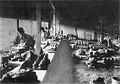
-
 Electronics Boutique
.jpg)
- Article(s)
- EB Games
- Request
- This photo has copyrighted content in its prominent window display. The photo will need to be deleted unless someone can replace or cover the derivative images. (Please {{ping}} me in replies.) czar 16:02, 10 September 2016 (UTC)
- Graphist opinion(s)
- @Czar: Doesn't copyright law have an exception for copyrighted material that appears incidentally in a limited way in an image? Otherwise it would be nearly impossible to publish a photo of a city street. Zerotalk 03:14, 20 October 2016 (UTC)
- De minimis would apply if it truly were incidental, but since the focus of this image is on the storefront (of which this is a significant part) and since we are able to create a freer alternative, we should. If the picture is of the city street and the copyrighted work is not a focus, and especially if the publication uses the image as fair use within a story, the publisher would be fine. For our case, we're not using these images under fair use but are opting for free licenses. That's my understanding. czar 04:32, 20 October 2016 (UTC)
- @Czar: I'm not sure what kind of solution you were hoping for, I went ahead and blurred the windows to obscure the copyrighted content. If that isn't acceptable then I would suggest to revert the changes and convert the image to a non-free rationale. Offnfopt(talk) 20:45, 31 October 2016 (UTC)
- @Offnfopt, looks great--thanks! czar 21:29, 31 October 2016 (UTC)
- @Czar: I'm not sure what kind of solution you were hoping for, I went ahead and blurred the windows to obscure the copyrighted content. If that isn't acceptable then I would suggest to revert the changes and convert the image to a non-free rationale. Offnfopt(talk) 20:45, 31 October 2016 (UTC)
- De minimis would apply if it truly were incidental, but since the focus of this image is on the storefront (of which this is a significant part) and since we are able to create a freer alternative, we should. If the picture is of the city street and the copyrighted work is not a focus, and especially if the publication uses the image as fair use within a story, the publisher would be fine. For our case, we're not using these images under fair use but are opting for free licenses. That's my understanding. czar 04:32, 20 October 2016 (UTC)
- @Czar: Doesn't copyright law have an exception for copyrighted material that appears incidentally in a limited way in an image? Otherwise it would be nearly impossible to publish a photo of a city street. Zerotalk 03:14, 20 October 2016 (UTC)
Silver Fish Award
[edit]
- Article(s)
- Silver Fish Award
- Request
- please
create png, and trim away box edgesfix perspective… -- Kintetsubuffalo (talk) 05:59, 11 October 2016 (UTC) - Graphist opinion(s)
I don't see anything wrong with the perspective, but went ahead and removed the black background. Offnfopt(talk) 20:16, 31 October 2016 (UTC)
- Thank you! Now the ribbon has lost its dark blueness and looks black, itself, though. Can that be fixed?--Kintetsubuffalo (talk) 03:52, 1 November 2016 (UTC)
- That was a byproduct of my process of removing the background, fixed now. Offnfopt(talk) 05:02, 1 November 2016 (UTC)
- Thank you! What I meant by perspective, is it sits on the ring offcenter, should this be fixed or left as is?--Kintetsubuffalo (talk) 05:16, 1 November 2016 (UTC)
- I think it is fine as is. Offnfopt(talk) 05:47, 1 November 2016 (UTC)
Edith Frances Crowdy
[edit]
- Article(s)
- Edith Frances Crowdy
- Request
- please trim and de-watermark… -- Kintetsubuffalo (talk) 13:48, 15 October 2016 (UTC)
- Graphist opinion(s)
![]() Done - Offnfopt(talk) 18:56, 28 October 2016 (UTC)
Done - Offnfopt(talk) 18:56, 28 October 2016 (UTC)
- Much better, thank you!--Kintetsubuffalo (talk) 04:21, 29 October 2016 (UTC)
File:Bowl (Wan) LACMA M.73.48.132.jpg
[edit]-
 1
1 -

-
 2
2 -

-
 3
3 -
-
 4
4 -

-
 5
5 -
_LACMA_M.73.48.132.jpg)
_LACMA_M.73.48.132_(retouched).jpg)

.jpg)

.JPG)

.jpg)

.jpg)
- Article(s)
- Jun ware, Oribe ware
- Request
- Image 1 is overcropped again, please increase distance so it ends up looking somewhat like this one [11]. Same applies for image 2, and could the glass be removed? Image 3 could the plastic string and its shadow be removed? Image 4 has this short dark line in the background right behind the box's right side, please remove. Image 5 has some rectangular reflection of some other piece in the glass in the background, also please remove. -- Gryffindor (talk) 13:45, 18 October 2016 (UTC)
- Graphist opinion(s)
-
- I don't agree re the overcropping on 1 or 2. If you must do work on these, please DON'T over-write the original file, nor replace the images at Jun ware. Johnbod (talk) 14:55, 18 October 2016 (UTC)
- Johnbod, Commons already has a policy in place regarding overwriting existing files. No one here has gone against any policies so please don't come here using caps telling others what they should and shouldn't do, when no actions have taken place to this point. If someone does go against policy you can refer them to the policy and revert the changes. As far as changing out the images in the article, that is a discussion that needs to happen between the editors of that article. Perhaps you and Gryffindor should discuss this among the editors of Jun ware and return when there is a consensus. Offnfopt(talk) 16:17, 18 October 2016 (UTC)
- Well, to be fair, if you feel the need to "shout", it's probably nicer to say "please DON'T" than just plain "DON'T", so there's that, I suppose...

Anyway, here's a version of [1] with slightly more border on a different background. Nobody has to like it, hate it, use it, ignore it, or even discuss it. I'm not even sure I like it much myself, but there it is...- [3], [4] and [5] are also done, files linked above. -- Begoon 13:06, 19 October 2016 (UTC)
- Thank you Begoon. In 1 the shadow of the bowl at the foot is unfortunately gone from the original image, is there any way to restore it? And the space between the bowl and the edges could still be larger. I will wait for 2. 3, 4 and 5 look great. Gryffindor (talk) 09:35, 20 October 2016 (UTC)
- I tried a new version of [1]. The problem is I can't get a satisfactory result from trying to create an extended background from the original to look seamless, which means I'm using a new background, and the shadow doesn't transplant. With [2], I'm not sure what to do - if you lose the glass, you lose the reflection, so similar problems arise. The background on [2] is pretty awful on the left, so replacing it is maybe not a bad thing, but then it'll need some shadow/reflection/depth at the bottom. I'll have a look tomorrow. -- Begoon 13:38, 20 October 2016 (UTC)
- I think it looks better now. In 2 feel free to change the background in that case, if it makes it easier. Gryffindor (talk) 18:37, 20 October 2016 (UTC)
- Ok - I've had a go at [2]. I replaced the background, but I couldn't add as much at the bottom as the other sides, because of the reflection. If you don't have the reflection the pot looks like it's floating in mid air, and I can't cheat any more than I did with the reflection at the bottom without it looking stupid. I'm not thrilled with this result really, but I don't think I can do much better, sorry. On [1] I did manage to replicate the shadow a bit better from the original. -- Begoon 16:09, 23 October 2016 (UTC)
- This is great work, thank you Begoon for your help. Gryffindor (talk) 09:41, 24 October 2016 (UTC)
- Ok - I've had a go at [2]. I replaced the background, but I couldn't add as much at the bottom as the other sides, because of the reflection. If you don't have the reflection the pot looks like it's floating in mid air, and I can't cheat any more than I did with the reflection at the bottom without it looking stupid. I'm not thrilled with this result really, but I don't think I can do much better, sorry. On [1] I did manage to replicate the shadow a bit better from the original. -- Begoon 16:09, 23 October 2016 (UTC)
- I think it looks better now. In 2 feel free to change the background in that case, if it makes it easier. Gryffindor (talk) 18:37, 20 October 2016 (UTC)
- I tried a new version of [1]. The problem is I can't get a satisfactory result from trying to create an extended background from the original to look seamless, which means I'm using a new background, and the shadow doesn't transplant. With [2], I'm not sure what to do - if you lose the glass, you lose the reflection, so similar problems arise. The background on [2] is pretty awful on the left, so replacing it is maybe not a bad thing, but then it'll need some shadow/reflection/depth at the bottom. I'll have a look tomorrow. -- Begoon 13:38, 20 October 2016 (UTC)
- Well, to be fair, if you feel the need to "shout", it's probably nicer to say "please DON'T" than just plain "DON'T", so there's that, I suppose...
- Johnbod, Commons already has a policy in place regarding overwriting existing files. No one here has gone against any policies so please don't come here using caps telling others what they should and shouldn't do, when no actions have taken place to this point. If someone does go against policy you can refer them to the policy and revert the changes. As far as changing out the images in the article, that is a discussion that needs to happen between the editors of that article. Perhaps you and Gryffindor should discuss this among the editors of Jun ware and return when there is a consensus. Offnfopt(talk) 16:17, 18 October 2016 (UTC)
- I don't agree re the overcropping on 1 or 2. If you must do work on these, please DON'T over-write the original file, nor replace the images at Jun ware. Johnbod (talk) 14:55, 18 October 2016 (UTC)
E-cig image
[edit]- Article(s)
- Electronic cigarette
- Request
- A) A white background. B) If possible I would like a second image uploaded with the three products in the image organised and straightened. I don't know if it is better to just have a white background or also have the products organised and so on. QuackGuru (talk) 05:16, 23 October 2016 (UTC)
- Graphist opinion(s)
- [A] White background, linked above.
- [B] You can't really do a good job of that, perspective in the original doesn't permit. See this image - that's just the elements rearranged. Looks pretty silly.
- You could, however, have separate images of each "thing" - imagine that demo image cropped in three....-- Begoon 09:34, 23 October 2016 (UTC)
- I guess, if you wanted them in one image, you could adjust relative size and have something like this - that's only rough, I'd need to fix up sizes, alignment, clean up the quick retouch where they overlapped - my corner is pointy and should be round, etc... It's already pretty low resolution, though. -- Begoon 14:21, 23 October 2016 (UTC)
- For [A] the image matches the other images with a white background. For [B] I want the three products from left to right. I can test it out in my sandbox to compare which image works better. The resolution seems fine. QuackGuru (talk) 16:18, 23 October 2016 (UTC)
- File:Ecig USB charger (retouched-2).jpg - if you want individual, single images too, say what orientation you want for the items. -- Begoon 16:50, 23 October 2016 (UTC)
- I don't need individual, single images. For image [B] I want the e-cig first. It is currently last. I want both chargers sideways. I want the image to be rectangle rather than square to match the other images I am using that are rectangle. QuackGuru (talk) 17:07, 23 October 2016 (UTC)
- Both images are very high-quality. I chose the second retouched image. Thank you. Great work! QuackGuru (talk) 18:17, 23 October 2016 (UTC)
- I switched back to the first retouched image. QuackGuru (talk) 18:39, 23 October 2016 (UTC)
- File:Ecig USB charger (retouched-2).jpg - if you want individual, single images too, say what orientation you want for the items. -- Begoon 16:50, 23 October 2016 (UTC)
I request a new image under a different file name be uploaded with a white background like this previous version. The shadows are okay but the background is no longer white. QuackGuru (talk) 03:03, 24 October 2016 (UTC)
- Nagualdesign did a great job of contrast-masking the original shadows, it's excellent. The reason I didn't attempt that and just put some basic photoshop drop shadows in was because you said you wanted a white background to match your other pics. I've reverted the first pic for you, and uploaded a new one with the more realistic shadows, hope that's ok. I personally think Nagualdesign's version looks better in the ecig article as it stands now, so I fixed that filename up, and the one in your sandbox. What images you use in the article ultimately is up to the editors, but building a new sandbox version as you are seems a good way to consider alternatives. -- Begoon 04:09, 24 October 2016 (UTC)
- ...Okay, I've redone File:Ecig USB charger (retouched-3).jpg to make more of the background pure white, and improved the masking. FWIW I think that retaining the original composition of the image conveys some useful three-dimensional information about the objects. If you cut the images out and line them up separately the forced perspective is a little jarring and you can easily lose sense of the simple fact that that thing plugs into the other thing right there. Just my two cents, you understand. nagualdesign 00:32, 28 October 2016 (UTC)
- That looks great - and I agree with you about rearranging the objects - it looks unnatural, hence my first comments at [B] above - "you can't really do a good job of that...perspective in the original doesn't permit...it looks silly...". I understand what QG is trying to do, to an extent, he has an idea for his ideal image - but it really would be better to find, or take, a photograph with the items in the configuration you desire. Personally, I think the image looks just fine, and nothing needs rearranging, but beauty and functionality are in the eye of the beholder. -- Begoon 02:31, 28 October 2016 (UTC)
- ...Okay, I've redone File:Ecig USB charger (retouched-3).jpg to make more of the background pure white, and improved the masking. FWIW I think that retaining the original composition of the image conveys some useful three-dimensional information about the objects. If you cut the images out and line them up separately the forced perspective is a little jarring and you can easily lose sense of the simple fact that that thing plugs into the other thing right there. Just my two cents, you understand. nagualdesign 00:32, 28 October 2016 (UTC)
Tilted image
[edit]-
 Forest W. and Jeannette Wales Blanton House

- Article(s)
- National Register of Historic Places listings in Hendricks County, Indiana
- Request
- Would you please un-tilt this image? Thanks -- Nyttend (talk) 13:22, 23 October 2016 (UTC)
- Graphist opinion(s)
![]() Done - I hope the bright red thing was a blemish, I spotted it out at the same time. For the bright white "flash" in the centre the only thing would be to try and clone the other brickwork and even out the levels in the area, but that's up to you if you think that makes it "non-authentic". I can't guarantee a good result if I try. -- Begoon 14:06, 23 October 2016 (UTC)
Done - I hope the bright red thing was a blemish, I spotted it out at the same time. For the bright white "flash" in the centre the only thing would be to try and clone the other brickwork and even out the levels in the area, but that's up to you if you think that makes it "non-authentic". I can't guarantee a good result if I try. -- Begoon 14:06, 23 October 2016 (UTC)
- The bright thing is a porch light, not something problematic. I can't see any red blemishes on the door (when looking both at the original upload and the second reupload, the two look the same, colorwise), but maybe that's just me. No complaints, at any rate. Thanks for the help! Nyttend (talk) 17:56, 23 October 2016 (UTC)
- Heh - I did wonder if it was a light, but it washes out the whole area, so couldn't tell for sure. There were two bright red marks, one on the door frame, one way over to the right, near ground level on the bit of building that's set back, but if you don't miss them, all is good... -- Begoon 18:21, 23 October 2016 (UTC)
- The bright thing is a porch light, not something problematic. I can't see any red blemishes on the door (when looking both at the original upload and the second reupload, the two look the same, colorwise), but maybe that's just me. No complaints, at any rate. Thanks for the help! Nyttend (talk) 17:56, 23 October 2016 (UTC)
Amoco
[edit]-
Done
-
 Done
Done -
Done
- Article(s)
- Amoco
- Request
- Please remove smudges and watermarks as best you can. Defunct company so I don't know if I need to GNLF these… -- Kintetsubuffalo (talk) 09:30, 26 October 2016 (UTC)
- Graphist opinion(s)
- First photo Done - Offnfopt(talk) 19:45, 28 October 2016 (UTC)
- Third photo Done - Offnfopt(talk) 04:19, 30 October 2016 (UTC)
- Second photo Done - Offnfopt(talk) 04:59, 30 October 2016 (UTC)
- OffnfoptThank you! Can the b/w be rotated 1 degree left?--Kintetsubuffalo (talk) 05:39, 30 October 2016 (UTC)
- The way it is now is as level as it will get, rotating it 1 degree to the left makes the lines in the picture not level. Offnfopt(talk) 05:53, 30 October 2016 (UTC)
Lord Baden-Powell
[edit]

- Article(s)
- Lord Baden-Powell
- Request
- png version with no border or caption, please… -- Kintetsubuffalo (talk) 12:38, 26 October 2016 (UTC)
- Graphist opinion(s)
![]() Done - Offnfopt(talk) 22:56, 27 October 2016 (UTC)
Done - Offnfopt(talk) 22:56, 27 October 2016 (UTC)
- Thank you for catching these!--Kintetsubuffalo (talk) 05:41, 30 October 2016 (UTC)
Removal of numbers or irregularities
[edit]-
-
 Retouched version
 -
 Reina Prinsen Geerligs Prize
 -
 Van Deyssel playing chess


- Article(s)
- Used in several articles
- Request
- If possible: please remove numbers or irregularities. Vysotsky (talk) 16:15, 26 October 2016 (UTC)
- Graphist opinion(s)
Second one done. -- Begoon 09:16, 27 October 2016 (UTC)
First one done. Offnfopt(talk) 22:28, 27 October 2016 (UTC)
![]() All three now done. -- Begoon 05:09, 29 October 2016 (UTC)
All three now done. -- Begoon 05:09, 29 October 2016 (UTC)
Cliff Robertson
[edit]
![[1]](https://upload.wikimedia.org/wikipedia/commons/archive/3/3e/20161012142120%21BomansVanDeyssel_retouch.jpg)
.jpg)
_retouch.jpg)
_retouch.jpg&action=edit&redlink=1)
.jpg)
_retouch.jpg)
_retouch.jpg&action=edit&redlink=1)
![[2]](https://upload.wikimedia.org/wikipedia/commons/archive/f/f3/20161014135146%21%E5%AE%89%E8%97%A4%E4%B8%83%E5%AE%9D%E5%BA%97_%289%29_retouch.jpg)
![[3]](https://upload.wikimedia.org/wikipedia/commons/archive/f/f3/20161014141003%21%E5%AE%89%E8%97%A4%E4%B8%83%E5%AE%9D%E5%BA%97_%289%29_retouch.jpg)
![[4]](https://upload.wikimedia.org/wikipedia/commons/archive/f/f3/20161014141027%21%E5%AE%89%E8%97%A4%E4%B8%83%E5%AE%9D%E5%BA%97_%289%29_retouch.jpg)
![[5]](http://www.trocadero.com/stores/modernceramicsjapan/items/916777/catphoto.jpg)
![[6]](http://hotoke-antiques.com/topics5/KiSetoBowl_e_1.jpg)
![[8]](https://commons.wikimedia.orghttps://demo.azizisearch.com/lite/wikipedia/page/File:WLA_brooklynmuseum_Side_Dish_Mukozuke_with_Camellia_Design_3.jpg)
![[10]](https://upload.wikimedia.org/wikipedia/commons/archive/8/8d/20161012053330%21Alda_H._Wilson_retouch.jpg)
.jpg)
.jpg)
_LACMA_M.73.48.132.jpg)
![[11]](https://commons.wikimedia.orghttps://demo.azizisearch.com/lite/wikipedia/page/File:Bowl_(Wan)_LACMA_30.2.57.jpg)
_LACMA_M.73.48.132.jpg)
.jpg)
.jpg&action=edit&redlink=1)
.jpg)
.jpg&action=edit&redlink=1)
.jpg)
.jpg&action=edit&redlink=1)
- Article(s)
- Cliff Robertson
- Request
- this picture is terribly washed out. I don't know the voodoo that you do, but please do… -- Kintetsubuffalo (talk) 11:14, 29 October 2016 (UTC)
- Graphist opinion(s)
![]() Done Not perfect, but I think it looks better than it previously did. Someone else may be able to improve it. Offnfopt(talk) 00:02, 31 October 2016 (UTC)
Done Not perfect, but I think it looks better than it previously did. Someone else may be able to improve it. Offnfopt(talk) 00:02, 31 October 2016 (UTC)
- Oh heck yeah, thanks! What is the difference between tweak 1 and tweak 2?--Kintetsubuffalo (talk) 15:14, 31 October 2016 (UTC)
- There are color tone differences. Offnfopt(talk) 17:19, 31 October 2016 (UTC)
- Oh heck yeah, thanks! What is the difference between tweak 1 and tweak 2?--Kintetsubuffalo (talk) 15:14, 31 October 2016 (UTC)
- Very cool, thanks!--Kintetsubuffalo (talk) 03:54, 1 November 2016 (UTC)