Wikipedia:Graphics Lab/Photography workshop/Archive/Oct 2014 Source: en.wikipedia.org/wiki/Wikipedia:Graphics_Lab/Photography_workshop/Archive/Oct_2014
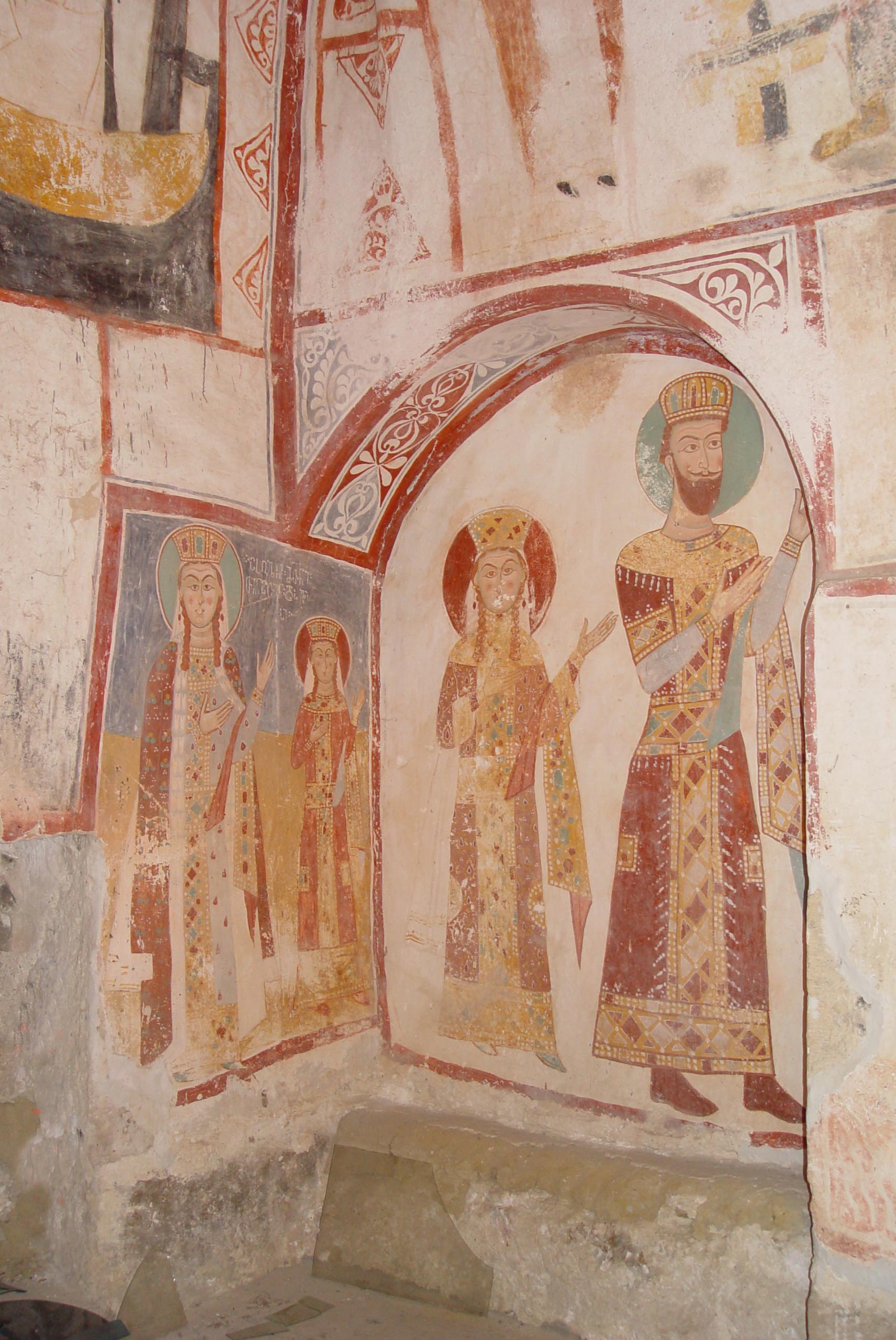
Vakhtang
[edit]
Article(s): Vakhtang I of Iberia
Request:
- Please clean and remove that dirt from his head and forehead. Jaqeli 23:46, 30 September 2014 (UTC)
Graphist opinion(s):![]() Done Minor cleanup; agma Centpacrr (talk) 02:28, 1 October 2014 (UTC)
Done Minor cleanup; agma Centpacrr (talk) 02:28, 1 October 2014 (UTC)
- @Centpacrr: Done? That's definitely not done. The face, head and his forehead still have the dirt places. And also why did you change its original colour? Jaqeli 08:39, 1 October 2014 (UTC)
- Frankly then, Jaqeli, I don't know what you mean by "remove that dirt from his head and forehead". I removed a couple of streaks of what appeared to be "dirt" and lightened the image slightly as it seemed a bit dark to me, but actually I didn't really see that there was anything wrong with it to start with. The original image appears to me to likely be an fairly accurate representation of the statue as it likely exists and so I have reverted the file to the original image. However as a point of advice, Jaqeli, I would also urge you to be much more specific in what you are looking for when you make a request in here, and also be more polite in interacting with the graphists who volunteer their time and skills to address them. Frankly I find that the tone of you comment above to be quite demanding, sarcastic, and offputting. We are all volunteers in here, not employees. So in future if you are not satisfied with what a graphist does then clearly and carefully explain how you would like it done differently as opposed to being rude and condescending. That will get you nowhere. Regards. Centpacrr (talk) 12:58, 1 October 2014 (UTC)
- @Centpacrr: I mean this dirt. Is there any way you can remove them if possible without changing the original colour of the face? Jaqeli 13:20, 1 October 2014 (UTC)
- No, not really. I just don't see anything that looks like significant "dirt" to me, just a couple of streaks that appear to be stains from dripping moisture or something else over time. Therefore I don't think I can do anything else constructive as upon reflection it seems to me that the original image constitutes probably the best encyclopedic representation of the statue as it is. Centpacrr (talk) 15:48, 1 October 2014 (UTC)
- @Centpacrr: I mean this dirt. Is there any way you can remove them if possible without changing the original colour of the face? Jaqeli 13:20, 1 October 2014 (UTC)
- Frankly then, Jaqeli, I don't know what you mean by "remove that dirt from his head and forehead". I removed a couple of streaks of what appeared to be "dirt" and lightened the image slightly as it seemed a bit dark to me, but actually I didn't really see that there was anything wrong with it to start with. The original image appears to me to likely be an fairly accurate representation of the statue as it likely exists and so I have reverted the file to the original image. However as a point of advice, Jaqeli, I would also urge you to be much more specific in what you are looking for when you make a request in here, and also be more polite in interacting with the graphists who volunteer their time and skills to address them. Frankly I find that the tone of you comment above to be quite demanding, sarcastic, and offputting. We are all volunteers in here, not employees. So in future if you are not satisfied with what a graphist does then clearly and carefully explain how you would like it done differently as opposed to being rude and condescending. That will get you nowhere. Regards. Centpacrr (talk) 12:58, 1 October 2014 (UTC)
- This is a modern sculpture - for copyright reasons should it be on Wikipedia at all? Tiptoethrutheminefield (talk) 21:22, 1 October 2014 (UTC)
 Done Minor cleanup; feel free to revert it.--Carnby (talk) 19:30, 12 October 2014 (UTC)
Harutyun Shahrikyan
[edit]

Article(s): Harutyun Shahrikyan
Request:
- Can you please make the outline of the circle on the left picture similar to the one done to the picture on the right? Also, if you can make any basic improvements to the photo that would be great. But please, nothing too drastic. And to clarify: I just want the picture on the left to be improved. The right one is just for example. Thanks in advance, Étienne Dolet (talk) 08:08, 1 October 2014 (UTC)
Graphist opinion(s):![]() Done Centpacrr (talk) 13:16, 1 October 2014 (UTC)
Done Centpacrr (talk) 13:16, 1 October 2014 (UTC)
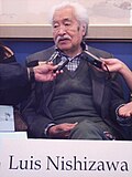
Luis Nishizawa
[edit]-
-
 Cropped

.jpg)
Article(s): Luis Nishizawa
Request:
- please trim (namecard? magazine scan?) large name off bottom, snug up on sides to focus on him, recently deceased... -- Kintetsubuffalo (talk) 13:09, 2 October 2014 (UTC)
- Thanks--Kintetsubuffalo (talk) 04:36, 4 October 2014 (UTC)
Graphist opinion(s):
Roman calendar
[edit]
Article(s): Roman calendar
Request:
- please straighten and reduce bleedthrough... -- Kintetsubuffalo (talk) 14:33, 2 October 2014 (UTC)
Graphist opinion(s):
- Done Let me know if it needs more work. I can bump the contrast up to b/w levels, for instance, instead of the black/gray it's at now. MjolnirPants Tell me all about it. 03:32, 3 October 2014 (UTC)
- It's great, thank you! But yeah, can you try and see how that comes out?--Kintetsubuffalo (talk) 04:47, 4 October 2014 (UTC)
- How is it now? MjolnirPants Tell me all about it. 23:54, 4 October 2014 (UTC)
- It's great, thank you! But yeah, can you try and see how that comes out?--Kintetsubuffalo (talk) 04:47, 4 October 2014 (UTC)
- Yup, that's even better, thank you!--Kintetsubuffalo (talk) 00:21, 5 October 2014 (UTC)
Antim
[edit]
Article(s): Anthim the Iberian
Request:
- Please remove that part of halo and the sceptre. Jaqeli 10:26, 3 October 2014 (UTC)
- Comment More falsification of historic images we shouldn't be doing. Just say no! Johnbod (talk) 16:35, 4 October 2014 (UTC)
- I agree It is an 18th century mosaic (see the requester's earlier edit request), so should not be altered. I also think that it is questionable to take such images and present them in article infoboxes as if they were actual portraits of historical figures. Tiptoethrutheminefield (talk) 19:59, 4 October 2014 (UTC)
- I can't see the point of doing this. The face is clearly visible, removing the elements doesn't improve it. If they were distracting or damaged, perhaps. (Hohum @) 22:58, 4 October 2014 (UTC)
- Concur with the above. Centpacrr (talk) 13:36, 5 October 2014 (UTC)
Graphist opinion(s):
Commons move and crop request
[edit]-
 O'Brian Hall at the University at Buffalo North Campus
 -
 Cropped (on Commons)

_2009.jpg)
Article(s): University at Buffalo Law School, Judiciary of New York
Request:
- Can someone please move this file to Commons (I don't have an IPBE on Commons; the templates and categories used are meant for Commons, so just copy everything) and create a new crop of just the building? Pretty please and thank you. -- Int21h (talk) 16:08, 3 October 2014 (UTC)
Graphist opinion(s):![]() Done Cropped; agma; uploaded as new file on Commons. Centpacrr (talk) 16:33, 3 October 2014 (UTC)
Done Cropped; agma; uploaded as new file on Commons. Centpacrr (talk) 16:33, 3 October 2014 (UTC)
New_Delhi
[edit]Article(s): New_Delhi
Request:
- please remove deadspace... -- Kintetsubuffalo (talk) 05:41, 4 October 2014 (UTC)
Graphist opinion(s):
- Done ///EuroCarGT 15:36, 4 October 2014 (UTC)
- Can you take off the crooked blue frame? Thanks, --Kintetsubuffalo (talk) 16:06, 4 October 2014 (UTC)
- Done additional cropping. ///EuroCarGT 21:17, 4 October 2014 (UTC)
- Can you take off the crooked blue frame? Thanks, --Kintetsubuffalo (talk) 16:06, 4 October 2014 (UTC)
- Perfect, thank you--Kintetsubuffalo (talk) 23:22, 4 October 2014 (UTC)
Smithfield ham
[edit]Original files


New files (Cropped, color corrected)
-
 crp/cc
 -
 crp/cc
 -
 crp/cc
.jpg)
.jpg)
.jpg)
Article(s): Smithfield ham
Request:
- These are beautiful old postcards, but for Wiki purposes, they need to be trimmed and de-postcardynessish-ed. I made that word up. ;) Please do what you think best, new upload or rework existing files. -- Kintetsubuffalo (talk) 13:40, 4 October 2014 (UTC)
- Thank you--Kintetsubuffalo (talk) 16:09, 4 October 2014 (UTC)
Graphist opinion(s):
Please remove watermark
[edit]-
 John Muckler

Article(s): John Muckler
Request:
- Please remove watermark -- We hope (talk) 02:56, 5 October 2014 (UTC)
- Thanks! We hope (talk) 04:49, 5 October 2014 (UTC)
Graphist opinion(s):
Christiaan de Wet
[edit]
Article(s): Christiaan de Wet
Request:
- please pngify, trim border and capitalize the W in his last name... -- Kintetsubuffalo (talk) 14:26, 5 October 2014 (UTC)
Graphist opinion(s):
- Done Trimmed and renamed.--Carnby (talk) 13:16, 12 October 2014 (UTC)
- Thank you!--Kintetsubuffalo (talk) 01:48, 13 October 2014 (UTC)
Grace Marguerite Hay Drummond-Hay
[edit]-

-
 cropped and restored

.jpg)
Article(s): Grace Marguerite Hay Drummond-Hay
Request:
- please remove border, fix warp... -- Kintetsubuffalo (talk) 14:29, 5 October 2014 (UTC)
Graphist opinion(s):
- Done by Centpacrr, Fallschirmjäger ✉ 21:04, 8 October 2014 (UTC)
- Thanks--Kintetsubuffalo (talk) 01:44, 13 October 2014 (UTC)
Angle
[edit]-

-
 perspective adjusted; tone corrected

.JPG)
Article(s): Old St. Peter's Basilica
Request:
- Is it possible to re-angle the image so that it looks as if it was taken from up front? Image also has blueish hue to it, compare with this image here [1] which seems to show more natural colours. Thank you. -- Gryffindor (talk) 16:48, 6 October 2014 (UTC)
Graphist opinion(s):![]() Request taken by Centpacrr (talk) 17:28, 6 October 2014 (UTC).
Request taken by Centpacrr (talk) 17:28, 6 October 2014 (UTC). ![]() Done As new upload Centpacrr (talk) 17:58, 6 October 2014 (UTC)
Done As new upload Centpacrr (talk) 17:58, 6 October 2014 (UTC)
Pierre Bernac photograph
[edit]-
 Image of Pierre Bernac, 1968

Article(s): Pierre Bernac and Francis Poulenc
Request:
- This image has several thin watermarks all over it. Would it be possible to remove them, please? Tim riley talk 07:57, 8 October 2014 (UTC)
Graphist opinion(s):
- Frankly the copyright status of this looks highly questionable to me. If it was first published in France, as seems likely, it is I think still in copyright. That it was later republished in a US paper means nothing. Johnbod (talk) 14:06, 10 October 2014 (UTC)
- But the picture is identified as by William A Wynne, who worked in the US. Tim riley talk 14:24, 10 October 2014 (UTC)
- When could Wynne have taken the image? Not 1968, obviously, as Poulenc had died. — Crisco 1492 (talk) 23:19, 10 October 2014 (UTC)
- The image is of Bernac, not Poulenc. He lived till 1979; from 1960 onwards he gave masterclasses in the US, Canada and France until at least 1977. See here. Tim riley talk 07:06, 11 October 2014 (UTC)
- @Johnbod: and @Crisco 1492:, may I invite you to to revisit this point, in the light of the information provided above? Tim riley talk 19:00, 12 October 2014 (UTC)
- Hmm, where does the information that it was by Wynne come from? Do we know it was published in the US before 1977? If not, I think the osition is different. Frankly ebay is no place to be sourcing copyright info from. Johnbod (talk) 20:06, 12 October 2014 (UTC)
- As you can see from the original upload, the reverse of the image is marked as Wynne's work by the newspaper for which he worked, the Cleveland Plain Dealer. When experienced users upload from selling sites in such cases it is customary to include the reverse to show the copyright status, as here. Tim riley talk 21:13, 12 October 2014 (UTC)
- But the picture is identified as by William A Wynne, who worked in the US. Tim riley talk 14:24, 10 October 2014 (UTC)
- Done. Regards, MagentaGreen (talk) 17:18, 17 October 2014 (UTC)
- Once again, MagentaGreen, I am in your debt for removing a watermark so skilfully. Thank you so much. Tim riley talk 18:46, 17 October 2014 (UTC)
- @Tim riley: I would like to thank you for the warm words. This is not self-evident, but only so it's a pleasure. Kind regards, MagentaGreen (talk) 13:14, 18 October 2014 (UTC)
- Once again, MagentaGreen, I am in your debt for removing a watermark so skilfully. Thank you so much. Tim riley talk 18:46, 17 October 2014 (UTC)
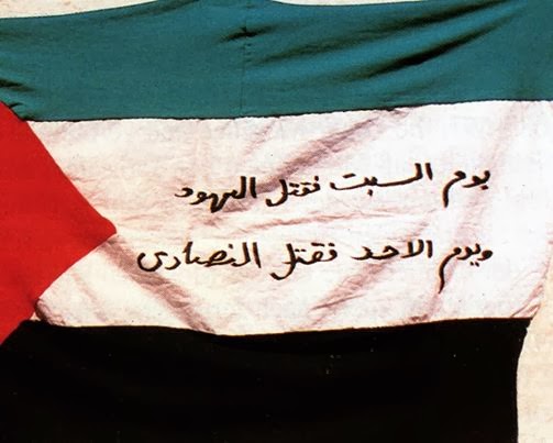
Opinion on an image please
[edit]Please see this image. Was the writing on the flag, or added later to the photo? Unfortunately I don't know of a higher resolution version. Thanks. Zerotalk 13:45, 9 October 2014 (UTC)
- When the image is examined at 1,200% it appears to me that the text has been digitally added as I do not see any distortion in the characters that match the undulations in the surface of the cloth. Centpacrr (talk) 14:14, 9 October 2014 (UTC)
- I zoomed in and looked as well, and I respectfully disagree. The left-most character on the second line appears to me to be distorted by the contour of the flag, and there are two or three less apparent examples. Of course, that is a subjective judgement made by someone who doesn't recognize that font or read Arabic script. However, in checking the compression artifacts on the JPG file, it appears there hasn't been any editing*.
- *This only means that it appears there was no editing since the photo was first saved as a jpg. If it was, for example, a color TIF or a PNG it may have been edited, and then saved as a JPG and the compression would show no signs of editing. This too is a subjective judgement, but it is based on considerable experience and I am quite certain of it. MjolnirPants Tell me all about it. 15:13, 9 October 2014 (UTC)
- I think the distortion is an optical illusion. Adjust levels, or otherwise, to make the folds in the flag disappear while leaving the writing visible. I don't think anyone looking at that would consider that it was written on a non-flat surface. Zerotalk 23:11, 9 October 2014 (UTC)
- @Zero0000: I tried adjusting the levels and I see what you're saying. It could well be that the apparent folds are optical illusions, but it could also be that the 'straightening' of the character when levels are adjusted is, as well. For example, see the following two images:
- unadjusted comparison of two very similar characters
- adjusted comparison of two very similar characters
- I don't think these two characters should be as different as they are. The bottom appears to be a modified version of the top, which suggests that the similar elements (the leftmost stroke and the top center stroke) should be the same, or at least much more similar than this. Given the angle of distortion (away from the camera and down) in the second one, that could explain the difference. Again, however, I don't read Arabic, so I can't be certain. MjolnirPants Tell me all about it. 14:00, 10 October 2014 (UTC)
- I think the distortion is an optical illusion. Adjust levels, or otherwise, to make the folds in the flag disappear while leaving the writing visible. I don't think anyone looking at that would consider that it was written on a non-flat surface. Zerotalk 23:11, 9 October 2014 (UTC)
Qin Shi Huang
[edit]-
 First Emperor of China

Article(s): Qin Shi Huang
Request:
- Could you remove the greenish tone in the right corner, please?. -- Lecen (talk) 15:41, 10 October 2014 (UTC)
- Thank you very much! --Lecen (talk) 22:03, 10 October 2014 (UTC)
- The picture looks amazing. I really appreciate what you both did. Thank you very much! --Lecen (talk) 13:08, 15 October 2014 (UTC)
Graphist opinion(s):
- Done. --Victor•talk 19:17, 10 October 2014 (UTC).
- I have adjusted the colours to be closer to the reference image here. (Hohum @) 15:25, 11 October 2014 (UTC)
- User Horum, why file size so huge now (about 9 Mb)? --Victor•talk 05:57, 13 October 2014 (UTC)
- Different save settings, probably made it the best quality therefore having the file size huge. ///EuroCarGT 17:20, 13 October 2014 (UTC)
- I believe I kept the same quality settings as the previous version (100%), but the background has more grain to it now so it was less compressible. Earlier versions had lower quality settings - 94% I think. (Hohum @) 20:19, 13 October 2014 (UTC)
- My previous version was saved with Adobe Photoshop CS setting at "Maximum (11)". I resaved the file of User Horum with the same settings "Maximum (11)" as before to reduce excessive file size and got about the same size as my previous version (2.73 MB), actually a bit less (2.2 MB), because the background is almost white. --Victor•talk 15:20, 17 October 2014 (UTC).
- I believe I kept the same quality settings as the previous version (100%), but the background has more grain to it now so it was less compressible. Earlier versions had lower quality settings - 94% I think. (Hohum @) 20:19, 13 October 2014 (UTC)
- Different save settings, probably made it the best quality therefore having the file size huge. ///EuroCarGT 17:20, 13 October 2014 (UTC)
- User Horum, why file size so huge now (about 9 Mb)? --Victor•talk 05:57, 13 October 2014 (UTC)
- I have adjusted the colours to be closer to the reference image here. (Hohum @) 15:25, 11 October 2014 (UTC)
Thoth
[edit]
Article(s): Thoth
Request:
- please flatten warp and trim... -- Kintetsubuffalo (talk) 01:41, 13 October 2014 (UTC)
Graphist opinion(s):
- Done --Victor•talk 05:41, 13 October 2014 (UTC)
- Thank you, much nicer! I just now noticed the bleedthrough from the back, can anything be done about that?--Kintetsubuffalo (talk) 11:37, 13 October 2014 (UTC)
- Thank you both, sorry late, just got out of hospital.--Kintetsubuffalo (talk) 12:24, 21 October 2014 (UTC)
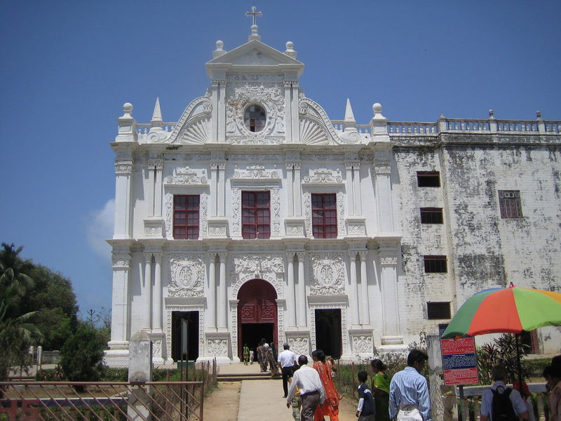
Diu
[edit]
Article(s): St. Paul's Church, Diu
Request:
- There is a slightly yellow, greenish tint. Please remove it, you can compare with here [2]. -- Gryffindor (talk) 13:16, 14 October 2014 (UTC)
Graphist opinion(s):![]() Done Centpacrr (talk) 15:16, 14 October 2014 (UTC)
Done Centpacrr (talk) 15:16, 14 October 2014 (UTC)
- Reworked using this image as a reference. (Hohum @) 18:52, 14 October 2014 (UTC)
- Much better, thank you. Gryffindor (talk) 10:19, 16 October 2014 (UTC)
Otis Harlan
[edit]-
 American actor Otis Harlan
 -
 SVG signature

Article(s): Otis Harlan
Request:
- Remove handwritten note; possibly extract Harlan's signature as a stand-alone file with encyclopedic value. -- Acdixon (talk · contribs) 15:28, 14 October 2014 (UTC)
Graphist opinion(s):
- I removed the writing. It looks too low resolution to extract the signature in any meaningful way, however. MjolnirPants Tell me all about it. 16:14, 14 October 2014 (UTC)
![]() Done Fair enough. Great job, and thanks for the quick response. Acdixon (talk · contribs) 17:18, 14 October 2014 (UTC)
Done Fair enough. Great job, and thanks for the quick response. Acdixon (talk · contribs) 17:18, 14 October 2014 (UTC)
- I tried to trace the signature anyway...--Carnby (talk) 20:35, 14 October 2014 (UTC)
- @Carnby: Good job.. I didn't think it could come out that well. MjolnirPants Tell me all about it. 21:10, 14 October 2014 (UTC)
Teotihuacán
[edit].jpg)
Article(s): Teotihuacan
Request:
- Please remove the guidebook in the lower right corner. -- Gryffindor (talk) 08:25, 15 October 2014 (UTC)
Graphist opinion(s):
- I took a stab at it. Let me know what you think. MjolnirPants Tell me all about it. 14:36, 15 October 2014 (UTC)
- This is great, thank you. Gryffindor (talk) 10:16, 16 October 2014 (UTC)
Coming Out (1989 film)
[edit]- Moved from Illustrations workshop. --Gh87 in the public computer (talk) 17:48, 15 October 2014 (UTC)

_Poster.png)
Article(s): Coming Out (1989 film)
Request:
- Contains fold marks of a poster. -- George Ho (talk) 06:00, 15 October 2014 (UTC)
Graphist opinion(s):
These requests really should be made in the Photography Workshop. This page is predominantly for vector images and other illustrations.MjolnirPants Tell me all about it. 14:47, 15 October 2014 (UTC)- Done: This is my first project I've completed on Graphics Lab, so I've probably done something wrong here. I've posted my final result in the "gallery" type thing above, is there anything wrong with it? ∫ A Y™ 15:07, 30 October 2014 (UTC)
- Use GLNF here next time; I've done that for you. By the way, I've uploaded the JPEG version of your digital restoration. --George Ho (talk) 00:56, 31 October 2014 (UTC)
Alexander II
[edit]
Article(s): Alexander II of Imereti
Request:
- Please colorize the image from this. Jaqeli 21:31, 22 October 2014 (UTC)
Graphist opinion(s):
- I have done a colour version based on the pic you posted: who is the author of the photo? What license should I choose?--Carnby (talk) 13:42, 28 October 2014 (UTC)
- @Carnby: It's from the medieval church so it's in the public domain. Jaqeli 14:52, 28 October 2014 (UTC)
- Done --Carnby (talk) 15:34, 28 October 2014 (UTC)
- @Carnby: It's from the medieval church so it's in the public domain. Jaqeli 14:52, 28 October 2014 (UTC)
If you're going to do thuis, you must explain what you've done on the file! Johnbod (talk) 14:16, 2 November 2014 (UTC)
iconic painting
[edit]This one has no image attached, http://1.bp.blogspot.com/-nvztvgODM-I/UEr83Txb8uI/AAAAAAAAAAU/_38RrZSjyf4/s200/28798_420015510621_98499235621_5865069_6844880_n.jpg is a small version just in case of copyright problems, but larger versions are all over the net
Article(s): WikiProject Scouting Portal
Request:
- I am working on an idea for the WikiProject Scouting Portal, and I would like the Photography workshop's opinion before I proceed. I am in need of a touchup of an iconic painting of Robert Baden-Powell, 1st Baron Baden-Powell, with a background transparency that can periodically be laid on top of (to the side of) other topical images on an irregular basis, based on the topic of the Portal at the time. But because this is a painting and not a photograph, I wonder if doing anything to it runs afoul of copyright-you guys discuss these things here a lot, so... -- Kintetsubuffalo (talk) 12:39, 23 October 2014 (UTC)
Graphist opinion(s):
- Really, this is not the place for copyright expertise! Johnbod (talk) 14:19, 2 November 2014 (UTC)
- Where in Wikipedia is better to ask? Thanks for the exclamation point! Hyperbole much?--Kintetsubuffalo (talk) 14:37, 2 November 2014 (UTC)
Anna Marie Hahn
[edit]
Article(s): Anna Marie Hahn
Request:
- please cut to oval and fix top... -- Kintetsubuffalo (talk) 10:29, 24 October 2014 (UTC)
Graphist opinion(s):
- Done --Victor•talk 23:39, 24 October 2014 (UTC)
- Fantastic, thank you!--Kintetsubuffalo (talk) 01:40, 25 October 2014 (UTC)
Rangoon
[edit]
Article(s): Rangoon
Request:
- please fix scorch mark bottom right... -- Kintetsubuffalo (talk) 10:51, 24 October 2014 (UTC)
Graphist opinion(s):
- Done by Centpacrr. ///EuroCarGT 03:51, 25 October 2014 (UTC)
- Thanks, also for the watermark removal--Kintetsubuffalo (talk) 06:08, 25 October 2014 (UTC)
Haymarket
[edit]-

 done
done -
 done
done -
 done
done -
 done
done -
 done
done -
 done
done -
 done
done -
 done
done -
 done
done


Article(s): Haymarket
Request:
- please straighten, trim, Wikify... -- Kintetsubuffalo (talk) 15:24, 25 October 2014 (UTC)
Graphist opinion(s):
- Done all nine. --Victor•talk 09:04, 5 November 2014 (UTC).
- Great, thank you for your hard work!--Kintetsubuffalo (talk) 15:17, 6 November 2014 (UTC)
Bengal
[edit]

Article(s): Bengal
Request:
- please remove borders... -- Kintetsubuffalo (talk) 02:03, 26 October 2014 (UTC)
Graphist opinion(s):
- Done ///EuroCarGT 03:06, 26 October 2014 (UTC)
- Thank you!--Kintetsubuffalo (talk) 03:11, 26 October 2014 (UTC)
Wang_Chengpin
[edit]
Article(s): Wang Chengbin
Request:
- please trim... -- Kintetsubuffalo (talk) 08:49, 26 October 2014 (UTC)
Graphist opinion(s):
- Done - Fallschirmjäger ✉ 14:17, 26 October 2014 (UTC)
- Thank you!--Kintetsubuffalo (talk) 12:56, 27 October 2014 (UTC)
Confucius
[edit]
Article(s): Confucius
Request:
- please remove excess white space... -- Kintetsubuffalo (talk) 08:59, 26 October 2014 (UTC)
Graphist opinion(s):
- Done - Fallschirmjäger ✉ 14:20, 26 October 2014 (UTC)
- Thanks! Had to check on another monitor-his security blanket is awfully faint.--Kintetsubuffalo (talk) 13:33, 28 October 2014 (UTC)
Poolhall_Junkies
[edit]
Article(s): Poolhall_Junkies
Request:
- please trim to front cover only... -- Kintetsubuffalo (talk) 10:25, 26 October 2014 (UTC)
Graphist opinion(s):
- Done - Fallschirmjäger ✉ 14:24, 26 October 2014 (UTC)
- Thank you!--Kintetsubuffalo (talk) 13:01, 27 October 2014 (UTC)
Kodama
[edit]
Article(s): Kodama
Request:
- please trim off bordering... -- Kintetsubuffalo (talk) 15:28, 27 October 2014 (UTC)
Graphist opinion(s):
- Done --Victor•talk 00:18, 28 October 2014 (UTC)
- Thank you!--Kintetsubuffalo (talk) 13:37, 28 October 2014 (UTC)
Amitabh Bachchan
[edit]-
 Amitabh Bachchan

Article(s): Amitabh Bachchan
Request:
- Please make grayish neutral background -- Abhi (talk) 12:07, 30 October 2014 (UTC)
Graphist opinion(s):![]() Done Centpacrr (talk) 02:30, 31 October 2014 (UTC)
Done Centpacrr (talk) 02:30, 31 October 2014 (UTC)
Three Gorges Dam
[edit]-
 Three Gorges Dam

Article(s): Lead image at Three Gorges Dam
Request:
- Hi, would it be possible for someone to straighten this photograph?
Graphist opinion(s):
- That file is currently protected from editing due to cascading protection at Commons:Auto-protected files/wikipedia/en. I've requested some help at the talk page and have a rotated version ready to go as soon as possible. MjolnirPants Tell me all about it. 17:20, 31 October 2014 (UTC)
- Ah, yes, I wonder if that's because it is presently on the main page (illustrating the featured list). Perhaps when it rolls off the main page tomorrow it will be freed up. Thanks for looking. 109.147.188.227 (talk) 18:04, 31 October 2014 (UTC)
- Done Rotated 2º CCW & cropped. Centpacrr (talk) 02:00, 1 November 2014 (UTC)
- Thank you! 86.130.66.237 (talk) 12:52, 1 November 2014 (UTC)
reverse image?
[edit]-
 Skip re-entry image

![[1]](https://commons.wikimedia.orghttps://demo.azizisearch.com/lite/wikipedia/page/File:San_marco,_firenze,_altare_ricci,_madonna_orante,_dalla_basilica_costantiniana_di_san_pietro_in_vaticano.JPG)
![[2]](https://commons.wikimedia.orghttps://demo.azizisearch.com/lite/wikipedia/page/File:PERSPECTIVE_VIEW_OF_ST.PAUL_CHURCH.JPG)
Article(s): Skip_reentry
Request:
- An alert reader Ticket:2014103010007945 noticed that the image of the earth in this image seems to be reversed. Can it be fixed?--S Philbrick(Talk) 17:38, 31 October 2014 (UTC)
Graphist opinion(s):
- Done – JBarta (talk) 19:44, 31 October 2014 (UTC)
- Something seems to be wrong and I don't know what. All of a sudden my edit and the last edit show a transparent earth when Wikimedia renders it as a PNG... but the browser displays the SVG just fine and it validates just fine. What started as a simple tweak has become a mystery. Opinons welcome. – JBarta (talk) 19:58, 31 October 2014 (UTC)
- I give up. I reverted back to the earlier version and it's still showing up with a transparent earth. I'm thinking it's a Wikimedia issue. I don't know. At any rate, of the two edits I uploaded, the second (marked "try again") is the preferred. My first upload contains a mistake (visible on the right edge). In the image, the earth section isn't exactly centered, so mirroring it leaves a bit of black on one edge. When dealing with that the first time around I fixed that problem but caused another. The second time around I dealt with it a little better. I hope someone else has better luck. – JBarta (talk) 20:28, 31 October 2014 (UTC)
- Nice to see you, JB. nagualdesign 19:53, 31 October 2014 (UTC)
- Well, don't get used to it. I pop in every so often jut to see what's going on and for some reason I decided to take this one. And as you can see, I now have a litle mystery on my hands. Once that's sorted I'll probably bugger off again. – JBarta (talk) 20:02, 31 October 2014 (UTC)
- JBarta, I think you're right. I just gave it a a shot and I got the same error, then when I reverted to the original (which showed the earth when I checked it out), it was still missing. MjolnirPants Tell me all about it. 20:37, 31 October 2014 (UTC)
- Tried again, this time converting the earth to SVG. Didn't really like the look and not sure if it solved the problem. It's hard to tell what's going on... is stuff getting stuck in the WM cache? Who knows. All the images seem fine until the Wikimedia software gets hold of it. – JBarta (talk) 21:23, 31 October 2014 (UTC)
- I fixed the pure-vector version by removing a blur-filter invocation which seemed to be messing things up (it would not have significantly changed the image appearance even if it had been working)... AnonMoos (talk) 00:56, 1 November 2014 (UTC)
- Ah, I remember blurring the earth ever-so-slightly because I thought it looked better. Bad idea I guess. Thanks ;-) Any idea what's going on with the others? – JBarta (talk) 01:13, 1 November 2014 (UTC)
- That seems kind of academic now... AnonMoos (talk) 04:49, 1 November 2014 (UTC)
- The patient died.
- Why?
- That seems kind of academic now...
- I don't do SVGs, but I wonder if the entire background was converted into a single image, and the text left as vectors, would that work? (less layers) Just a thought. nagualdesign 19:33, 1 November 2014 (UTC)
Wouldn't work, raster+vector don't mix. ///EuroCarGT 20:15, 1 November 2014 (UTC)
- I disagree. It does work actually, sometimes quite nicely. The "problem" with embedding raster graphics in an SVG is a matter of scalability more than anything else. The embedded raster graphic starts looking pretty crappy when you scale it up. Here's an example. Now look at it much larger. The raster part starts looking crappy while the vector part is still crisp. In the "Skip reentry" image above, the image displayed just fine.... until I uploaded a modified file. Not only did my upload display incorrectly, but the one I replaced all of a sudden started acting squirrely as well. The question is, what was going on? The issue is not that embedding raster graphics in an SVG is inherently bad, the issue is that something in the SVG file caused the Wiki software (ImageMagick?) to choke. This all while the images validated and displayed fine in the browser. – JBarta (talk) 03:47, 2 November 2014 (UTC)
- Let me rephrase that: The scaling issue was the thing I was going to talk about. Yes, rasters in some SVGs as indicated in the linked category looks well. But the one's with a higher resolution turns out quite well. The smaller ones not quite... ///EuroCarGT 04:18, 2 November 2014 (UTC)
- The 'texture' of the Earth in this image is already an embedded raster. The problem, it seems, is that the Wikipedia thumbnail generator can't cope with something in this SVG. I just thought that simplifying the SVG file might help to troubleshoot the issue. At the correct settings, the only thing lost by flattening the background is the fine gradient of the fade/atmosphere and the smooth edge of the Earth. Never mind. nagualdesign 19:32, 2 November 2014 (UTC)
- Let me rephrase that: The scaling issue was the thing I was going to talk about. Yes, rasters in some SVGs as indicated in the linked category looks well. But the one's with a higher resolution turns out quite well. The smaller ones not quite... ///EuroCarGT 04:18, 2 November 2014 (UTC)
- Well, I got things mostly figured out. You can see my excursion step by step here. The result was a working file. – JBarta (talk) 03:22, 3 November 2014 (UTC)
- I think we can call it Done now. – JBarta (talk) 20:17, 3 November 2014 (UTC)
.svg)
- Phew! 10/10 for effort. I hope you learned something in the process. Sounds like stray code was throwing up quirks in the software, maybe? I compared a few versions in Notepad2 and noticed that the original upload has what should be a single line of code (beginning with
xlink:href="data:image/jpg;base64,/9j/4AAQSkZ...) spread over about 1,500 lines, for example. nagualdesign 02:09, 4 November 2014 (UTC)
- Phew! 10/10 for effort. I hope you learned something in the process. Sounds like stray code was throwing up quirks in the software, maybe? I compared a few versions in Notepad2 and noticed that the original upload has what should be a single line of code (beginning with
- Whether the base64 stuff is one line or many doesn't matter.
Here's what I suspect... when the SVG was first constructed by Ctillier back in 2006, he imported a large image of the earth, then resized it and moved it into its proper position. Fine so far. At some point the software Wikimedia uses to create PNG thumbnails got changed/updated (I'm guessing). When I uploaded a new version it triggered the software to create a new PNG thumbnail. Only this time, the wiki software didn't recognize that the image was moved... only resized. So the earth image was still there... floating off to the side outside the boundaries of the SVG image. That's why we couldn't see it. Getting rid of the old image and importing a new one seemed to solve it. Now, that's just a general conclusion based on my limited experiments. After I got it working, I didn't try any further to narrow down whether it was definitely a quirky bit of SVG code or definitely a flaky image.– JBarta (talk) 03:09, 4 November 2014 (UTC)
- Whether the base64 stuff is one line or many doesn't matter.
- Ok, scratch what I said above. Not being easily beat by a stupid little problem, I finally figured out EXACTLY what the problem was. It was the mime type in the <image> element. When the file was first made by Ctillier and the earth image was imported into Inkscape, it was asigned the mime type of "image/jpg" (you can see this in the SVG file) At some point the Wiki software decided it didn't like that mime type and wanted "image/jpeg" instead. Since it wasn't recognized, the image simply wasn't displayed. (legacy code... huh? what's that?) Long story short, add that one little "e" to the SVG file and bingo... all better. Amazing actually... one letter was the problem... ONE FRICKIN LETTER! – JBarta (talk) 05:08, 5 November 2014 (UTC)


- If anyone's interested, I made up a couple example images demonstrating this problem. If you open each in a text editor, you'll find the only difference is one little "e". – JBarta (talk) 07:43, 5 November 2014 (UTC)
- @JBarta: I might suggests you much easier way to fix this problem. Just open this .svg file with Adobe Illustrator CS6, flip the Earth, save as .svg, and you are done in less than 30 seconds! Wikimedia rendering of PNG and of SVG will be just fine. --Victor•talk 08:55, 5 November 2014 (UTC).
- 30 seconds? Where were you earlier when we needed you?? Next time there's a problem I'm coming to you first ;-) – JBarta (talk) 09:02, 5 November 2014 (UTC)
- O.K. : ) --Victor•talk 09:08, 5 November 2014 (UTC).
- Victor, you're an effing genius, buddy! It's amazing that no-one thought of such an elegant solution, really. :-D nagualdesign 00:33, 6 November 2014 (UTC)
- O.K. : ) --Victor•talk 09:08, 5 November 2014 (UTC).
- 30 seconds? Where were you earlier when we needed you?? Next time there's a problem I'm coming to you first ;-) – JBarta (talk) 09:02, 5 November 2014 (UTC)
- @JBarta: I might suggests you much easier way to fix this problem. Just open this .svg file with Adobe Illustrator CS6, flip the Earth, save as .svg, and you are done in less than 30 seconds! Wikimedia rendering of PNG and of SVG will be just fine. --Victor•talk 08:55, 5 November 2014 (UTC).
- If anyone's interested, I made up a couple example images demonstrating this problem. If you open each in a text editor, you'll find the only difference is one little "e". – JBarta (talk) 07:43, 5 November 2014 (UTC)
- To be honest, it hardly surprises me that an iota of code can cause a huge problem. Well done on getting to the bottom of it. You might wish to share your findings with the technical team, if you haven't already. That way it wasn't all for very little, hey? Regards, nagualdesign 00:33, 6 November 2014 (UTC)
- With nagual here, thanks Victor! TIL something new... you could open a SVG in Photoshop then re-export it as an SVG. That's very useful! ///EuroCarGT 00:49, 6 November 2014 (UTC)
- To be honest, it hardly surprises me that an iota of code can cause a huge problem. Well done on getting to the bottom of it. You might wish to share your findings with the technical team, if you haven't already. That way it wasn't all for very little, hey? Regards, nagualdesign 00:33, 6 November 2014 (UTC)
- I've already submitted a bug report to librsvg, which is the software MediaWiki uses to rasterize SVG images. I also added a bit to Wikipedia:SVG help describing the problem. Actually, Victor above triggers a interesting question... would Illustrator catch the problem and fix it on resaving? Or would it simply pass along the problem like Inkscape did? Actually, I suppose a bug report to Inkscape might not be a bad idea. – JBarta (talk) 01:01, 6 November 2014 (UTC)
- Bug report submitted to Inkscape. And Nagualdesign, it's never "all for very little". Solving a problem is one of the best learning vehicles there is. I figure by the time I'm 90 I'll know just about everything. – JBarta (talk) 02:26, 6 November 2014 (UTC)
- I've already submitted a bug report to librsvg, which is the software MediaWiki uses to rasterize SVG images. I also added a bit to Wikipedia:SVG help describing the problem. Actually, Victor above triggers a interesting question... would Illustrator catch the problem and fix it on resaving? Or would it simply pass along the problem like Inkscape did? Actually, I suppose a bug report to Inkscape might not be a bad idea. – JBarta (talk) 01:01, 6 November 2014 (UTC)