Wikipedia:Graphics Lab/Photography workshop/Archive/Jan 2015 Source: en.wikipedia.org/wiki/Wikipedia:Graphics_Lab/Photography_workshop/Archive/Jan_2015
Watermarks
[edit]

- Article(s)
- Various
- Request
- Can we have the watermarks removed from these images?
--The Theosophist (talk) 21:17, 29 December 2014 (UTC)
- Graphist opinion(s)
![]() Done Second one. Will work on the first one later. MjolnirPants Tell me all about it. 18:40, 14 January 2015 (UTC)
Done Second one. Will work on the first one later. MjolnirPants Tell me all about it. 18:40, 14 January 2015 (UTC)
 Done First one. MjolnirPants Tell me all about it. 14:48, 22 January 2015 (UTC)
- @MjolnirPants: Thank you!--The Theosophist (talk) 09:15, 24 January 2015 (UTC)
Watery images
[edit]

- Article(s)
- Various
- Request
- Can you make these illustrations more clear?
--The Theosophist (talk) 21:17, 29 December 2014 (UTC)
- Graphist opinion(s)
- The original images are so bad, not much can be done to help them. (Hohum @) 21:34, 29 December 2014 (UTC)
- Hohum is right on. Most of the trouble with them is the high level of compression artifacts. I could repaint new images with those as a guide that might look pretty darn close, but it'd take a long time. If you can't find better versions, him me up on my talk page and I'll start on them. MjolnirPants Tell me all about it. 21:58, 29 December 2014 (UTC)
- @MjolnirPants:Thank you for your disposition. However, my mission is to have the actual Vanity Fair caricatures uploaded, not replicas. Again, I thank you very much and I wish you a happy new year.--The Theosophist (talk) 13:28, 30 December 2014 (UTC)
- I can certainly understand that. As a final offer, I can try to smooth out some of the compression artifacts, but the sad truth is that doing so requires that all the imagery behind the artifacts be recreated. This can result in an image that differs significantly from the original. Really, the best thing to do is try to find better versions. I'm sure that somewhere out there, with luck, you should be able to get your hands on some 300-1200DPI scans. MjolnirPants Tell me all about it. 13:49, 30 December 2014 (UTC)
- @MjolnirPants:Thank you for your disposition. However, my mission is to have the actual Vanity Fair caricatures uploaded, not replicas. Again, I thank you very much and I wish you a happy new year.--The Theosophist (talk) 13:28, 30 December 2014 (UTC)
- Hohum is right on. Most of the trouble with them is the high level of compression artifacts. I could repaint new images with those as a guide that might look pretty darn close, but it'd take a long time. If you can't find better versions, him me up on my talk page and I'll start on them. MjolnirPants Tell me all about it. 21:58, 29 December 2014 (UTC)
On a side note, is this method here http://www.howtogeek.com/105215/how-to-remove-jpg-artifacts-and-ugly-image-distortion-from-photographs/ easy?--The Theosophist (talk) 13:34, 30 December 2014 (UTC)
- I can do much better than that on these images, honestly. It's a good article, but it's kind of beginner level stuff, and doesn't work well on the levels of distortion these images have. The best thing to do is to smudge and blur by hand, following the contours and details. If you want, I can give it a shot, but as I mentioned above, that involves changing the image. It will be different from the original, but I can't say how much. MjolnirPants Tell me all about it. 13:49, 30 December 2014 (UTC)
- I took a shot at the first one. Let me know what you think. MjolnirPants Tell me all about it. 17:31, 30 December 2014 (UTC)
- @MjolnirPants:It is beautiful. The only difference I notice is the absence of the distortions. Could you also do the same with the other file?
- I took a shot at the first one. Let me know what you think. MjolnirPants Tell me all about it. 17:31, 30 December 2014 (UTC)
- P.S.
- The only thing missing is the signature. Is it possible to cut-and-paste it from a clearer image?
- --The Theosophist (talk) 20:01, 30 December 2014 (UTC)
Sure, I can work the other file. Give me a day or two to finish (I actually started the first one yesterday). I'm not sure what signature you're referring to, though. I don't see one in the original version, unless you're referring to what looks like three diagonal lines above and to the left of his feet. MjolnirPants Tell me all about it. 20:07, 30 December 2014 (UTC)
- Yes, that is the signature. Compare it with the one at File:Father John Vaughan, Vanity Fair, 30 January 1907.jpg--The Theosophist (talk) 22:59, 30 December 2014 (UTC)
- @The Theosophist: How's that? MjolnirPants Tell me all about it. 13:53, 31 December 2014 (UTC)
- @MjolnirPants:Magnificent! Thank you very much and happy 2015! Can you do anything with the watermarks, above?--The Theosophist (talk) 00:03, 1 January 2015 (UTC)
- @The Theosophist: How's that? MjolnirPants Tell me all about it. 13:53, 31 December 2014 (UTC)
- Yes, that is the signature. Compare it with the one at File:Father John Vaughan, Vanity Fair, 30 January 1907.jpg--The Theosophist (talk) 22:59, 30 December 2014 (UTC)
- I did the second one. It was a lot simpler than the first, actually. MjolnirPants Tell me all about it. 22:08, 30 December 2014 (UTC)
- Thanks again!--The Theosophist (talk) 23:00, 30 December 2014 (UTC)
Lord's slope
[edit]-
 Lord's media centre and sloped pitch
 -


- Article(s)
- Lord's Slope
- Request
- Can someone make a copy of this image and crop and enlarge so the image focusses more on the slope on the pitch rather than the media centre? This is for a future article so could the graphist please not override the current image as it is used on another page. -- The C of E God Save the Queen! (talk) 16:49, 31 December 2014 (UTC)
- Graphist opinion(s)
How bout that? ///EuroCarGT 19:45, 31 December 2014 (UTC)
- Great, thank you. The C of E God Save the Queen! (talk) 22:57, 31 December 2014 (UTC)
Leonard Bernstein
[edit]
- Article(s)
- Leonard Bernstein
- Request
- Remove frame. Maybe make b/w. -- Երևանցի talk 03:43, 2 January 2015 (UTC)
- Graphist opinion(s)
![]() Request taken. Fallschirmjäger ✉ 10:47, 2 January 2015 (UTC)
Request taken. Fallschirmjäger ✉ 10:47, 2 January 2015 (UTC)
União Nacional dos Escuteiros de Timor-Leste
[edit]
- Article(s)
- União Nacional dos Escuteiros de Timor-Leste
- Request
- please make background transparent… -- Kintetsubuffalo (talk) 06:02, 3 January 2015 (UTC)
- Graphist opinion(s)
![]() Done ///EuroCarGT 21:23, 3 January 2015 (UTC)
Done ///EuroCarGT 21:23, 3 January 2015 (UTC)
- great, thank you!--Kintetsubuffalo (talk) 04:53, 4 January 2015 (UTC)
Blurry image
[edit]
- Article(s)
- Louisiana
- Request
Please remove the blurriness.-- Hipposcrashed (talk) 20:39, 3 January 2015 (UTC)
- Graphist opinion(s)
@Hipposcrashed: I just wanted to give you a heads up. Blurry images are some of the most difficult to fix. In this case, where there is a pronounced motion blur, as well as a shadow blur (the effect of having the same image double-exposed and slightly offset), it would take many hours of work to get something clear. Additionally, the result would look heavily edited, as if someone had applied a couple of filters to an image taken with a cellphone camera. I've spent some time working on it, but the result have been wholly unspectacular so far, and I just don't see any way of doing it right short of manually airbrushing the ever loving crap out of it. Sorry to disappoint, but I think you need to find a better image. I could whip up a digital painting of this image faster than I could restore this one, and though it might look a lot better, I don't think that would work very well. MjolnirPants Tell me all about it. 20:41, 13 January 2015 (UTC)
- I concur with MjolnirPants, you could try looking around Commons for any similar images, Search Flickr for images with the keywords: Welcome to Louisiana under these licenses: cc-by or cc-by-sa all with Creative Commons-compatible licenses. ///EuroCarGT 22:01, 13 January 2015 (UTC)
- That's a great link. From the first page: Welcome to Louisiana, U.S. 61. MjolnirPants Tell me all about it. 22:06, 13 January 2015 (UTC)
- I concur with MjolnirPants, you could try looking around Commons for any similar images, Search Flickr for images with the keywords: Welcome to Louisiana under these licenses: cc-by or cc-by-sa all with Creative Commons-compatible licenses. ///EuroCarGT 22:01, 13 January 2015 (UTC)
Chiomara
[edit]
- Article(s)
- Chiomara
- Request
- please fix perspective… -- Kintetsubuffalo (talk) 10:31, 5 January 2015 (UTC)
- Graphist opinion(s)
- Done How's that? Gimp isn't the best for this sort of thing, but I don't have access to Photoshop at the moment. MjolnirPants Tell me all about it. 17:33, 5 January 2015 (UTC)
- I think it's considerably better, thank you! can you even out the left-side margin, it's way bigger than the others.--Kintetsubuffalo (talk) 11:40, 6 January 2015 (UTC)
- Great, thank you!--Kintetsubuffalo (talk) 13:34, 6 January 2015 (UTC)
Add colour
[edit].

.jpg)
- Article(s)
- Catherine, Duchess of Cambridge
- Request
- Currently the image is used in the infobox of her article. If possible please add colour to it in a separate file. The image is one of the few that shows her face well. If you can't do full colour, then sepia might help make the image less dull looking. -- Hipposcrashed (talk) 16:17, 6 January 2015 (UTC)
- Actually sepia is something that I'm capable of doing. So if you are unable to add full colour let me know.--Hipposcrashed (talk) 16:24, 6 January 2015 (UTC)

- Graphist opinion(s)
![]() Request taken. MjolnirPants Tell me all about it. 16:24, 6 January 2015 (UTC)
Request taken. MjolnirPants Tell me all about it. 16:24, 6 January 2015 (UTC)
- Before I get too caught up (colorizing takes a while), could you possibly use File:Catherine duchesse de Cambridge 2012.jpg ? MjolnirPants Tell me all about it. 17:39, 6 January 2015 (UTC)
- The image was changed in the first place because people prefer more recent images. I guess the image you linked to could be used, but it needs cleaning up. Also the black and white image was taken at a better angle in my opinion. Take your time.--Hipposcrashed (talk) 18:32, 6 January 2015 (UTC)
- Okeydokey. I've been working on it intermittently all day so far. It'll be another two or three days before I'm finished. The truth is that there's no real way to get the colors exactly right when you're colorizing greyscale photographs. A keen eye will always be able to tell it's colorized, which is why I suggested the other one ( I could fix the glare in that one, but I can't do anything about the angle). So as long as you don't expect something indistinguishable from a color photograph, I think you'll like the result. MjolnirPants Tell me all about it. 22:02, 6 January 2015 (UTC)
- I hope it will be "infobox-worthy". But that's not up to me to decide. When you're done with your version of it, I will suggest it on the talk page and hopefully people will like it enough to use it as the main image.--Hipposcrashed (talk) 18:04, 7 January 2015 (UTC)
- That's probably a good idea. I can pretty much guarantee that there will be at least one person who hates it. The combination of the original being taken in B&W (which has a higher dynamic range than color) and the bright sunlight makes it hard to get the colors looking completely natural. Take a look up top. MjolnirPants Tell me all about it. 14:03, 8 January 2015 (UTC)
- I hope it will be "infobox-worthy". But that's not up to me to decide. When you're done with your version of it, I will suggest it on the talk page and hopefully people will like it enough to use it as the main image.--Hipposcrashed (talk) 18:04, 7 January 2015 (UTC)
- Okeydokey. I've been working on it intermittently all day so far. It'll be another two or three days before I'm finished. The truth is that there's no real way to get the colors exactly right when you're colorizing greyscale photographs. A keen eye will always be able to tell it's colorized, which is why I suggested the other one ( I could fix the glare in that one, but I can't do anything about the angle). So as long as you don't expect something indistinguishable from a color photograph, I think you'll like the result. MjolnirPants Tell me all about it. 22:02, 6 January 2015 (UTC)
- The image was changed in the first place because people prefer more recent images. I guess the image you linked to could be used, but it needs cleaning up. Also the black and white image was taken at a better angle in my opinion. Take your time.--Hipposcrashed (talk) 18:32, 6 January 2015 (UTC)
Sadly I'm one of the people that hates this image. here is a colour image of her taken the same day, which was easy to find, and could have been used as a reference. many more here. (Hohum @) 17:13, 8 January 2015 (UTC)
- I have uploaded my own version, revert if you need. (Hohum @) 17:59, 8 January 2015 (UTC)
- I have a few complaints about the version now, but for some reason or another, the image as shown in GIMP on my computer has a very different gradation of luminosity than it does when I upload. I've tried twice now to get it to display right, but it just doesn't, so I reverted myself. MjolnirPants Tell me all about it. 15:12, 9 January 2015 (UTC)
- I managed to reset the color calibration in GIMP. I've uploaded aversion which combines mine and Hohum's submission. Revert if needed. MjolnirPants Tell me all about it. 16:35, 9 January 2015 (UTC)
- I have a few complaints about the version now, but for some reason or another, the image as shown in GIMP on my computer has a very different gradation of luminosity than it does when I upload. I've tried twice now to get it to display right, but it just doesn't, so I reverted myself. MjolnirPants Tell me all about it. 15:12, 9 January 2015 (UTC)
Malus x robusta
[edit]
- Article(s)
- Request
- May someone whiten the background?--Kopiersperre (talk) 17:15, 6 January 2015 (UTC)
- Graphist opinion(s)
- DoneHow's that? MjolnirPants Tell me all about it. 18:49, 6 January 2015 (UTC)
- I meant the colour FFFFFF. But thats also fine.--Kopiersperre (talk) 21:24, 6 January 2015 (UTC)
- Would you prefer pure white? I don't mind redoing it (I saved the selection as a channel, so it would only take a few seconds). MjolnirPants Tell me all about it. 13:21, 7 January 2015 (UTC)
- Yes, but it isn't worth the hassle.--Kopiersperre (talk) 13:35, 7 January 2015 (UTC)
- How's that? Feel free to revert if you don't like it. Or, I can add shadows, make it look like they were photographed against a white background. MjolnirPants Tell me all about it. 14:08, 7 January 2015 (UTC)
- Yes, but it isn't worth the hassle.--Kopiersperre (talk) 13:35, 7 January 2015 (UTC)
- Would you prefer pure white? I don't mind redoing it (I saved the selection as a channel, so it would only take a few seconds). MjolnirPants Tell me all about it. 13:21, 7 January 2015 (UTC)
- I meant the colour FFFFFF. But thats also fine.--Kopiersperre (talk) 21:24, 6 January 2015 (UTC)
Thanks, Mjölnir--Kopiersperre (talk) 23:58, 7 January 2015 (UTC)
- Anything for someone who can spell my name better than I. ;) MjolnirPants Tell me all about it. 13:14, 8 January 2015 (UTC)
![]() Done
Done
Gray-tailed vole
[edit]-
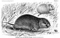 Small mammal drawing from 1900 textbook

- Article(s)
- Gray-tailed vole
- Request
- Simple: Refresh the images, get rid of watermarks, general polishing. Thanks! -- Gaff (talk) 04:39, 7 January 2015 (UTC)
- Graphist opinion(s)
![]() Done How does this look? MjolnirPants Tell me all about it. 16:46, 7 January 2015 (UTC)
Done How does this look? MjolnirPants Tell me all about it. 16:46, 7 January 2015 (UTC)
- looks good! Gaff (talk) 19:30, 7 January 2015 (UTC)
Improve
[edit]


- Article(s)
- various
- Request
- Remove blurriness and in the ones that have a line over the person, remove the line. --The Theosophist (talk) 18:20, 7 January 2015 (UTC)
- @Hipposcrashed: As a courtesy.--The Theosophist (talk) 18:21, 7 January 2015 (UTC)
- Graphist opinion(s)
San Lazzaro degli Armeni
[edit]
- Article(s)
- San Lazzaro degli Armeni
- Request
- If possible, please fix the tower (whatever's wrong with it). -- Երևանցի talk 21:16, 8 January 2015 (UTC)
- Graphist opinion(s)
- Done Centpacrr (talk) 21:31, 8 January 2015 (UTC)
- Thank you. --Երևանցի talk 00:05, 9 January 2015 (UTC)
Capra aegagrus
[edit]
.png)
- Article(s)
- Bezoar ibex
- Request
- Please remove the reverse face (the one on the right) and improve the brightness of the left one. -- Երևանցի talk 03:01, 10 January 2015 (UTC)
- Graphist opinion(s)
 Request taken. Do you want the background to be transparent? MjolnirPants Tell me all about it. 06:27, 11 January 2015 (UTC)
![]() Done See above. I did the best I could with the levels, but they were actually pretty good to begin with, it's just that silver is hard to photograph. I did get all of the compression distortion out of the polish, though. MjolnirPants Tell me all about it. 05:52, 15 January 2015 (UTC)
Done See above. I did the best I could with the levels, but they were actually pretty good to begin with, it's just that silver is hard to photograph. I did get all of the compression distortion out of the polish, though. MjolnirPants Tell me all about it. 05:52, 15 January 2015 (UTC)
- Thank you. --Երևանցի talk 03:06, 16 January 2015 (UTC)
Gastarbeiter
[edit]
- Article(s)
- Gastarbeiter
- Request
- please remove watermark and right edge border… -- Kintetsubuffalo (talk) 05:46, 11 January 2015 (UTC)
- Graphist opinion(s)
- Done - Fallschirmjäger ✉ 22:56, 12 January 2015 (UTC)
- Thank you!--Kintetsubuffalo (talk) 13:24, 13 January 2015 (UTC)
Garegin Srvandztiants
[edit]

- Article(s)
- Garegin Srvandztiants
- Request
- Any improvements to these photographs will be great. I think the first photograph needs a lot more work. The excessive light has made it appear very bad. Étienne Dolet (talk) 20:55, 11 January 2015 (UTC)
- Thank you so much for your work guys! This came out a lot better than I expected!! Étienne Dolet (talk) 06:54, 14 January 2015 (UTC)
- Graphist opinion(s)
I did some work on the first one. There's really not much that can be done to the second without a higher resolution copy. MjolnirPants Tell me all about it. 13:58, 13 January 2015 (UTC)
- Nice work! I initially thought about doing this one, but fixing uneven brightness isn't one of my strengths. I have removed the scratch across his face though. (Hohum @) 19:02, 13 January 2015 (UTC)
- Good catch. I completely missed it before I uploaded. That wasn't a scratch though: it was a mistake of mine. I use the quick mask mode to fix the uneven luminosity, and I add masking to the region I want to adjust and invert after the fact. Normally, it works really well so long as I'm patient and remember to blur to remove the brush artifacts, but this time, I accidentally went over the edge a little and didn't catch it.
- The quick mask/invert method is the best way I've found for selecting a region of uneven brightness. It usually works pretty well on glaring too, because it's so easy to see if your selection gradient matches the gradient of the pre-touchup image. Just remember to check your edges by exiting quick mask mode, turning off the ant line and dragging around the sliders on the brightness and contrast adjustments (I didn't do that this time , which is why I messed up). Once you get the selection right, use curves or levels to do the actual adjusting, as I've found the luminosity differences are mostly in the mid tones. Sometimes it takes a couple of passes with ever-expanding regions of adjustment, but the results are usually near-perfect. MjolnirPants Tell me all about it. 20:31, 13 January 2015 (UTC)
Grayson Perry
[edit]
- Article(s)
- Grayson Perry
- Request
- Correct colour of his eyes. -- Hipposcrashed (talk) 03:00, 16 January 2015 (UTC)
- Graphist opinion(s)
- Done by EuroCarGT. Fallschirmjäger ✉ 23:05, 18 January 2015 (UTC)
Racine Scouts Drum and Bugle Corps
[edit]
- Article(s)
- Racine Scouts Drum and Bugle Corps
- Request
- please cleanup tearmarks… -- Kintetsubuffalo (talk) 10:31, 16 January 2015 (UTC)
- Graphist opinion(s)
![]() Done Carl Henderson (talk) 05:39, 31 July 2015 (UTC)
Done Carl Henderson (talk) 05:39, 31 July 2015 (UTC)
1936 US publicity photographs
[edit]-
 1936 image of Peggy Ashcroft
 -
 1936 image of Peggy Ashcroft


- Article(s)
- Peggy Ashcroft; Laurence Olivier; John Gielgud
- Request
- Would it be possible to remove the seller's watermark from these two images, please? – Tim riley talk 16:57, 16 January 2015 (UTC)
- Graphist opinion(s)
Willie Sutton
[edit]
- Article(s)
- Willie Sutton
- Request
- please remove white bordering… -- Kintetsubuffalo (talk) 03:31, 17 January 2015 (UTC)
- Graphist opinion(s)
- Done - Fallschirmjäger ✉ 23:03, 18 January 2015 (UTC)
- Thank you!--Kintetsubuffalo (talk) 11:14, 19 January 2015 (UTC)
Vehicle registration plates of Switzerland
[edit]

- Article(s)
- Vehicle registration plates of Switzerland
- Request
- please straighten, trim and fix perspective… -- Kintetsubuffalo (talk) 03:33, 17 January 2015 (UTC)
- Graphist opinion(s)
- Done Centpacrr (talk) 15:55, 19 January 2015 (UTC)
- Thank you!--Kintetsubuffalo (talk) 14:02, 20 January 2015 (UTC)
blown out white patches on portrait
[edit]-
 Main portrait
 -
 Group shot (lower priority)
.jpg)

- Article(s)
- Peter Larson
- Request
- It would be excellent if the white patches on subject's face, teeth, clothing, and the white space behind the head could be removed or hidden. Thanks -- --Animalparty-- (talk) 05:12, 18 January 2015 (UTC)
- Graphist opinion(s)
- I did the first one. MjolnirPants Tell me all about it. 15:18, 20 January 2015 (UTC)
- That looks much better, thanks! I don't know if much more can be done given the quality of the source photo. No need to retouch the group photo for now, unless someone requests it in the future. Cheers. --Animalparty-- (talk) 19:23, 20 January 2015 (UTC)
Temple of Garni
[edit]
- Article(s)
- Temple of Garni
- Request
- Please improve the general quality of the image and enhance the brightness so it doesn't look so gloomy. (NOTE: might wanna consider working with the original version) -- Երևանցի talk 03:16, 20 January 2015 (UTC)
- Graphist opinion(s)
- How's that? MjolnirPants Tell me all about it. 14:10, 20 January 2015 (UTC)
- Could you please make it a bit less brighter? --Երևանցի talk 21:52, 21 January 2015 (UTC)
- How now? (brown cow) MjolnirPants Tell me all about it. 13:23, 22 January 2015 (UTC)
- Not exactly what I hoped for, but would do. Thank you. --Երևանցի talk 22:48, 22 January 2015 (UTC)
- How now? (brown cow) MjolnirPants Tell me all about it. 13:23, 22 January 2015 (UTC)
- Could you please make it a bit less brighter? --Երևանցի talk 21:52, 21 January 2015 (UTC)
Mkhitar Sebastatsi
[edit]_(5182840694).jpg)
_(5182840694)(crop).jpg)
- Article(s)
- Mkhitar Sebastatsi
- Request
- Please crop out the portrait in the center (in an oval shape) and upload it as a separate file. -- Երևանցի talk 19:51, 23 January 2015 (UTC)
- Graphist opinion(s)
- Done MjolnirPants Tell me all about it. 21:18, 23 January 2015 (UTC)
- Great! --Երևանցի talk 01:02, 24 January 2015 (UTC)
Drastamat Kanayan
[edit]
- Article(s)
- Drastamat Kanayan
- Request
- Would it be possible to improve the quality of this picture? -- Steverci (talk) 03:50, 24 January 2015 (UTC)
- Graphist opinion(s)
- I would say there isn't really much that could be done to improve the image in all honesty. There isn't enough detail to work with, best bet really would be try to and source a better image. Regards, Fallschirmjäger ✉ 20:24, 25 January 2015 (UTC)
- Done Fallschirmjäger is right in that there's not much to be done. However, after doing an image search myself (flikr, google, bing, yahoo, tineye, yandex, dogpile and a few others I have in a script) and not finding anything better than an enlargement of the face in this photo, I've done what I could. Really, if this article is dear to you, I would suggest hitting the pavement and contacting some museums and archives that might have better quality images of him. MjolnirPants Tell me all about it. 15:42, 26 January 2015 (UTC)
- Looks great, thanks! I too had tried looking for a copy after uploading but couldn't. The only regret I have is that his right eye looks blurred. Is there any way it can be fixed by using the already existing image in his article (same picture, but just a head shot and better quality)? I don't know much about photo editing so I don't know if that is possible, but I thought it worth asking. — Preceding unsigned comment added by Steverci (talk • contribs) 23:34, 26 January 2015 (UTC)
- I actually already gave that a shot. I couldn't get the curves to match up the face with the rest, so I ended up masking out everything but the eyes, which only made for a very slight improvement. At this resolution, this is pretty much as good as it gets, sorry. MjolnirPants Tell me all about it. 13:17, 27 January 2015 (UTC)
- Don't apologize, you did a great job. --Steverci (talk) 22:59, 27 January 2015 (UTC)
- I actually already gave that a shot. I couldn't get the curves to match up the face with the rest, so I ended up masking out everything but the eyes, which only made for a very slight improvement. At this resolution, this is pretty much as good as it gets, sorry. MjolnirPants Tell me all about it. 13:17, 27 January 2015 (UTC)
Straighter
[edit]
- Article(s)
- Rudolph Feilding, 8th Earl of Denbigh
- Request
- Can you make this image straighter?
--The Theosophist (talk) 09:14, 24 January 2015 (UTC)
- Graphist opinion(s)
- Done - Fallschirmjäger ✉ 12:27, 25 January 2015 (UTC)
Josephine Diebitsch Peary
[edit]

- Article(s)
- Josephine Diebitsch Peary
- Request
- please remove border… -- Kintetsubuffalo (talk) 13:29, 25 January 2015 (UTC)
- Graphist opinion(s)
- Request taken. - Fallschirmjäger ✉ 20:30, 25 January 2015 (UTC)
- Done - Cleaned it up a bit while I was at it too. Fallschirmjäger ✉ 21:08, 25 January 2015 (UTC)
- Thanks! Why second image?--Kintetsubuffalo (talk) 10:50, 26 January 2015 (UTC)
- I would normally overwrite the original image however as it is a historical image it is best practice to upload as a separate file no matter how minor the changes are. If I had overwitten the folks at Commons would probably revert it. Thanks for the understanding! Fallschirmjäger ✉ 16:46, 7 February 2015 (UTC)
- Gotcha-cool. I've had other old photos fixed up, wonder if I need to go back and revert them...?--Kintetsubuffalo (talk) 00:47, 8 February 2015 (UTC)
- I wouldn't worry too much, can imagine would be a right pain to go back and revert loads with work already done, just keep in mind for future! ;) Fallschirmjäger ✉ 11:28, 8 February 2015 (UTC)
Broch of Mousa
[edit]
- Article(s)
- Broch of Mousa
- Request
- please remove left border sliver… -- Kintetsubuffalo (talk) 16:15, 27 January 2015 (UTC)
- Graphist opinion(s)
![]() Done MjolnirPants Tell me all about it. 17:13, 27 January 2015 (UTC)
Done MjolnirPants Tell me all about it. 17:13, 27 January 2015 (UTC)
- Thank you!--Kintetsubuffalo (talk) 23:19, 30 January 2015 (UTC)
Herne the Hunter
[edit]
- Article(s)
- Herne the Hunter
- Request
- please remove border and straighten slightly… -- Kintetsubuffalo (talk) 12:34, 29 January 2015 (UTC)
- Graphist opinion(s)
- Done Centpacrr (talk) 17:21, 29 January 2015 (UTC)
- Thank you!--Kintetsubuffalo (talk) 23:21, 30 January 2015 (UTC)
Coir
[edit]
- Article(s)
- Coir
- Request
- please remove border… -- Kintetsubuffalo (talk) 13:42, 29 January 2015 (UTC)
- Graphist opinion(s)
- Done Centpacrr (talk) 17:16, 29 January 2015 (UTC)
- Thank you!--Kintetsubuffalo (talk) 23:24, 30 January 2015 (UTC)
Carl Zeiss
[edit]
- Article(s)
- Carl Zeiss
- Request
- please give transparent back and clean up oval… -- Kintetsubuffalo (talk) 14:34, 29 January 2015 (UTC)
- Graphist opinion(s)
- Done Centpacrr (talk) 17:05, 29 January 2015 (UTC)
- Thank you!--Kintetsubuffalo (talk) 23:25, 30 January 2015 (UTC)