Wikipedia:Graphics Lab/Photography workshop/Archive/Feb 2014 Source: en.wikipedia.org/wiki/Wikipedia:Graphics_Lab/Photography_workshop/Archive/Feb_2014
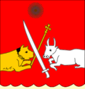
Dampier
[edit]
Article(s): Dampier
Request:
- fix warp... -- Kintetsubuffalo (talk) 03:17, 1 February 2014 (UTC)
Graphist opinion(s):
 Done nagualdesign (talk) 04:44, 7 February 2014 (UTC)
- nice, thanks!--Kintetsubuffalo (talk) 14:12, 8 February 2014 (UTC)
Signatures
[edit]-
 Khachaturian
 -
 Vector version
 -
 Saroyan
 -
 Vector version


Article(s): Aram Khachaturian, William Saroyan
Request:
- Please vectorize. -- Երևանցի talk 05:11, 1 February 2014 (UTC)
Graphist opinion(s):
- Done?--Carnby (talk) 11:43, 1 February 2014 (UTC)
- Thanks! --Երևանցի talk 20:10, 1 February 2014 (UTC)
Monica Keena
[edit]-

-
 New version


Article(s): Monica Keena
Request:
- new version to focus on subject, bottle blonde center left... -- Kintetsubuffalo (talk) 08:35, 1 February 2014 (UTC)
- Done - Rather than crop an image from the original image I managed to find a better one from flickr which I tweaked. Regards, Fallschirmjäger ✉ 15:51, 2 February 2014 (UTC)
- Thank you!--Kintetsubuffalo (talk) 13:37, 3 February 2014 (UTC)
Graphist opinion(s):
File:Hiluxmauritania.JPG - Vignetting and colour cast
[edit]-
 Toyota Hilux in Mauritania, travelling from Nema to Bassekounou

Article(s): Toyota Hilux
Request:
- This image is in bad conditions. I tried with YCbCr (G'MIC plugin for GIMP) and magenta/red desaturation, but I couldn't remove vignetting and the colours became faded and innatural. Could yopu help me resore it? Thanks in advance.--Carnby (talk) 15:01, 1 February 2014 (UTC)
Graphist opinion(s):
 Comment: I think the effect is intentionally caused by graphic manipulation outside the camera, which makes it difficult / impossible to fix. I have tried to improve it, but it's still a poor image and haven't bothered to upload it. If you wanted to use it in the Toyota Hilux article, I suggest finding a better image. (Hohum @) 16:44, 1 February 2014 (UTC)
- Done - Per the above. I've had a go at it, it's not perfect, never going to get it looking natural however it looks a little better now. Regards Fallschirmjäger ✉ 17:25, 1 February 2014 (UTC)
- Good work, almost perfect, I reduced that red shade around the vehicle.--Carnby (talk) 10:58, 2 February 2014 (UTC)
- Cheers, good job! Fallschirmjäger ✉ 12:44, 2 February 2014 (UTC)
- Good work, almost perfect, I reduced that red shade around the vehicle.--Carnby (talk) 10:58, 2 February 2014 (UTC)
Ambartsumian
[edit]-

-
 cropped image
.png)

Article(s): Victor Ambartsumian
Request:
- Please crop out his face and remove everything but his face and make it black and white. And upload it as a separate file. -- Երևանցի talk 01:33, 2 February 2014 (UTC)
Graphist opinion(s):
- Done--Carnby (talk) 19:49, 2 February 2014 (UTC)
- Perfect. Thank you very much! --Երևանցի talk 19:52, 2 February 2014 (UTC)
Khachaturian
[edit]
Article(s): Aram Khachaturian
Request:
- Please fix the shadowing if it's possible. Any other improvement will be appreciated. -- Երևանցի talk 04:15, 3 February 2014 (UTC)
Graphist opinion(s):![]() Request taken by Centpacrr (talk) 12:39, 3 February 2014 (UTC).
Request taken by Centpacrr (talk) 12:39, 3 February 2014 (UTC). ![]() Done Centpacrr (talk) 13:10, 3 February 2014 (UTC)
Done Centpacrr (talk) 13:10, 3 February 2014 (UTC)
- Better than the original, but it looks a bit unnatural. Is there any way you can make the hair on the right side a little smaller. Also, is the background color the best choice? --Երևանցի talk 17:49, 3 February 2014 (UTC)
- I have tweaked it a little more. Better? The border of the hair is correct according to the source image. (Hohum @) 17:52, 3 February 2014 (UTC)
- Since this hasn't been resolved yet, I thought I'd give it a go. Comments are welcome. nagualdesign (talk) 20:07, 23 February 2014 (UTC)
- nagualdesign, I appreciate your work. I think it came out more natural than the previous versions. I've already found a good replacement to use as lead pic. But again, thank you. --Երևանցի talk 20:36, 23 February 2014 (UTC)
- No worries. I'll mark this one resolved. nagualdesign (talk) 22:18, 23 February 2014 (UTC)
- nagualdesign, I appreciate your work. I think it came out more natural than the previous versions. I've already found a good replacement to use as lead pic. But again, thank you. --Երևանցի talk 20:36, 23 February 2014 (UTC)
- Since this hasn't been resolved yet, I thought I'd give it a go. Comments are welcome. nagualdesign (talk) 20:07, 23 February 2014 (UTC)
- I have tweaked it a little more. Better? The border of the hair is correct according to the source image. (Hohum @) 17:52, 3 February 2014 (UTC)
Monogram
[edit]-
 Monogram of Tamar of Georgia
 -
 Black version


Article(s): Above-mentioned.
Request:
- Please convert this red SVG to black SVG and upload it as seperate file. Jaqeli (talk) 19:23, 3 February 2014 (UTC)
Graphist opinion(s):
 Request taken. - Fallschirmjäger ✉ 19:53, 3 February 2014 (UTC)
- Done - Regards, Fallschirmjäger ✉ 20:01, 3 February 2014 (UTC)
- @Fallschirmjäger: Many thanks. Jaqeli (talk) 20:25, 3 February 2014 (UTC)
Coat of Arms of 3 Kingdoms
[edit]-
 Arms of Kingdom of Kartli
 -
 Transparent
 -
 Arms of Kingdom of Kakheti
 -
 Transparent
 -
 Arms of Kingdom of Imereti
 -
 Transparent


Article(s): Mentioned above.
Request:
- Please remove the backgrounds on these 3 images by making them transparent and SVG vectorize all of them and upload them as seperate files. Jaqeli (talk) 21:49, 3 February 2014 (UTC)
Graphist opinion(s):
- Not sure it's what you were looking for: I made them transparent but I couldn't vectorize them since I'm not able to do it.--Carnby (talk) 14:21, 4 February 2014 (UTC)
- Thanks anyway. Can you please if you can give the Coat of Arms of Kingdom of Kakheti same wave kind of effect down there instead of an oval form. Jaqeli (talk) 14:38, 4 February 2014 (UTC)
- All right.--Carnby (talk) 14:51, 4 February 2014 (UTC)
- Thanks anyway. Can you please if you can give the Coat of Arms of Kingdom of Kakheti same wave kind of effect down there instead of an oval form. Jaqeli (talk) 14:38, 4 February 2014 (UTC)
Interstate 190
[edit]-
 I-190 in Buffalo

Article(s): I-190 (NY)
Request:
- Remove timestamp. Cheers, Floydian τ ¢ 02:28, 4 February 2014 (UTC)
Graphist opinion(s):
- Done--Carnby (talk) 13:08, 4 February 2014 (UTC)
American Near East Relief Fund
[edit]


Article(s): Armenian Genocide
Request:
- Please provide any general improvements to the photographs. These are valuable photographs so any kind of improvement will be great. Étienne Dolet (talk) 05:49, 4 February 2014 (UTC)
Graphist opinion(s):
Geoffrey Howard (oval portrait)
[edit]
-
 Geoffrey Howard
 -
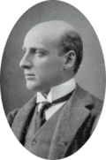 Transparent


Article(s): Geoffrey Howard (Liberal politician)
Request:
- Please oval crop to a portrait of the subject. -- January (talk) 11:53, 4 February 2014 (UTC)
Graphist opinion(s):
- Done--Carnby (talk) 14:37, 4 February 2014 (UTC)
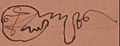
Signature of David Soslan
[edit]-
 Signature
 -
 Vector version
Article(s): Mentioned above.
Request:
- Please SVG vectorize the signature. Jaqeli (talk) 14:09, 4 February 2014 (UTC)
Graphist opinion(s):
- Done--Carnby (talk) 15:31, 4 February 2014 (UTC)
- Thanks. Jaqeli (talk) 17:04, 4 February 2014 (UTC)
Retouching. Bad lighting
[edit]


Article(s): wikivoyage:Kirthar_National_Park, wikivoyage:Sindh, Kirthar_National_Park, Kirthar Mountains, Sindh
Request:
- All the photos were uploaded from Flickr and definitely require touching especially lighting fixing. --175.110.232.5 (talk) 16:54, 4 February 2014 (UTC)
Graphist opinion(s):
- Done. Left the first one as I found it. nagualdesign (talk) 06:43, 5 February 2014 (UTC)
2 Kings Archil
[edit]-

-
 Sepia
Sepia -
 Sepia and cropped
 -

-
 Sepia and cropped


.jpg)
Article(s): Above-mentioned.
Request:
- Please change the colours of these 2 pictures into the one as King Heraclius I of Kakheti has and upload them as seperate files. Also crop the text out from the second image. Jaqeli (talk) 18:10, 4 February 2014 (UTC)
Graphist opinion(s):
![]() Done--Carnby (talk) 12:10, 5 February 2014 (UTC)
Done--Carnby (talk) 12:10, 5 February 2014 (UTC)
- @Carnby: Is it possible to light up a bit the face and crop till chest the pic of Archil of Kakheti? Just like the Archil of Imereti. Jaqeli (talk) 12:19, 5 February 2014 (UTC)
- @Jaqeli: Now?--Carnby (talk) 12:44, 5 February 2014 (UTC)
- @Carnby: Too sharpened but thanks anyway. Jaqeli (talk) 12:58, 5 February 2014 (UTC)
- @Jaqeli: I have smoothed it a bit.--Carnby (talk) 14:01, 5 February 2014 (UTC)
- @Carnby: Thanks again. Jaqeli (talk) 14:27, 5 February 2014 (UTC)
- @Jaqeli: I have redone Saint Archil cropped pic.--Carnby (talk) 21:39, 14 February 2014 (UTC)
- @Carnby: Thanks again. Jaqeli (talk) 14:27, 5 February 2014 (UTC)
- @Jaqeli: I have smoothed it a bit.--Carnby (talk) 14:01, 5 February 2014 (UTC)
- @Carnby: Too sharpened but thanks anyway. Jaqeli (talk) 12:58, 5 February 2014 (UTC)
- @Jaqeli: Now?--Carnby (talk) 12:44, 5 February 2014 (UTC)
Signature of Archil of Imereti
[edit]-
 Signature
 -
 Vector version
Article(s): Mentioned above.
Request:
- Please SVG vectorize the signature. Jaqeli (talk) 14:30, 5 February 2014 (UTC)
Graphist opinion(s):
- Done--Carnby (talk) 16:28, 5 February 2014 (UTC)
- Thank you. Jaqeli (talk) 17:15, 5 February 2014 (UTC)
King Simon I of Kartli
[edit]-

-
 Sepia and transparency

.png)
Article(s): Simon I of Kartli
Request:
- Please remove the emblem on the left and the watermark down at the right side, crop the text out from the pic and give it the same colour as it is in the image of Archil of Imereti. Jaqeli (talk) 19:29, 5 February 2014 (UTC)
Graphist opinion(s):
- Just a moment: the watermark says the image is copyrighted. While the image itself cannot be copyrighted, that particular reproduction can be copyrighted, and therefore should be deleted from Commons. Please ask Village pump/Copyright before any request.--Carnby (talk) 19:44, 5 February 2014 (UTC)
- It's dated c. 1590-1640 and how can that be copyrighted? Jaqeli (talk) 20:11, 5 February 2014 (UTC)
- Because it was scanned by the Vatican archive. The watermark explicitly says that reproduction is copyrighted.--Carnby (talk) 21:56, 5 February 2014 (UTC)
- What about the other picture which I changed to? Can you oval crop it then and give it the colour as described above? Jaqeli (talk) 22:44, 5 February 2014 (UTC)
- Done--Carnby (talk) 00:21, 6 February 2014 (UTC)
- Wait, you are aware of {{PD-Art}}? Go have a read of that; you're telling people misinformation about policy. You literally cannot claim copyright on a 2-dimensional image's reproduction in the U.S., and, for good or ill, Wikipedia has extended that to all files. Adam Cuerden (talk) 03:06, 6 February 2014 (UTC)
- Anyway, that said, that watermark covers some complicated detail in the clothing - I wouldn't want to try to restore that much of the picture, but it's the principle that matters. Also, what's with the fad on here for taking a nice, rectangular historical image that contains a little text and turning it into an oval crop that no longer looks like an image from the period it's from? Adam Cuerden (talk) 03:14, 6 February 2014 (UTC)
- @Adam Cuerden: I admit I'm not sure about policies regarding non copyrightable images watermarked with a clear copyright symbol; I will ask Village pump/Copyright; If they say it's all right I will crop the image and send apologies to Jaqeli for my mistake.--Carnby (talk) 07:59, 6 February 2014 (UTC)
- Not a problem, just, you know, it's something to be aware of, as otherwise a lot of confusion arises. Adam Cuerden (talk) 13:25, 6 February 2014 (UTC)
- @Adam Cuerden: As far as the crop asked here is concerned, I think the user wants a set of historical images with a similar sepia tone and without text, for the sake of homogeneity/coherence. It's reasonable, provided the original images are not overwritten.--Carnby (talk) 13:30, 6 February 2014 (UTC)
- Not a problem, just, you know, it's something to be aware of, as otherwise a lot of confusion arises. Adam Cuerden (talk) 13:25, 6 February 2014 (UTC)
- @Adam Cuerden: I admit I'm not sure about policies regarding non copyrightable images watermarked with a clear copyright symbol; I will ask Village pump/Copyright; If they say it's all right I will crop the image and send apologies to Jaqeli for my mistake.--Carnby (talk) 07:59, 6 February 2014 (UTC)
- Anyway, that said, that watermark covers some complicated detail in the clothing - I wouldn't want to try to restore that much of the picture, but it's the principle that matters. Also, what's with the fad on here for taking a nice, rectangular historical image that contains a little text and turning it into an oval crop that no longer looks like an image from the period it's from? Adam Cuerden (talk) 03:14, 6 February 2014 (UTC)
- What about the other picture which I changed to? Can you oval crop it then and give it the colour as described above? Jaqeli (talk) 22:44, 5 February 2014 (UTC)
- Because it was scanned by the Vatican archive. The watermark explicitly says that reproduction is copyrighted.--Carnby (talk) 21:56, 5 February 2014 (UTC)
- It's dated c. 1590-1640 and how can that be copyrighted? Jaqeli (talk) 20:11, 5 February 2014 (UTC)
@Carnby: So is it possible to remove the watermark from that pic I've posted yesterday? Jaqeli (talk) 14:12, 6 February 2014 (UTC)
- @Jaqeli: I think so.--Carnby (talk) 16:46, 6 February 2014 (UTC)
- @Carnby: So can you please make it? Jaqeli (talk) 16:52, 6 February 2014 (UTC)
- @Jaqeli: I will try, it's a rather big watermark.--Carnby (talk) 19:36, 6 February 2014 (UTC)
- @Carnby: So can you please make it? Jaqeli (talk) 16:52, 6 February 2014 (UTC)
-
 Version without watermark
 -
 Version without text and coat of arms


@Jaqeli: What do you think about? Do you need a version without CoA and text?--Carnby (talk) 23:19, 6 February 2014 (UTC)
- @Carnby: It is perfect. Yes please remove the COA and text as well and if you can upload it as seperate file. Jaqeli (talk) 08:39, 7 February 2014 (UTC)
![]() Done--Carnby (talk) 12:26, 8 February 2014 (UTC)
Done--Carnby (talk) 12:26, 8 February 2014 (UTC)
- Thank you. Jaqeli (talk) 12:34, 8 February 2014 (UTC)
Voltairine de Cleyre
[edit]-

-
 Restored
_-_Original.png)
.jpg)
Article(s): Voltairine de Cleyre
Request:
- Removal of scratches and dust. Otherwise a superb portrait. -- JJARichardson (talk) 23:21, 5 February 2014 (UTC)
Graphist opinion(s):
- Request taken.
- Thank you! JJARichardson (talk) 16:49, 6 February 2014 (UTC)
Eugène Delacroix
[edit]

Article(s): Eugène Delacroix
Request:
- Please restore. Will probably nominate for FP if nicely done. -- Երևանցի talk 02:12, 7 February 2014 (UTC)
Graphist opinion(s):
- What do you think about?--Carnby (talk) 14:19, 12 February 2014 (UTC)
- Thanks for the effort, but why make it smaller? --Երևանցի talk 05:45, 13 February 2014 (UTC)
- That was a mistake! I will redo it in its original size.
- Done @Yerevantsi: Now?--Carnby (talk) 21:13, 14 February 2014 (UTC)
- Better. --Երևանցի talk 01:00, 13 March 2014 (UTC)
- That was a mistake! I will redo it in its original size.
- Thanks for the effort, but why make it smaller? --Երևանցի talk 05:45, 13 February 2014 (UTC)
Frederick G. Coan
[edit]
Article(s): Frederick G. Coan and Witnesses and testimonies of the Armenian Genocide
Request:
- Please clean up the patterns in the background and on Mr. Coan himself. Please retain as much of the black and white resolution as possible. Étienne Dolet (talk) 04:43, 7 February 2014 (UTC)
Graphist opinion(s):Reduced moiré pattern. Centpacrr (talk) 22:32, 9 February 2014 (UTC) ![]() Done Redid image from scratch from the original source. Centpacrr (talk) 12:29, 10 February 2014 (UTC)
Done Redid image from scratch from the original source. Centpacrr (talk) 12:29, 10 February 2014 (UTC)
Freeman Interchange
[edit]-
 Freeman Interchange between QEW and Highway 403/407 in Burlington, Ontario

Article(s): Queen Elizabeth Way, Ontario Highway 403, Ontario Highway 407
Request:
- Can the smudge in the middle of the image be cleaned up? If so it would have very high EV. - Floydian τ ¢ 02:35, 8 February 2014 (UTC)
Graphist opinion(s):![]() Request taken by Centpacrr (talk) 04:10, 8 February 2014 (UTC). Digitally reconstructed "smudged" area. Centpacrr (talk) 04:45, 8 February 2014 (UTC)
Request taken by Centpacrr (talk) 04:10, 8 February 2014 (UTC). Digitally reconstructed "smudged" area. Centpacrr (talk) 04:45, 8 February 2014 (UTC)
compact
[edit]
Article(s): compact
Request:
- can the blank area be removed but the aspect ratio maintained?... -- Kintetsubuffalo (talk) 05:11, 8 February 2014 (UTC)
Graphist opinion(s):
- Done Now?--Carnby (talk) 11:24, 8 February 2014 (UTC)
- great, thanks!
George Congdon Gorham
[edit]
Article(s): George Congdon Gorham
Request:
- wikify, remove purple... -- Kintetsubuffalo (talk) 09:12, 8 February 2014 (UTC)
Graphist opinion(s):![]() Done Centpacrr (talk) 12:45, 8 February 2014 (UTC)
Done Centpacrr (talk) 12:45, 8 February 2014 (UTC)
- thanks, can you reduce the whitespace to focus on the cartoon?--Kintetsubuffalo (talk) 14:17, 8 February 2014 (UTC)
- Trimmed. Centpacrr (talk) 22:51, 8 February 2014 (UTC)
- Now we're closer, hate to nitpick, but in losing the purple the fine detail was lost, like the Chinese firecrackers. Is there a softer way to do it and not lose the details?--Kintetsubuffalo (talk) 01
- 10, 9 February 2014 (UTC)
Kings Constantine II, David X and David XI
[edit]


Article(s): Mentioned above.
Request:
- Please remove the text, hands, feet, clothes etc. around the Kings that are seen from the past crops. Jaqeli (talk) 12:46, 8 February 2014 (UTC)
Graphist opinion(s):![]() Request taken by Centpacrr (talk) 12:58, 8 February 2014 (UTC).
Request taken by Centpacrr (talk) 12:58, 8 February 2014 (UTC). ![]() Done Centpacrr (talk) 13:21, 8 February 2014 (UTC)
Done Centpacrr (talk) 13:21, 8 February 2014 (UTC)
- Thank you. Jaqeli (talk) 13:30, 8 February 2014 (UTC)
Crown
[edit]-
 Greater Arms of Georgia
 -
 Crown from the previous image


Article(s): Royalty articles.
Request:
- Please crop out the crown from this Coat of Arms and upload that crown as a seperate file as SVG. Jaqeli (talk) 13:01, 8 February 2014 (UTC)
- Anyone? Jaqeli (talk) 12:24, 11 February 2014 (UTC)
Graphist opinion(s): ![]() Done @Jaqeli: Now it works!--Carnby (talk) 14:28, 15 February 2014 (UTC)
Done @Jaqeli: Now it works!--Carnby (talk) 14:28, 15 February 2014 (UTC)
Voltairine de Cleyre
[edit]-
 .
.

Article(s): Voltairine de Cleyre
Request:
- Removal of dust and scratches, as per the other image of her. -- JJARichardson (talk) 20:25, 9 February 2014 (UTC)
Graphist opinion(s):![]() Done Centpacrr (talk) 13:58, 11 February 2014 (UTC)
Done Centpacrr (talk) 13:58, 11 February 2014 (UTC)
- Thank you! JJARichardson (talk) 16:27, 12 February 2014 (UTC)
Haji Bashir Ismail Yusuf
[edit]Article(s): Haji Bashir Ismail Yusuf
Request:
- fix proportion, remove border... -- Kintetsubuffalo (talk) 02:41, 11 February 2014 (UTC)
Graphist opinion(s):![]() Done Adjusted vertical perspective. Centpacrr (talk) 03:37, 11 February 2014 (UTC)
Done Adjusted vertical perspective. Centpacrr (talk) 03:37, 11 February 2014 (UTC)
- Thanks! Right border please!--Kintetsubuffalo (talk) 04:03, 11 February 2014 (UTC)
- What about slightly enhancing contrast and reconstructing hat (and uploading it as a different image)?--Carnby (talk) 12:00, 12 February 2014 (UTC)
Imelda Marcos in 1954
[edit]Article(s): Imelda Marcos, Imelda (film)
Request:
- Can this watermark be removed? Thanks. -- DoctorKubla (talk) 08:35, 13 February 2014 (UTC)
Graphist opinion(s):
Turn of Fortune
[edit]-
 Turn of Fortune Ferris wheel at night

Article(s): Turn of Fortune
Request:
- Please crop (to remove unwanted text) top and bottom. Thanks! 82.132.223.108 (talk) 12:31, 13 February 2014 (UTC)
Graphist opinion(s):
- Done Are you sure the CJK text was not a copyright claim?--Carnby (talk) 13:17, 13 February 2014 (UTC)
- Thanks! What is the CJK text? And do you know where I could request help to check if copyright is an issue? 82.132.223.229 (talk) 18:20, 13 February 2014 (UTC)
- I now know what CJK characters are! ;-)
- Any suggestions about where to get help confirming copyright much appreciated. 82.132.223.229 (talk) 18:48, 13 February 2014 (UTC)
Search for Enlightenment
[edit]-
 The sculpture Search for Enlightenment

Article(s): List of public art in the City of Westminster
Request:
- My own search for enlightenment (of this photo) has brought me here... Ham (talk) 22:15, 13 February 2014 (UTC)
Graphist opinion(s):![]() Done Centpacrr (talk) 7:27 pm, Yesterday (UTC−5)
Done Centpacrr (talk) 7:27 pm, Yesterday (UTC−5)
- Done nagualdesign (talk) 05:58, 14 February 2014 (UTC)
- @Ham, you may wish to choose which version you prefer, rather than letting Centpacrr decide for you. I provided my own edit as I thought the other one's a funny colour, and it has glowing edges if you look closely. nagualdesign (talk) 19:32, 14 February 2014 (UTC)
- I'm afraid I do rather prefer the colours of nagualdesign's version; no offence meant to Centpacrr. Thank you both! Ham (talk) 20:34, 14 February 2014 (UTC)
- I have reworked from the original using reference images, taking into account that the colour of the statues has changed over age - from metallic to the current weathered / orange look. (Hohum @) 16:59, 15 February 2014 (UTC)
- I don't think the colour was any better TBH but the luminosity looks good, so I uploaded another edit that retains the original colour. See what you think. Regards, nagualdesign (talk) 19:40, 15 February 2014 (UTC)
- Yes, this is my favourite version so far; it needs that luminosity. I've marked this as resolved. Ham (talk) 06:48, 17 February 2014 (UTC)
- I don't think the colour was any better TBH but the luminosity looks good, so I uploaded another edit that retains the original colour. See what you think. Regards, nagualdesign (talk) 19:40, 15 February 2014 (UTC)
- I have reworked from the original using reference images, taking into account that the colour of the statues has changed over age - from metallic to the current weathered / orange look. (Hohum @) 16:59, 15 February 2014 (UTC)
- I'm afraid I do rather prefer the colours of nagualdesign's version; no offence meant to Centpacrr. Thank you both! Ham (talk) 20:34, 14 February 2014 (UTC)
- @Ham, you may wish to choose which version you prefer, rather than letting Centpacrr decide for you. I provided my own edit as I thought the other one's a funny colour, and it has glowing edges if you look closely. nagualdesign (talk) 19:32, 14 February 2014 (UTC)
Got there in the end ;) (Hohum @) 18:07, 18 February 2014 (UTC)
Arrows
[edit]

Article(s): Georgian alphabet
Request:
- Please replace the current arrows with the rounded and curved arrows with giving them the same blue color as it has now. Jaqeli (talk) 08:19, 16 February 2014 (UTC)
Graphist opinion(s):
- @Jaqeli: Before continuing, check the first five letters: is exactly what you asked?--Carnby (talk) 11:31, 25 February 2014 (UTC)
- Yes but please look closely the directions of the arrows. For example the გ letter which is third in the row has a mistake as it should go up and not down. But as the arrows themselves they are perfect. And if you can also please curve those on the 4th letter on the lower part more curved if possible. Thanks a lot in advance. Jaqeli (talk) 11:44, 25 February 2014 (UTC)
- @Jaqeli: Please check now.--Carnby (talk) 22:30, 28 February 2014 (UTC)
- @Jaqeli: I have updated the file (sorry for the delay).--Carnby (talk) 23:17, 12 March 2014 (UTC)
- Thank you. But გ and ჰ arrows are wrong. On გ (3rd letter) first arrow should go up and not down and on ჰ which is last letter it is written totally wrong. It should have an arrow like the letter პ (15th letter) has. Jaqeli (talk) 10:56, 13 March 2014 (UTC)
- @Jaqeli: Now?--Carnby (talk) 11:28, 13 March 2014 (UTC)
- Now it's perfect. Could you please if you can curve the arrow of letter რ (17th letter)? Curving the arrow down-to-right would be better. Jaqeli (talk) 11:34, 13 March 2014 (UTC)
- @Jaqeli: Now?--Carnby (talk) 13:01, 13 March 2014 (UTC)
- That's a weird arrow. Make it like the letter თ (8th letter) has and cut a length of the arrow as it is very big. And if you can make the first arrow on the letter ყ (24th letter) just like the second arrow of the letter ზ (7th letter) has. Jaqeli (talk) 13:12, 13 March 2014 (UTC)
- @Jaqeli: Now?--Carnby (talk) 21:46, 13 March 2014 (UTC)
- Perfect. Just please move that arrow on ყ closer to the letter itself. And also if you can please make a curved arrow with right-to-down with curve on the letter წ. (29th letter.) Jaqeli (talk) 09:17, 14 March 2014 (UTC)
- @Jaqeli: Now?--Carnby (talk) 15:02, 14 March 2014 (UTC)
- Perfect. Just perfect. Especially the arrow on წ is perfectly done. Thank you carnby a lot. Gratzie. Jaqeli (talk) 16:49, 14 March 2014 (UTC)
- @Jaqeli: Now?--Carnby (talk) 15:02, 14 March 2014 (UTC)
- Perfect. Just please move that arrow on ყ closer to the letter itself. And also if you can please make a curved arrow with right-to-down with curve on the letter წ. (29th letter.) Jaqeli (talk) 09:17, 14 March 2014 (UTC)
- @Jaqeli: Now?--Carnby (talk) 21:46, 13 March 2014 (UTC)
- That's a weird arrow. Make it like the letter თ (8th letter) has and cut a length of the arrow as it is very big. And if you can make the first arrow on the letter ყ (24th letter) just like the second arrow of the letter ზ (7th letter) has. Jaqeli (talk) 13:12, 13 March 2014 (UTC)
- @Jaqeli: Now?--Carnby (talk) 13:01, 13 March 2014 (UTC)
- Now it's perfect. Could you please if you can curve the arrow of letter რ (17th letter)? Curving the arrow down-to-right would be better. Jaqeli (talk) 11:34, 13 March 2014 (UTC)
- @Jaqeli: Now?--Carnby (talk) 11:28, 13 March 2014 (UTC)
- Thank you. But გ and ჰ arrows are wrong. On გ (3rd letter) first arrow should go up and not down and on ჰ which is last letter it is written totally wrong. It should have an arrow like the letter პ (15th letter) has. Jaqeli (talk) 10:56, 13 March 2014 (UTC)
- @Jaqeli: I have updated the file (sorry for the delay).--Carnby (talk) 23:17, 12 March 2014 (UTC)
- @Jaqeli: Please check now.--Carnby (talk) 22:30, 28 February 2014 (UTC)
- Yes but please look closely the directions of the arrows. For example the გ letter which is third in the row has a mistake as it should go up and not down. But as the arrows themselves they are perfect. And if you can also please curve those on the 4th letter on the lower part more curved if possible. Thanks a lot in advance. Jaqeli (talk) 11:44, 25 February 2014 (UTC)
Round In Fifty
[edit]
Article(s): George Robey
Request:
- Please could the watermark "Jazz Age Club" be removed from the front of this image. Many thanks! -- Cassianto (talk) 09:45, 17 February 2014 (UTC)
- Is there a reason as to why this has been left? I'm finding it curious that certain, regular uploader's to this workshop get responded to within a few hours or so, yet new comers are seemingly ignored. Cassianto (talk) 00:26, 21 February 2014 (UTC)
Graphist opinion(s):
- Request taken. (Hohum @) 18:48, 21 February 2014 (UTC)
- Done (Hohum @) 18:50, 21 February 2014 (UTC)
Rigunth
[edit]
Article(s): Fredegund
Request:
- remove frame and text... -- Kintetsubuffalo (talk) 09:20, 17 February 2014 (UTC)
Graphist opinion(s):
- Now done
 Cassianto (talk) 09:42, 17 February 2014 (UTC)
 - Thank you!--Kintetsubuffalo (talk) 12:42, 17 February 2014 (UTC)
Quick fix
[edit]
Article(s): Thomas Bellamy
Request:
- Remove the black line on the top of the image. Thanks. -- – Connormah (talk) 18:24, 17 February 2014 (UTC)
Graphist opinion(s):![]() Done Restore, reconstruct, and adjust gamma. Centpacrr (talk) 19:14, 17 February 2014 (UTC)
Done Restore, reconstruct, and adjust gamma. Centpacrr (talk) 19:14, 17 February 2014 (UTC)
- Excellent job. Thanks. – Connormah (talk) 03:00, 18 February 2014 (UTC)
Cleanup - Thomas Bennett
[edit]
Article(s): Thomas Bennett (Canadian politician)
Request:
- Cleanup the bottom area of the photo - something doesn't look right from my (horrible) watermark removal. Will upload the watermarked image to the image history. Thanks. -- – Connormah (talk) 03:06, 18 February 2014 (UTC)
Graphist opinion(s):![]() Done Redid watermark removal from scratch and other cleanup. Centpacrr (talk) 04:04, 18 February 2014 (UTC)
Done Redid watermark removal from scratch and other cleanup. Centpacrr (talk) 04:04, 18 February 2014 (UTC)
Luarsab II
[edit]-

-
 King Luarsab II (cropped)

Article(s): Luarsab II of Kartli
Request:
- Please crop out the image of King Luarsab II (left) without damaging his clothing in the image and upload it as seperate file. Jaqeli (talk) 12:27, 18 February 2014 (UTC)
Graphist opinion(s):
- Done nagualdesign (talk) 02:04, 19 February 2014 (UTC)
- Thank you. Jaqeli (talk) 09:32, 19 February 2014 (UTC)
David IV
[edit]-

-
 Bigger version without text
 -
 Repaired, smoothed, grey background
.jpg)
_repaired.jpg)

Article(s): Above.
Request:
- Please remove the text from the image around David's face and also remove the clothing, hands etc. from the past crop outs around him. Jaqeli (talk) 11:43, 19 February 2014 (UTC)
Graphist opinion(s):
- Done @Jaqeli: what do you think about?--Carnby (talk) 20:59, 23 February 2014 (UTC)
- Thanks Carnby but can you give the background some different colour? Maybe grey? or dark grey? And what about arrows? :) Jaqeli (talk) 21:03, 23 February 2014 (UTC)
- @Jaqeli: now? As far as the arrows are concerned, I will complete them tomorrow or Tuesday ;)--Carnby (talk) 23:07, 23 February 2014 (UTC)
- It looks like blue. I think darker the better so maybe you could make it grey+black darker? Thanks for the arrows :) waiting for it :) Jaqeli (talk) 06:59, 24 February 2014 (UTC)
- @Jaqeli: now?--Carnby (talk) 14:43, 24 February 2014 (UTC)
- Is it possible to just remove the text but leave that background as it had in the original crop? Jaqeli (talk) 14:51, 24 February 2014 (UTC)
- @Jaqeli: now?--Carnby (talk) 23:01, 24 February 2014 (UTC)
- Thanks. It's perfect but why so big in size? Better to be like original is in its size if its possible. Jaqeli (talk) 11:50, 25 February 2014 (UTC)
- I did the same as Demetrius II; anyway now I have scaled the pic and uploaded it. Feel free to revert if ypou like.--Carnby (talk)
- Thanks. Jaqeli (talk) 13:18, 25 February 2014 (UTC)
- I did the same as Demetrius II; anyway now I have scaled the pic and uploaded it. Feel free to revert if ypou like.--Carnby (talk)
- Thanks. It's perfect but why so big in size? Better to be like original is in its size if its possible. Jaqeli (talk) 11:50, 25 February 2014 (UTC)
- @Jaqeli: now?--Carnby (talk) 23:01, 24 February 2014 (UTC)
- Is it possible to just remove the text but leave that background as it had in the original crop? Jaqeli (talk) 14:51, 24 February 2014 (UTC)
- @Jaqeli: now?--Carnby (talk) 14:43, 24 February 2014 (UTC)
- It looks like blue. I think darker the better so maybe you could make it grey+black darker? Thanks for the arrows :) waiting for it :) Jaqeli (talk) 06:59, 24 February 2014 (UTC)
- @Jaqeli: now? As far as the arrows are concerned, I will complete them tomorrow or Tuesday ;)--Carnby (talk) 23:07, 23 February 2014 (UTC)
- Thanks Carnby but can you give the background some different colour? Maybe grey? or dark grey? And what about arrows? :) Jaqeli (talk) 21:03, 23 February 2014 (UTC)
Adding an arrow to 3D .gif
[edit]-
 3D CT .gif showing a cyst (dark circle) between the impacted wisdom tooth and the nerve (blue)

Article(s): Impacted wisdom teeth
Request:
- The cyst (the dark spot between the nerve and the impacted tooth) isn't obvious and needs an arrow of some sort added to it. There is also bit's of the original image I captured in the .gif at the bottom of the screen that need to be removed. Ian Furst (talk) 02:05, 20 February 2014 (UTC)
Graphist opinion(s):
- How's that? Perhaps it would be better to find looping frames. And I missed the mouse pointer on a few of the frames. I may give it another go yet. Feel free to make suggestions in the meantime. nagualdesign (talk) 05:03, 20 February 2014 (UTC)
- That looks a lot better - thank you. Couple of things, 1) Could we change the red star to a green arrow like in this picture just off center of the cyst, I'm trying to standardize the markers throughout all xrays/photos in the project 2) can we slow the rotation down and shorten (slightly) the "hold" time when it's stopped? 3)
It seems more "choppy" than previously, but I'm not sure if that's just an optical illusion.Looked again at thumb size and looks perfect. Thank you for taking the work on. 10:56, 20 February 2014 (UTC)- Okay, I've redone it with a green arrow, remembering to remove the mouse pointer. It now runs at a constant 2fps (each frame lasts 0.5 seconds, some frames are repeated). I can make any frame last as long as you wish, so as to lengthen the pauses or quicken the whole thing. Any changes are easy at this point, so feel free to make suggestions. Regards, nagualdesign (talk) 19:47, 20 February 2014 (UTC)
- ...I've also changed several other images on that page, so that they all show green arrows, or green and red arrows. And I also altered the image captions/file page descriptions to reflect the changes. Feel free to revert all those edits. nagualdesign (talk) 20:33, 20 February 2014 (UTC)
- It looks great. And thank you very much for changing the arrows around on the page. In surgical shots, nothing is bright green or blue so we use those colours. On the xray, I think red looks pretty so I use it. Very scientific eh? Thanks again. Ian Furst (talk) 20:55, 20 February 2014 (UTC)
- That looks a lot better - thank you. Couple of things, 1) Could we change the red star to a green arrow like in this picture just off center of the cyst, I'm trying to standardize the markers throughout all xrays/photos in the project 2) can we slow the rotation down and shorten (slightly) the "hold" time when it's stopped? 3)
![]() Done. I'll mark this one as resolved. nagualdesign (talk) 21:13, 20 February 2014 (UTC)
Done. I'll mark this one as resolved. nagualdesign (talk) 21:13, 20 February 2014 (UTC)
Rossetti
[edit]
Article(s): Rossetti
Request:
- remove smidge of residual text at bottom... -- Kintetsubuffalo (talk) 10:50, 20 February 2014 (UTC)
Graphist opinion(s):
- Done--Carnby (talk) 17:14, 20 February 2014 (UTC)
Justin Welby photograph
[edit]-
 Justin Welby, Archbishop of Canterbury

Article(s): Justin Welby, Church of England
Request:
- Please reduce the blurriness of this image/sharpen the focus somehow. A minimal improvement would be much appreciated! -- Hazhk Talk to me 12:59, 21 February 2014 (UTC)
- A related request. Please could you blurr the background to remove the other faces. Welby should be focused in the foreground. Thanks. -- Hazhk Talk to me 13:00, 21 February 2014 (UTC)
Graphist opinion(s):![]() Done Centpacrr (talk) 13:45, 21 February 2014 (UTC)
Done Centpacrr (talk) 13:45, 21 February 2014 (UTC)
Watermark/touchup
[edit]

Article(s): William C. Smith (politician), Henry William McKenney
Request:
- Remove watermark and scratches. Thanks. (For McKenney - clone out the top left corner) Thx. -- – Connormah (talk) 13:35, 21 February 2014 (UTC)
Graphist opinion(s):![]() Request taken by Centpacrr (talk) 13:46, 21 February 2014 (UTC).
Request taken by Centpacrr (talk) 13:46, 21 February 2014 (UTC). ![]() Done Centpacrr (talk) 14:10, 21 February 2014 (UTC)
Done Centpacrr (talk) 14:10, 21 February 2014 (UTC)
Stoke-on-Trent montage request
[edit]-
 Stoke-on-Trent City Center skyline
 -
 Longton Town Hall
 -
 Two bottle kilns located in Longton
 -
 Bethseda Methodist Chapel, Hanley
 -
 The Regent Theatre, Hanley
 -
 Stoke-on-Trent Sixth Form College, Fenton
 -
 Montage by nagualdesign


Article(s): Stoke-on-Trent
Request:
- Hello there. Please can someone create an infobox montage image using the photographs above. You can find similar examples at Manchester, Birmingham, London etc -- Rain the 1 23:16, 23 February 2014 (UTC)
Graphist opinion(s):
- Done. Makes Stoke-on-Trent look like Las Vegas! I uploaded two versions, with and without the white spacing. I prefer with. Revert if you disagree. nagualdesign (talk) 01:27, 24 February 2014 (UTC)
- Thank you! It looks great. We discussed the article at a recent TED meeting in the city YMCA sky roof. So thought I should make a start on something everyone agreed on - the main image was not that good.Rain the 1 02:22, 24 February 2014 (UTC)
- Glad you're happy. If you find any other suitable images (perhaps something a bit more exciting) we could swap them around later. I'll mark this as resolved. nagualdesign (talk) 02:33, 24 February 2014 (UTC)
- Sure. I will ask around because there are better places without pictures here. The City Sentral (outdated article) project needs pictures too - it is transforming our city center like mad.Rain the 1 03:21, 24 February 2014 (UTC)
- Glad you're happy. If you find any other suitable images (perhaps something a bit more exciting) we could swap them around later. I'll mark this as resolved. nagualdesign (talk) 02:33, 24 February 2014 (UTC)
- Thank you! It looks great. We discussed the article at a recent TED meeting in the city YMCA sky roof. So thought I should make a start on something everyone agreed on - the main image was not that good.Rain the 1 02:22, 24 February 2014 (UTC)
Gamsakhurdia
[edit]Article(s): Above.
Request:
- Please colorize the picture if it is possible in any possible way. Jaqeli (talk) 14:54, 24 February 2014 (UTC)
Graphist opinion(s):
- I have done a colorized version... but are you sure the portrait is 70 years old as the license pretends to be?--Carnby (talk) 19:50, 24 February 2014 (UTC)
- It's from the Russian wiki. Should we nominate it for deletion? Jaqeli (talk) 14:10, 25 February 2014 (UTC)
- I have asked the Village pump. Let's wait for an answer.--Carnby (talk) 23:09, 28 February 2014 (UTC)
- It's from the Russian wiki. Should we nominate it for deletion? Jaqeli (talk) 14:10, 25 February 2014 (UTC)
Could you please colorize this? Is it possible? Jaqeli (talk) 14:13, 25 February 2014 (UTC)
.jpg)
_colorized.jpg)
![]() Done Just an attempt, don't take it too seriously...--Carnby (talk) 20:24, 28 February 2014 (UTC)
Done Just an attempt, don't take it too seriously...--Carnby (talk) 20:24, 28 February 2014 (UTC)
- Thanks a lot. Good version for colored one. Jaqeli (talk) 21:10, 28 February 2014 (UTC)
Sarkis Minassian
[edit]
Article(s): Sarkis Minassian (future article)
Request:
- Just some minor touch ups. Please get rid of the blots you see. The white part outside of the portait needs some cleaning. A line to the left of his left cheek needs to get rid of. That is all. Thanks in advance. Étienne Dolet (talk) 20:11, 24 February 2014 (UTC)
Graphist opinion(s):![]() Request taken by Centpacrr (talk) 21:07, 24 February 2014 (UTC).
Request taken by Centpacrr (talk) 21:07, 24 February 2014 (UTC). ![]() Done Centpacrr (talk) 21:26, 24 February 2014 (UTC)
Done Centpacrr (talk) 21:26, 24 February 2014 (UTC)
CSAR Railmotor
[edit]Article(s): CSAR Railmotor
Request:
- Please remove flash reflection -- André Kritzinger (talk) 22:15, 24 February 2014 (UTC)
Graphist opinion(s):![]() Done Centpacrr (talk) 22:44, 24 February 2014 (UTC)
Done Centpacrr (talk) 22:44, 24 February 2014 (UTC)
- Thanks, but you cut it a little too close to the engine's buffer beam when you leveled the picture. It looks like a picture taken of a framed photograph (hence the flash) and the whole picture is somewhat distorted - look at the rear end. Rather leave it untrimmed, and not too dark - it shows up rather black on my laptop. -- André Kritzinger (talk) 23:57, 24 February 2014 (UTC)
- Tweaked cropping as requested. Centpacrr (talk) 00:30, 25 February 2014 (UTC)
- Perfect, thank you! -- André Kritzinger (talk) 01:24, 25 February 2014 (UTC)
- Tweaked cropping as requested. Centpacrr (talk) 00:30, 25 February 2014 (UTC)
Tbilisi pics
[edit]-
 Tbilisi
 -
 Tbilisi (home of Gamsakurdia)


Article(s): Konstantine Gamsakhurdia
Request:
- These pics are a set taken by the same author; I think they definitely need a light adjustment, especially the second one (I tried with GIMP, but didn't achieve anything good, note excessive lighting in the upper part of the second pic)--Carnby (talk) 09:25, 25 February 2014 (UTC)
Graphist opinion(s):
Kenneth Clark
[edit]Article(s): Kenneth Clark
Request:
- New version, trimmed to focus on him and not the library, jpg or png, and please capitalize his name... -- Kintetsubuffalo (talk) 10:56, 26 February 2014 (UTC)
Graphist opinion(s):
- Done nagualdesign (talk) 20:46, 26 February 2014 (UTC)
- Thank you!--Kintetsubuffalo (talk) 21:59, 28 February 2014 (UTC)
Karekin Khajag
[edit]
Article(s): Karekin Khajag
Request:
- This needs to be touched up a bit. The white around the portrait needs to be a solid white. Karekin Khajag himself can be a little darker and as far as I can see, many touch-ups are needed in the background. Basically, any general improvements will do. I have another version of this photograph ([1]) if that is more helpful for you guys. The circle on these alternative file is cut off from the right side. If you are to use this alternative file, please fix that as well. Centpacrr is good at these, I really enjoyed the Sarkis Minassian portrait. You were right on the dot with that one. I'll be happy if you're willing to take this task up as well. Thanks in advance. Étienne Dolet (talk) 04:32, 27 February 2014 (UTC)
Graphist opinion(s): ![]() Done Centpacrr (talk) 06:42, 27 February 2014 (UTC)
Done Centpacrr (talk) 06:42, 27 February 2014 (UTC)
Teddy Kollek
[edit]-
 Israeli dignitaries
 -
 Cropped version
_-_P.M._Shimon_Peres_Flanked_by_Bethlehem_mayor_Elias_Freij_and_Jerusalem_mayor_Teddy_Kollek_During_a_Christmas_eve_cocktail_party_hosted_by_Freij_in_Bethlehem.jpg)

Article(s): Teddy Kollek
Request:
- Details of your request go here... Please upload a version of the image cropped to show just Teddy Kollek. Of the three men in the middle wearing suits, he's the leftmost, and on the left of the two holding glass cups. -- 149.160.175.36 (talk) 17:46, 27 February 2014 (UTC)
Graphist opinion(s):
- Done--Carnby (talk) 22:37, 13 March 2014 (UTC)
Svengali
[edit]
Article(s): Svengali
Request:
- excess frame... -- Kintetsubuffalo (talk) 11:39, 28 February 2014 (UTC)
Graphist opinion(s):
Civil War
[edit]
![[1]](http://norserunt.de/assets/images/db_images/db_Karekin_Chakalian.jpg)
Article(s): Civil War
Request:
- trim to oval and fix shading... -- Kintetsubuffalo (talk) 12:18, 28 February 2014 (UTC)
Graphist opinion(s): ![]() Done Centpacrr (talk) 17:11, 28 February 2014 (UTC)
Done Centpacrr (talk) 17:11, 28 February 2014 (UTC)
- Great, better than I hoped!--Kintetsubuffalo (talk) 22:03, 28 February 2014 (UTC)
Signature of Erekle I
[edit]-
 Signature of Erekle I
 -
 Vector version
Article(s): Erekle I
Request:
- Please SVG vectorize the signature of King Erekle I. Jaqeli (talk) 21:40, 28 February 2014 (UTC)
Graphist opinion(s):
- Done--Carnby (talk) 23:04, 28 February 2014 (UTC)