Wikipedia:Graphic Lab/Photography workshop/Archive/Mar 2010 Source: en.wikipedia.org/wiki/Wikipedia:Graphic_Lab/Photography_workshop/Archive/Mar_2010
| This is an archive of past discussions on Wikipedia:Graphics Lab. Do not edit the contents of this page. If you wish to start a new discussion or revive an old one, please do so on the current main page. |
Stale
Kindi Vessel

Article(s): Kindi vessel
Request: Remove background. JovianEye (talk) 18:58, 24 February 2010 (UTC)
Graphist opinion(s):
I'm not sure removing the background in this instance would be an improvement. You'll still have the general darkness of the pitcher and all the reflections of the surroundings. As it is (especially for such a small article) I think the image is groovy just the way it is. JBarta (talk) 20:10, 24 February 2010 (UTC)
Image of GCHS
Article(s): Garden City High School (Kansas)
Request: Hi, I was wondering if you could improve this photo (File:GCHSFront.png) of my high school.' Its pretty grainy. I'm not sure if this is what you do, but it would be appreciated if it could be improved in any way.
Graphist opinion(s):
- I sharpened it a little. There's not a whole lot that can be done with such a small image. Hope that helps. JBarta (talk) 03:04, 17 February 2010 (UTC)
- Addendum: I also altered the width of the image displayed on your schools page to match the width of the original image (248px). This will prevent the image from resizing and the image will look crisper in the article. JBarta (talk) 03:14, 17 February 2010 (UTC)
James M. Masters, Sr.
-
 Marines bound for China with wives, 1937.
 -
 Marines social gathering at French Club in Shanghai, 1937-38
(UPDATED)

-and-wife(below)--socializing-with-rupertuses-and-other-marines-in-shanghai-1937-1938.jpg)
Article(s): James_M._Masters,_Sr.
Request: Please clean up noise, grain, and slight distortion on first and second images - and, on 2nd image, please remove blue hand-written ink. Man on the Roof (talk) 19:18, 17 February 2010 (UTC)
Graphist opinion(s):
- I cleaned up the second image a little. At some point this image has been fairly highly compressed and permanent damage was done (most likely crappy settings with the scanner software). It's a grand old photo, and if it can be re-scanned into a high resolution low compression jpg, that would be good. Jpeg compression is a wonderful tool, but most people either compress too little or too much. Too little is no big deal, too much can ruin a digital image permanently. Also, it appears as if at some point (possibly when the image was originally developed) the faces appear to have been lightened. It's most prominent on the guy on the left. JBarta (talk) 06:08, 18 February 2010 (UTC)
- I took a look at the first image. To an even greater extent, it has been decimated by excess jpeg compression. I'm not so sure it can be improved by any substantial degree. Again, if these images can be re-scanned and re-uploaded, (or if the scans are good, re-uploading them before they were so heavily compressed) then efforts to improve them would yield much more satisfying results. (garbage in >> garbage out) JBarta (talk) 07:59, 18 February 2010 (UTC)
- Thanks *very* much for the help, Jbarta. (I'm a beginner-intermediate (?) level graphics editor of images for my website (Learning Practical Turkish), using Paint Shop Pro. I have a copy of Photoshop, but have almost never used it. If you don't mind sharing your 'secrets'...What graphic program/tool/technique did you use to get rid of the blue ink? P.S. I'll investigate the possibility of a re-scan for both photos. In the meantime, I'll use the new/existing versions that you worked on. Again, thanks.
- For removing the blue marker, by far the most important tool was a clone brush. Most good graphic apps have them. (Keep in mind, my results are amateurish and somewhat hurried. A real pro taking his time could achieve significantly superior results.) JBarta (talk) 16:14, 18 February 2010 (UTC)
- OK. Nice job. I use the combination 'clone brush/scratch remover' tool a lot too (in Paint Shop Pro), but I thought maybe you used a 'magic wand' to isolate the blue in its own layer...and then made the layer disappear. I wonder if that would work? Thanks very much again for your help and explanation of your work.
Mahmoud al-Mabhouh
Article(s): Mahmoud al-Mabhouh
Request: Trim down sides to encyclopedic... Chris (クリス • フィッチュ) (talk) 17:59, 19 February 2010 (UTC)
Graphist opinion(s):
![]() Done: Fallschirmjäger 18:15, 19 February 2010 (UTC)
Done: Fallschirmjäger 18:15, 19 February 2010 (UTC)
- I took the liberty of a further edit by darkening the white spots. JBarta (talk) 23:36, 19 February 2010 (UTC)
- Question-his shoulders disappear against that dark background, would it be better lightened or cut away? --Chris (クリス • フィッチュ) (talk) 02:57, 20 February 2010 (UTC)
- Lightened. JBarta (talk) 08:42, 20 February 2010 (UTC)
File:Arrowpl.jpg
-

-
 Jbarta's attempt
 -
 Quibik's


Article(s):
Request: Wow, um, do your best... Chris (クリス • フィッチュ) (talk) 21:56, 16 February 2010 (UTC)
Graphist opinion(s):
- I gave it an amateurish shot. I didn't want to attempt smoothing it out too much for fear of destroying detail. I did manage to clean it up a bit, got rid of a few imperfections, desaturated it a bit and recolored those blue socks! Still, I'm sure a better job could be done by someone with more expertise. (Also note, the image description and the image caption in the article have this image as being from 1996. Might want to check that.) JBarta (talk) 02:21, 17 February 2010 (UTC)
- That does seem better, thank you! --Chris (クリス • フィッチュ) (talk) 12:39, 17 February 2010 (UTC)
- I tried to clean it up a bit more thoroughly. It's far from perfect, but should be an improvement. What do you think? —Quibik (talk) 00:05, 19 February 2010 (UTC)
- The kid on the right... you did a great job on his glasses
 JBarta (talk) 00:22, 19 February 2010 (UTC)
- The kid on the right... you did a great job on his glasses
- Thank you, can you overwrite the weird one? --Chris (クリス • フィッチュ) (talk) 08:37, 23 February 2010 (UTC)
New Milano collage
-
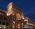 Galleria Vittorio Emanuele
 -
 Duomo
Duomo -
 Via Dante and Castello
 -
 Borsa
Borsa -
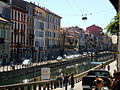 Naviglio Grande
 -
 Royal palace
 -
 Panorama


Article(s): Milan
Request: Like most important cities, they nowadays have collages. Milan does have one, but which has been proposed for deletion and is a badly arranged collage. I would please like to have these images put for a collage.--Theologiae (talk) 15:35, 20 February 2010 (UTC)
Graphist opinion(s):
- Just out of curiosity, I looked around in the MOS for any guidelines on collages. Surprisingly, I found none. I suppose I'll offer an opinion then. I tend to think collages are unencyclopedic. I think grouping images in a gallery is good, peppering an article with relevant images is good, but simply pasting a bunch together for the sake of trying to make a stylish picture is not good and just adds unencyclopedic clutter. I would hate to see a trend in that direction. Anyone else have any thoughts on the matter? JBarta (talk) 20:48, 20 February 2010 (UTC)
- Second that. -- RA (talk) 03:42, 21 February 2010 (UTC)
Update: Collages, like the one proposed above, are now discouraged on WP, preferring instead a simple image gallery. The new guideline is here. JBarta (talk) 03:57, 24 February 2010 (UTC)
Kate Greenaway image
-
 Kate Greenaway illustration
 -
 crop
crop

.jpg)
Article(s): Edmund Evans
Request: Improve resolution and crop out text and side illustration of flowers leaving only the illustration of the girl in the garden. Thanks. Truthkeeper88 (talk) 03:10, 2 March 2010 (UTC)
Graphist opinion(s):
![]() Done: -Andrew c [talk] 14:55, 2 March 2010 (UTC)
Done: -Andrew c [talk] 14:55, 2 March 2010 (UTC)
- Thank you! Looks much better. When taking screenshots, is it best to save as .png or .jpg? Truthkeeper88 (talk) 20:51, 2 March 2010 (UTC)
- Wikipedia:Image use policy#Rules of thumb #7 discusses that. I guess I should have stayed with PNG, but the optimization wizard in photoshop was making the PNG twice as large as the "high quality" JPG, so that is what I based my choice on. I'd be glad to redo this as a PNG if you, or anyone else, prefers. -Andrew c [talk] 00:50, 3 March 2010 (UTC)
- No, it's lovely as is and makes the other images in the article look murky. Was just curious when/if I download similar images. Thanks again. Truthkeeper88 (talk) 02:50, 3 March 2010 (UTC)
- Wikipedia:Image use policy#Rules of thumb #7 discusses that. I guess I should have stayed with PNG, but the optimization wizard in photoshop was making the PNG twice as large as the "high quality" JPG, so that is what I based my choice on. I'd be glad to redo this as a PNG if you, or anyone else, prefers. -Andrew c [talk] 00:50, 3 March 2010 (UTC)
Silver Wolf Award
Article(s): Silver Wolf Award
Request: Not sure, it just seems fuzzy, can it be sharpened? Chris (クリス • フィッチュ) (talk) 12:26, 4 March 2010 (UTC)
Graphist opinion(s):
- I've smoothed the pixels throughout the cloth part so as to create a smoother feel, as well as sharpened the edges a bit and retouched some of the coloring to make it more realistic and less faded in appearance. -CamT|C 23:24, 4 March 2010 (UTC)
- After some closer examination, it seemed that what this image needed (besides some retouching) was a lite shadow to help bring out the color, so I've gone ahead and added that in as well, and done a small amount of burning to bring out some of the shadows a bit more. -CamT|C 23:41, 4 March 2010 (UTC)
- Thanks for your attempt, I appreciate it. Kinda going the other direction, without shading, if we can. --Chris (クリス • フィッチュ) (talk) 13:16, 6 March 2010 (UTC)
Scouting in Yugoslavia
-

-
 retouched

.jpg)
Article(s): Scouting in Yugoslavia
Request: Trim a little off the left hand side, maybe fix staining? Chris (クリス • フィッチュ) (talk) 12:33, 4 March 2010 (UTC)
Graphist opinion(s):
- Not sure if I went a bit overboard or not. You tell me. -Andrew c [talk] 15:42, 4 March 2010 (UTC)
- I don't know what the original color was, may have been more sepia, but you did great on fixing the staining! --Chris (クリス • フィッチュ) (talk) 00:07, 6 March 2010 (UTC)
Marion Barry
-
 Marion Barry

Article(s): Marion Barry
Request: Requesting to change the background to a more neutral color. The current background is kind of "loud", and quite distracting. SchuminWeb (Talk) 02:10, 6 March 2010 (UTC)
Graphist opinion(s):
Desaturated the background. Original file overwritten but revertable.--Fred the Oyster (talk) 14:34, 6 March 2010 (UTC)
![]() Request taken by Fred the Oyster.
Request taken by Fred the Oyster.
![]() Done
Done
Resolved
Louis Borno

Article(s): Louis Borno
Request: Please trim away extra oval... Chris (クリス • フィッチュ) (talk) 13:25, 24 February 2010 (UTC)
Graphist opinion(s):
![]() Done: Fallschirmjäger 16:05, 24 February 2010 (UTC)
Done: Fallschirmjäger 16:05, 24 February 2010 (UTC)
- Thank you! --Chris (クリス • フィッチュ) (talk) 07:02, 26 February 2010 (UTC)
Santeria (song)
Article(s): Santeria (song)
Request: This is kind of tricky because it's an incomplete image taken at an angle. Please try to straighten it, even if it means cutting it down to the red center. Thanks. Chris (クリス • フィッチュ) (talk) 01:43, 24 February 2010 (UTC)
Graphist opinion(s):
- I attempted straightening and repairing, but the result was looking just awful. And, if the album cover is going to be displayed, it should be displayed whole (not just the red center). The image you have ain't all that bad. JBarta (talk) 04:12, 24 February 2010 (UTC)
Scottish Council
Article(s):
Request: Remove border... Chris (クリス • フィッチュ) (talk) 07:01, 26 February 2010 (UTC)
Graphist opinion(s):
 Done Well, it's sort of like putting a dress on a pig... but I cropped off the "border". I suppose it will do until a better image comes along. JBarta (talk) 09:30, 26 February 2010 (UTC)
- Thanks, is there any way to rotate this slightly counterclockwise? I did not see that it was crooked when I saw it first. --Chris (クリス • フィッチュ) (talk) 13:22, 26 February 2010 (UTC)
- Rotating will introduce blurriness. Plus, it's so barely crooked, one might consider it more than straight enough. Again, the key would be in finding a better image rather than screwing around with this one too much. JBarta (talk) 17:23, 26 February 2010 (UTC)
- Thanks, is there any way to rotate this slightly counterclockwise? I did not see that it was crooked when I saw it first. --Chris (クリス • フィッチュ) (talk) 13:22, 26 February 2010 (UTC)
Angelique Widjaja
-

Picture of Angelique Widjaja

Article(s): Angelique Widjaja
Request: Improve this image where possible. Arteyu ? Blame it on me ! 18:43, 26 February 2010 (UTC)
Graphist opinion(s):
- What are you looking to improve? It doesn't seem all that bad and I'm not seeing much opportunity for improvement. What are your thoughts? JBarta (talk) 19:06, 26 February 2010 (UTC)
- Maybe the noise volume or image quality? I don't know, but I do think this image can be further improved. Arteyu ? Blame it on me ! 22:03, 26 February 2010 (UTC)
- The "noise" is permanent damage to the image due to excessive jpeg compression, a VERY common (and needless) problem. Also, being a relatively small image, opportunities for improvement are rather limited. I used a tool to eliminate some of the jpeg artifacts and sharpened it just a bit. Unfortunately, that didn't make a whole lot of difference. Again... the image isn't really all that bad as it is. JBarta (talk) 23:06, 26 February 2010 (UTC)
- Nevermind, thank you for trying anyway. Arteyu ? Blame it on me ! 23:25, 26 February 2010 (UTC)
- The "noise" is permanent damage to the image due to excessive jpeg compression, a VERY common (and needless) problem. Also, being a relatively small image, opportunities for improvement are rather limited. I used a tool to eliminate some of the jpeg artifacts and sharpened it just a bit. Unfortunately, that didn't make a whole lot of difference. Again... the image isn't really all that bad as it is. JBarta (talk) 23:06, 26 February 2010 (UTC)
- Maybe the noise volume or image quality? I don't know, but I do think this image can be further improved. Arteyu ? Blame it on me ! 22:03, 26 February 2010 (UTC)
Yuzu
-
 4:3
4:3 -
 Square

.jpg)
Article(s): Yuzu
Request: Trim out extra side space to focus on fruit... Chris (クリス • フィッチュ) (talk) 08:53, 1 March 2010 (UTC)
Graphist opinion(s):
- Done The photo is currently in a very common aspect ratio of 4:3. I've uploaded another version with a square (1:1) framing. Since the original framing is very common, and could have a number of uses, I did not want to upload over the original, as they both could be use full on the Commons (or even here). Anyway, now we have two file. Hope this is what you wanted. -Andrew c [talk] 16:00, 1 March 2010 (UTC)
- Cool, thank you, and also for the lesson, I did not know of the proportion rule! Great job! --Chris (クリス • フィッチュ) (talk) 12:37, 3 March 2010 (UTC)
Savez Skauta Kraljevine Jugoslavije
Article(s):
Request: I know it's bad, I know it's small, lipstick on a pig... please trim away extra background anyway. Chris (クリス • フィッチュ) (talk) 13:02, 3 March 2010 (UTC)
Graphist opinion(s): ![]() Done: Hows this? Fallschirmjäger 19:55, 3 March 2010 (UTC)
Done: Hows this? Fallschirmjäger 19:55, 3 March 2010 (UTC)
- Perfect, thank you! --Chris (クリス • フィッチュ) (talk) 12:05, 4 March 2010 (UTC)
Kielbasa

Article(s): Sausage
Request: Trim away excess blank edge... Chris (クリス • フィッチュ) (talk) 08:34, 2 March 2010 (UTC)
Graphist opinion(s): {{Done}}: -Andrew c [talk] 14:44, 2 March 2010 (UTC)
- Not quite yet, can you give it a buzz-cut? --Chris (クリス • フィッチュ) (talk) 12:39, 3 March 2010 (UTC)
- I believe margin, in general, serves an important purpose, and I was internally questioning the reason for your requests. I can understand at thumbnail size, you want the subject to be as big as possible, but I believe that should be balanced between a good margin. When I highlight the thumbnail (so I can tell where the white background ends and the photo starts), it looks appropriate to me. Furthermore, any more shaving would start to cut into the shadows on the bottom, which I think help fulfill the composition. Therefore, I would recommend against further shaving, and if it was to be performed, I'd ask that the original file not be over-written, so that the superior composition could still be accessible. That said, if you still need such a closely cropped version, I'd reluctantly create one at say File:Kielbasa7 (cropped).jpg. -Andrew c [talk] 15:14, 3 March 2010 (UTC)
- Okay. Just looks weird to me, but you sound informed. --Chris (クリス • フィッチュ) (talk) 13:14, 6 March 2010 (UTC)
wabi-sabi

Article(s): wabi-sabi
Request: Trim down and sharpen... Chris (クリス • フィッチュ) (talk) 05:08, 6 March 2010 (UTC)
Graphist opinion(s):
- Are you looking to enhance the details (as I did), or just define the rim?-CamT|C 05:38, 6 March 2010 (UTC)
- I think you nailed it! Can we overwrite? --Chris (クリス • フィッチュ) (talk) 13:17, 6 March 2010 (UTC)
- There doesn't seem to be an option on the page for me to. I'm pretty bad with working out uploads, so I may just not see it, but it's not in the normal location on the pages. -CamT|C 14:07, 6 March 2010 (UTC)
- That's because the file is actually hosted on the Commons, and you have to click the "description page there" link towards the top of the page in order to get to the Commons (and once at the Commons, you will have the "upload new version of this file" link). -Andrew c [talk] 19:44, 6 March 2010 (UTC)
- That said, the original image is in 4:3 aspect ratio, and perhaps it would be useful to keep both (see my citrus fruit post above). Slides (which may be an outdated technology), SDTV, and a number of other formats prefer 4:3, and it is a common standard, so there may be useful applications of a file in that ratio. -Andrew c [talk] 19:45, 6 March 2010 (UTC)
- That's because the file is actually hosted on the Commons, and you have to click the "description page there" link towards the top of the page in order to get to the Commons (and once at the Commons, you will have the "upload new version of this file" link). -Andrew c [talk] 19:44, 6 March 2010 (UTC)
Robert M. Isaac
Article(s): Robert M. Isaac
Request: Remove background. As it is, there may be issues with the image. Photos of this deceased mayor are rare. Chris (クリス • フィッチュ) (talk) 11:00, 6 March 2010 (UTC)
Graphist opinion(s):
- I'm assuming you wanted a PNG, and a transparent background. I've gone and softened the edges for you as well if you're planning to add a background in. -CamT|C 22:06, 6 March 2010 (UTC)
![]() Done:NastlagicCam
Done:NastlagicCam
- Splendid, thank you! I wish he had a whole head! :) --Chris (クリス • フィッチュ) (talk) 09:36, 7 March 2010 (UTC)
Scouting in Iraq
-

-
Cropped


Article(s): Scouting in Iraq
Request: Can I get a trim out of just the top image to illustrate the article? Chris (クリス • フィッチュ) (talk) 09:39, 7 March 2010 (UTC)
Graphist opinion(s):![]() Done: Hows this crop? I tried to retain as much as possible but it was difficult with that gradient blending around the image, which I removed. Fallschirmjäger 20:03, 7 March 2010 (UTC)
Done: Hows this crop? I tried to retain as much as possible but it was difficult with that gradient blending around the image, which I removed. Fallschirmjäger 20:03, 7 March 2010 (UTC)
- Absolutely perfect, just what I needed! --Chris (クリス • フィッチュ) (talk) 10:41, 8 March 2010 (UTC)
Red Robin

Article(s): Red Robin
Request: Trim away unnecessary parking and sky... Chris (クリス • フィッチュ) (talk) 10:36, 8 March 2010 (UTC)
Graphist opinion(s): ![]() Done:Fallschirmjäger 11:13, 8 March 2010 (UTC)
Done:Fallschirmjäger 11:13, 8 March 2010 (UTC)
- Great, thank you! --Chris (クリス • フィッチュ) (talk) 11:31, 8 March 2010 (UTC)
Scouting 'round the World
Article(s):
Request: clear background... Chris (クリス • フィッチュ) (talk) 03:07, 9 March 2010 (UTC)
Graphist opinion(s): Errr? It's a book cover. It's supposed to have a background ;) You really don't like 'em do you? :D --Fred the Oyster (talk) 03:22, 9 March 2010 (UTC)
- This is my book from home, it just looks cruddy, I think the original was white. --Chris (クリス • フィッチュ) (talk) 03:46, 9 March 2010 (UTC)
- I cleaned it up a bit to make it more white, but still retaining a slight bit of vignette to show it's a cover. -CamT|C 04:37, 9 March 2010 (UTC)
- Thanks, that's it! --Chris (クリス • フィッチュ) (talk) 15:16, 9 March 2010 (UTC)
Shellfish

Article(s): Shellfish
Request: Trim away blank space to focus on dish... Chris (クリス • フィッチュ) (talk) 12:47, 1 March 2010 (UTC)
- The blank space is needed to draw the focus to the dish. It's the way the human eye works. --Fred the Oyster (talk) 14:36, 6 March 2010 (UTC)
Graphist opinion(s):
![]() Done Fallschirmjäger 23:43, 7 March 2010 (UTC)
Done Fallschirmjäger 23:43, 7 March 2010 (UTC)
- Thank you! --Chris (クリス • フィッチュ) (talk) 12:35, 10 March 2010 (UTC)
Osamu Shimomura
Article(s): Osamu Shimomura
Request: Not sure, work your magic, he just seems to blend in with the background and the effect is weird... Chris (クリス • フィッチュ) (talk) 12:55, 7 March 2010 (UTC)
Graphist opinion(s):
Background blurred, darkened and desaturated. Overwritten but revertable.
![]() Request taken by Fred the Oyster.
Request taken by Fred the Oyster.
![]() Done
Done
- Thank you! --Chris (クリス • フィッチュ) (talk) 12:37, 10 March 2010 (UTC)
Dulmatin
Article(s): Dulmatin
Request: Remove frame... Chris (クリス • フィッチュ) (talk) 18:26, 10 March 2010 (UTC)
Graphist opinion(s): ![]() Done: Fallschirmjäger 01:36, 12 March 2010 (UTC)
Done: Fallschirmjäger 01:36, 12 March 2010 (UTC)
- Thank you! --Chris (クリス • フィッチュ) (talk) 04:15, 12 March 2010 (UTC)
Chocolate liqueur
Article(s): Chocolate liqueur
Request: Trim away blank space... Chris (クリス • フィッチュ) (talk) 04:14, 12 March 2010 (UTC)
Graphist opinion(s): ![]() Done: Fallschirmjäger 11:19, 12 March 2010 (UTC)
Done: Fallschirmjäger 11:19, 12 March 2010 (UTC)
- Thank you! --Chris (クリス • フィッチュ) (talk) 12:47, 12 March 2010 (UTC)
watermarking
_by_Maurice_Ascalon.jpg)
Article(s):
Request: Remove watermarking per WPMOS... Chris (クリス • フィッチュ) (talk) 04:22, 12 March 2010 (UTC)
Graphist opinion(s): ![]() Done: Fallschirmjäger 12:13, 12 March 2010 (UTC)
Done: Fallschirmjäger 12:13, 12 March 2010 (UTC)
- Thanks again! --Chris (クリス • フィッチュ) (talk) 12:47, 12 March 2010 (UTC)
remove border

Article(s):
Request: remove border... Chris (クリス • フィッチュ) (talk) 04:23, 12 March 2010 (UTC)
Graphist opinion(s): ![]() Done: Fallschirmjäger 11:34, 12 March 2010 (UTC)
Done: Fallschirmjäger 11:34, 12 March 2010 (UTC)
- 有難うございます! --Chris (クリス • フィッチュ) (talk) 12:48, 12 March 2010 (UTC)
- どう致しましてどういたしまして Fallschirmjäger 14:16, 12 March 2010 (UTC)
Chopsticks

Article(s): Chopsticks
Request: Clear background and remove extra space, thank you... Chris (クリス • フィッチュ) (talk) 04:38, 24 February 2010 (UTC)
Graphist opinion(s):
![]() Request taken by richardprins.: lookie ;lookie Richardprins (talk) 16:23, 24 February 2010 (UTC)
Request taken by richardprins.: lookie ;lookie Richardprins (talk) 16:23, 24 February 2010 (UTC)
Hawrylyshyn
-
 For lulz, a transparent background.

Article(s):
Request: Trim away blank space... Chris (クリス • フィッチュ) (talk) 05:52, 14 March 2010 (UTC)
Graphist opinion(s): ![]() Done: Fallschirmjäger 08:13, 14 March 2010 (UTC)
Done: Fallschirmjäger 08:13, 14 March 2010 (UTC)
- Thank you! --Chris (クリス • フィッチュ) (talk) 09:45, 14 March 2010 (UTC)
- That's actually great, as the original uploader is complaining about the blank space being important somehow. --Chris (クリス • フィッチュ) (talk) 14:08, 14 March 2010 (UTC)
- Rama's usually complaining about something :) --Fred the Oyster (talk) 14:17, 14 March 2010 (UTC)
- That's actually great, as the original uploader is complaining about the blank space being important somehow. --Chris (クリス • フィッチュ) (talk) 14:08, 14 March 2010 (UTC)
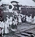
Korea under Japanese rule
-
 Done
Done -
 Done
Done


Article(s): Korea under Japanese rule
Request: straighten, bordering etc... Chris (クリス • フィッチュ) (talk) 13:27, 14 March 2010 (UTC)
Graphist opinion(s):
![]() Request taken by Fred the Oyster.
Request taken by Fred the Oyster.
![]() Done
Done
- Fantastic job, especially the second one! --Chris (クリス • フィッチュ) (talk) 14:02, 14 March 2010 (UTC)
Udon

Article(s): Udon
Request: remove framing... Chris (クリス • フィッチュ) (talk) 21:09, 14 March 2010 (UTC)
Graphist opinion(s):
![]() Request taken by Jovianeye.
Request taken by Jovianeye.
![]() Done
Done
- Thank you! --Chris (クリス • フィッチュ) (talk) 03:45, 15 March 2010 (UTC)
Wyndham Deedes image extraction
-
 The arrival at the 1920 Cario Conference of Sir Herbert Samuel, H.B.M. high commissioner, etc. Col. Lawrence, Emir Abdullah, Air Marshal Sir Geoffrey Salmond and Sir Wyndham Deedes.
 -
 Sir Wyndham Deedes potrait.
 -
 Sir Wyndham Deedes full.


Article(s): Wyndham Deedes
Request: Could someone extract Wyndham Deedes (far right) from the image? Would be most appreciated. Thank you, Gaia Octavia Agrippa Talk | Sign 16:52, 27 February 2010 (UTC)
Graphist opinion(s):
You say "far right". There appear to be 4 people specifically named in the photo, the last being Sir Wyndham Deedes. By the photo's description I take him to be the man in the black suit with the gold chain around his middle. But he is not on the "far right". The chap with the cap is on the far right. Would you please clarify? JBarta (talk) 22:29, 27 February 2010 (UTC)
- Sorry for being late getting back to you. Deedes is the army officer on the far right of the image. I know it isn't the best picture but it is the only one I can find. Gaia Octavia Agrippa Talk | Sign 11:55, 13 March 2010 (UTC)
![]() Request taken by Wine Guy.. Since he's so far toward the edge a full body image is going to be an odd aspect ratio, so I'll do both a full body and a head shot. Wine Guy~Talk 17:14, 15 March 2010 (UTC)
Request taken by Wine Guy.. Since he's so far toward the edge a full body image is going to be an odd aspect ratio, so I'll do both a full body and a head shot. Wine Guy~Talk 17:14, 15 March 2010 (UTC)
![]() Done: On both images I blurred the man behind Deedes right shoulder to better focus on Deedes. The blur is noticeable at full resolution, but should be fine at the size used in articles. A bit of general cleanup was done as well. Hope one of these works for you. Wine Guy~Talk 18:53, 15 March 2010 (UTC)
Done: On both images I blurred the man behind Deedes right shoulder to better focus on Deedes. The blur is noticeable at full resolution, but should be fine at the size used in articles. A bit of general cleanup was done as well. Hope one of these works for you. Wine Guy~Talk 18:53, 15 March 2010 (UTC)
- Brilliant! Thank you so much. I think I will use the head shot in his article. Gaia Octavia Agrippa Talk | Sign 19:38, 15 March 2010 (UTC)
File:Angelou19 cropped.jpg
- File:Angelou19 cropped.jpg (graphic, not censoring, just being mindful)
Article(s):
Request: Remove border... Chris (クリス • フィッチュ) (talk) 03:53, 15 March 2010 (UTC)
Graphist opinion(s):
Cropped, watermark removed, sharpened, histogram tweaked,
![]() Request taken by Fred the Oyster.
Request taken by Fred the Oyster.
![]() Done
Done
- Thank you as always! --Chris (クリス • フィッチュ) (talk) 11:23, 15 March 2010 (UTC)
Jack Layton
-
 Cropped and blurred.
 -
 Cropped with background removed.


Article(s): Jack Layton
Request: Upload, [1], crop the top of the photo and the left side a bit and blur or remove/blank out the backround. Please and thank you - Tyughjbn (talk) 17:00, 15 March 2010 (UTC)
Graphist opinion(s):
- Would you like us to do the washing up too? --Fred the Oyster (talk) 00:52, 16 March 2010 (UTC)
- Sorry if the request is rather large but can you complete it? - Tyughjbn (talk) 18:10, 15 March 2010 (UTC)
- Working on it, I need the practice with GIMP anyway. In the future, it might be nice to upload the original here first before making a request. Wine Guy~Talk 01:11, 16 March 2010 (UTC)
- And combine it with a "please" and/or "thank you". --Fred the Oyster (talk) 01:27, 16 March 2010 (UTC)
- That too ;-) --Wine Guy~Talk 01:34, 16 March 2010 (UTC)
- And combine it with a "please" and/or "thank you". --Fred the Oyster (talk) 01:27, 16 March 2010 (UTC)
- Working on it, I need the practice with GIMP anyway. In the future, it might be nice to upload the original here first before making a request. Wine Guy~Talk 01:11, 16 March 2010 (UTC)
- Sorry if the request is rather large but can you complete it? - Tyughjbn (talk) 18:10, 15 March 2010 (UTC)
![]() Done Take your pick. Wine Guy~Talk 01:34, 16 March 2010 (UTC)
Done Take your pick. Wine Guy~Talk 01:34, 16 March 2010 (UTC)
- Thank you for your work and I prefer the photo with the backround blured - Tyughjbn (talk) 18:40, 15 March 2010 (UTC)
- The blurred one would be my preference as well. Glad I could help. Wine Guy~Talk 02:00, 16 March 2010 (UTC)
- Thank you for your work and I prefer the photo with the backround blured - Tyughjbn (talk) 18:40, 15 March 2010 (UTC)
Image crop
-

-
 cropped

.jpg)
Article(s): Ontario general election, 2011
Request: Hi, I was wondering if you could re-upload and crop this photo of Tim Hudak, can you please crop it so that the only thing left would just be him in his suit with everything else would be cropped out.
Thanks -Qaqwewew (talk) 08:00, 3 March 2010 (UTC)
Graphist opinion:
![]() Done. -Andrew c [talk] 15:08, 4 March 2010 (UTC)
Done. -Andrew c [talk] 15:08, 4 March 2010 (UTC)
1967 Marine General Officers Symposium photo
-
 Symposium photo
 -


Article(s): 15 biographies
Request: Since I've converted the typed caption into a wiki-formatted table on the file description page, that red text can be cropped out (though it may be worth uploading as a new image to preserve the original?). There are also some scratches and dust marks that could be cleanup up a bit, as well as an odd reflective blur on the far left side. bahamut0013wordsdeeds 16:27, 5 March 2010 (UTC)
Graphist opinion(s):
- There's a lot of work that needs to be done if you're looking to remove all of the blemishes. I've done what I can, as well as retouched the image so as to provide some better color and detail and try to obscure the dust particles a bit more by blending them into the background (more or less). Let me know what you think. -Regards, -CamT|C 05:25, 6 March 2010 (UTC)
- Also as a note, the man on the left (who was in the glare) was retouched by simply replicating the right side of his face and blending it in. I know that it isn't an exact copy on that part, and it's going to take more time for me to get that down better. -CamT|C 05:27, 6 March 2010 (UTC)
- Well, it looks good thus far. The only remaining thing that I'm overly concerned with is that horizontal line going across the knees of the front row on the left. bahamut0013wordsdeeds 13:41, 6 March 2010 (UTC)
- Right, that is a weird one, and I tried working with it, but I'm not really sure what I can do. Someone else may want to take a look at it. I was thinking about just cloning but I'm afraid that too much detail would be lost.-CamT|C 14:08, 6 March 2010 (UTC)
- Are there any takers on this? bahamut0013wordsdeeds 00:19, 11 March 2010 (UTC)
- I'll have a look and see if I can clean it up. Wine Guy~Talk 19:17, 15 March 2010 (UTC)
- Are there any takers on this? bahamut0013wordsdeeds 00:19, 11 March 2010 (UTC)
- Right, that is a weird one, and I tried working with it, but I'm not really sure what I can do. Someone else may want to take a look at it. I was thinking about just cloning but I'm afraid that too much detail would be lost.-CamT|C 14:08, 6 March 2010 (UTC)
- Well, it looks good thus far. The only remaining thing that I'm overly concerned with is that horizontal line going across the knees of the front row on the left. bahamut0013wordsdeeds 13:41, 6 March 2010 (UTC)
- Also as a note, the man on the left (who was in the glare) was retouched by simply replicating the right side of his face and blending it in. I know that it isn't an exact copy on that part, and it's going to take more time for me to get that down better. -CamT|C 05:27, 6 March 2010 (UTC)
![]() Done: Cleaned up the line and blotches in the bottom left, and also the worst of the discoloration in the upper left and a couple other spots. I think this is as good as it's going to get without going through the entire image pixel by pixel. Could you please try to track down the source from the original uploader, it would be nice if this doesn't get deleted. Wine Guy~Talk 21:25, 15 March 2010 (UTC)
Done: Cleaned up the line and blotches in the bottom left, and also the worst of the discoloration in the upper left and a couple other spots. I think this is as good as it's going to get without going through the entire image pixel by pixel. Could you please try to track down the source from the original uploader, it would be nice if this doesn't get deleted. Wine Guy~Talk 21:25, 15 March 2010 (UTC)
- Looks great. I've taken care of the source issue. bahamut0013wordsdeeds 12:35, 16 March 2010 (UTC)
Saint Patrick's Day
Article(s): Saint Patrick's Day
Request: Guess... Chris (クリス • フィッチュ) (talk) 02:59, 16 March 2010 (UTC)
Graphist opinion(s):
![]() Done
I don't know how this image makes me feel, Chris. -CamT|C 05:25, 16 March 2010 (UTC)
Done
I don't know how this image makes me feel, Chris. -CamT|C 05:25, 16 March 2010 (UTC)
- Schadenfreude? --Chris (クリス • フィッチュ) (talk) 01:20, 17 March 2010 (UTC) (Thank you by the way)
Damnatio memoriae
-

-
 Done
Done


Article(s): Damnatio memoriae
Request: Remove background... Chris (クリス • フィッチュ) (talk) 01:19, 17 March 2010 (UTC)
Graphist opinion(s):
Trust you to pick one with no license :P. I'm presuming it's PD anyway. --Fred the Oyster (talk) 01:34, 17 March 2010 (UTC)
![]() Request taken by Fred the Oyster.
Request taken by Fred the Oyster.![]() Done
Done
- Doin' what I can. ;) Thank you! --Chris (クリス • フィッチュ) (talk) 02:43, 17 March 2010 (UTC)
Brian Mason
-
 Brian Mason

Article(s): Brian Mason
Request: Upload this, and try to balance the brightness level. Thank you - Tyughjbn (talk) 13:00, 17 March 2010 (UTC)
Graphist opinion(s):![]() Request taken by Wine Guy., I'll have it shortly. Wine Guy~Talk 00:47, 18 March 2010 (UTC)
Request taken by Wine Guy., I'll have it shortly. Wine Guy~Talk 00:47, 18 March 2010 (UTC)
![]() Done There's still a bright spot on his forehead, but that area is completely white (overexposed) in the original, not a lot that can be done with that easily. Wine Guy~Talk 01:17, 18 March 2010 (UTC)
Done There's still a bright spot on his forehead, but that area is completely white (overexposed) in the original, not a lot that can be done with that easily. Wine Guy~Talk 01:17, 18 March 2010 (UTC)
- You did a good job, thank you - Tyughjbn (talk) 15:00, 17 March 2010 (UTC)
- I took the liberty of re-doing the image by colour correcting, sharpening, using a custom mask to alter the over-exposure on the forehead and finally removing some lint from his coat. --Fred the Oyster (talk) 02:40, 18 March 2010 (UTC)
- Nicely done, thanks. Your 'shop-fu is stronger than mine (but I knew that already). Wine Guy~Talk 04:12, 18 March 2010 (UTC)
- I took the liberty of re-doing the image by colour correcting, sharpening, using a custom mask to alter the over-exposure on the forehead and finally removing some lint from his coat. --Fred the Oyster (talk) 02:40, 18 March 2010 (UTC)
Iraq Boy Scouts and Girl Guides Council
Article(s): Iraq Boy Scouts and Girl Guides Council
Request: trim top rainbow-looking stripe, some sort of coding error (shows up when you click)... Chris (クリス • フィッチュ) (talk) 03:18, 18 March 2010 (UTC)
Graphist opinion(s):
It's a combination of digital noise and moire pattern distortion. Basically a mix of the weave, a low quality camera and a lot of jpeg compression all interacting with each other. Virtually impossible to get rid of, especially given the resolution of the image. --Fred the Oyster (talk) 03:26, 18 March 2010 (UTC)
- Done:I've gotten rid of the rainbow stripe but I agree that nothing can really be done with regards to the noise and moire. Fallschirmjäger 19:56, 18 March 2010 (UTC) (talk)
- Thank you! --Chris (クリス • フィッチュ) (talk) 02:53, 19 March 2010 (UTC)
Fess Parker

Article(s): Fess Parker
Request: Focus on Fess, for goodness sake... Chris (クリス • フィッチュ) (talk) 18:40, 19 March 2010 (UTC)
- Comment: Excuse me for butting in Kintetsubuffalo, (I am editing this article heavily, hence my interest) try this link. The pic in the article was a much closer shot a day ago, but someone changed it. Regards, --220.101.28.25 (talk) 19:03, 19 March 2010 (UTC)
Graphist opinion(s): ![]() Done: Is this crop okay? Or would you like one closer. Fallschirmjäger 11:57, 20 March 2010 (UTC)
Done: Is this crop okay? Or would you like one closer. Fallschirmjäger 11:57, 20 March 2010 (UTC)
- That's great, thank you! --Chris (クリス • フィッチュ) (talk) 18:58, 20 March 2010 (UTC)
Soong May-ling

Request: crop and straighten... Chris (クリス • フィッチュ) (talk) 09:42, 21 March 2010 (UTC)
Graphist opinion(s):
![]() Request taken by Fred the Oyster.
Request taken by Fred the Oyster.![]() Done
Done
- Thank you! --Chris (クリス • フィッチュ) (talk) 13:55, 21 March 2010 (UTC)
Ono no Komachi

Article(s): Ono no Komachi
Request: fix side shading... Chris (クリス • フィッチュ) (talk) 10:58, 21 March 2010 (UTC)
- I tried to do it without cropping though there is now a slight colour discrepancy on the right-hand side. If this isn't acceptable, let me know and I'll crop it instead. I also sorted a band of shading about 3/4 of the way across from the left. --Fred the Oyster (talk) 13:32, 21 March 2010 (UTC)
Graphist opinion(s):
- Fred that's great, thank you! --Chris (クリス • フィッチュ) (talk) 13:54, 21 March 2010 (UTC)
Barscunes

Article(s): Basques
Request: remove background.. Chris (クリス • フィッチュ) (talk) 11:21, 21 March 2010 (UTC)
Graphist opinion(s):
![]() Request taken by Ruminaglass.: Removed background and converted to png. Do let me know if you think that the edges need smoothening 18:08, 21 March 2010
Request taken by Ruminaglass.: Removed background and converted to png. Do let me know if you think that the edges need smoothening 18:08, 21 March 2010 ![]() Done
Done
- Fantastic, thank you! --Chris (クリス • フィッチュ) (talk) 20:24, 21 March 2010 (UTC)
Crop sides to produce vertical image
-
 Holy Family Catholic Church, Frenchtown, Ohio
 -
 Vertical crop


Article(s): Holy Rosary Catholic Church (St. Marys, Ohio)
Request: Please crop out both sides to produce a vertical image; I'm planning to use this next to another vertical image, so I'd like both to have the same shape. Please upload under a new name, such as "Holy Family Church, Frenchtown, vertical.jpg", since the horizontal image is presently in use in settings where it's better than my proposed vertical image would be. Nyttend (talk) 02:20, 23 March 2010 (UTC)
Graphist opinion(s):
![]() Request taken by Jovianeye.
Request taken by Jovianeye. ![]() Done
I have cropped it with an aspect ratio of 3X4. (Hope this is what you want) --JovianEye (talk) 04:23, 23 March 2010 (UTC)
Done
I have cropped it with an aspect ratio of 3X4. (Hope this is what you want) --JovianEye (talk) 04:23, 23 March 2010 (UTC)
- This is perfect. I needed it for the multiple-image box near the bottom of Holy Rosary Catholic Church (St. Marys, Ohio); the other image is also a vertical image with a 3X4 ratio. Thanks much! Nyttend (talk) 12:59, 23 March 2010 (UTC)

Request: straighten and crop... Chris (クリス • フィッチュ) (talk) 16:36, 23 March 2010 (UTC)
Graphist opinion(s): ![]() Done: Fallschirmjäger 10:01, 24 March 2010 (UTC)
Done: Fallschirmjäger 10:01, 24 March 2010 (UTC)
- Thank you! --Chris (クリス • フィッチュ) (talk) 15:09, 24 March 2010 (UTC)
Passport
-

Done -

Done


Article(s): Passport
Request: Cleanup, straighten, fix perspective, transparent and/or remove backgrounds and borders... Chris (クリス • フィッチュ) (talk) 11:31, 8 March 2010 (UTC)
Graphist opinion(s):
![]() Request taken by various Wikipedians :).
Request taken by various Wikipedians :).
- Great, just a few more to go! --Chris (クリス • フィッチュ) (talk) 12:50, 12 March 2010 (UTC)
Done
- File:Inside of an azerbaijani passport.JPG|Done
- File:Frenchpassportinside.jpg|Done
- File:Pasaporteargentino.jpg|Done
- File:Turkish Passport First Page.jpg|Done
- File:Israel Passport Page.jpg|Done
- File:Albanian Italian biometric Passport.JPG|Done
Converted to File:Italian biometric passport.jpg and File:Albanian biometric passport (crop).jpg (see right) - File:Italian biometric passport.jpg|Done
- File:Albanian biometric passport (crop).jpg|Done
- File:Passport card.jpg|Done
- File:Passport of Armenia.jpg
- File:DZpasseport.jpg|Done
- File:Current cover Cuban passport.JPG|Done
- File:Georgian passport.jpg|Done
- File:Guyana Passport.png|Done
- File:Cover of HKSAR e-Passport.jpg|Done
- File:Is vegabréf.jpg|Done
- File:IndianPassportcover.jpg|Done
- File:Passport of Montenegro.jpg|Done
- File:Nepal-passport-cover-old.jpg|Done
- File:PasaporteEspaňol2009.jpg|Done
Commons wouldn't accept the existing filename so new version at File:PasaporteEspaHol2009.jpg - File:PasaporteEspaHol2009.jpg|Done
Commons wouldn't accept the existing filename so this is the new version -I got it to accept the overwrite, can we delete the duplicate? - File:Taiwan ROC Passport.jpg|Done
- File:Togolese passport.png|Done
- File:TT Passport.jpg|Done
- File:Turkish Passport.jpg|Done
(repaired rip too) - File:BiometricVenPassport.jpg|Done
There's too many distortions in too many planes to get it aligned properly. The top text needed 0.55°, the CoA needs 1.43° and the bottom text needs 1.93°. I went with the top as the others distorted too much. - File:Vietnam passport 1998.JPG|Done
- File:1. World Passport (Cover).jpg|Done
- File:Passport of Saudi Arabia.jpg
remove watermark Done - File:British new style passport.jpg|Done
Tim Cahill
-

-
 Done
Done


Article(s): Tim Cahill (politician)
Request: Crop to only show Tim Cahill (right) - Tyughjbn (talk) 21:00, 14 March 2010 (UTC)
Graphist opinion(s):
![]() Request taken by Fred the Oyster.
Request taken by Fred the Oyster.
![]() Done
Done
Bennett
-

-
 Cropped


Article(s): Carolyn Bennett
Request: Crop the photo on the left and right sides to focus in on her and also try to increase the brightness level a bit. Thank you - Tyughjbn (talk) 2:23, 18 March 2010 (UTC)
Graphist opinion(s):![]() Done
Done
Here's my attempt. Not sure if you wanted any other changes. Ruminaglass 15:07, 19 March 2010 (UTC)
- I did a quick white balance adjustment and fixed color in lower right corner of crop as well. That should do it. Wine Guy~Talk 16:13, 19 March 2010 (UTC)
Oval portraits of authors as icons for their WP Portals
-
 The inspiration
 -
 Shakespeare (note the existing oval)
 -
 Done
Done -
 Dickens (please crop to a close up of the head and shoulders)
 -
 Done
Done -
 Closer in, but more pixellated.
 -
 Wilde (The background may have to be extended to the left and right for the oval cropping to work)
 -
 Done
Done -
 Poe (please ignore the existing oval and crop so that it's uniform with the others)
 -
 Done
Done


.png)


.png)
_in_New_York,_1882._Picture_by_Napoleon_Sarony_(1821-1896)_1.jpg)
.png)

.png)
Article(s): Portal:Charles Dickens, Portal:Edgar Allan Poe, Portal:Shakespeare, Portal:Oscar Wilde
Request: As a way of tidying up the appearance of the Related portals sections of these portals, it would be good to create a standard shape of icon. I propose that these portraits of authors be cropped into a uniform oval shape, the proportions of which would be based on the Chandos Portrait of William Shakespeare (above, in colour). Ham 11:57, 22 March 2010 (UTC)
Graphist opinion(s):
![]() Request taken by Fred the Oyster.
Request taken by Fred the Oyster.![]() Done
Done
Joy Luck Club

Article(s): Joy Luck Club
Request: smooth visible folds... Chris (クリス • フィッチュ) (talk) 19:17, 25 March 2010 (UTC)
Graphist opinion(s): ![]() Done: Fallschirmjäger 01:50, 26 March 2010 (UTC)
Done: Fallschirmjäger 01:50, 26 March 2010 (UTC)
- Fantastic, thank you! --Chris (クリス • フィッチュ) (talk) 02:46, 26 March 2010 (UTC)
Tommy Douglas
-

-
 Cropped


.jpg&action=edit&redlink=1)
.jpg)
Article(s): Tommy Douglas
Request: Crop the photo to focus in on his on him and also try to fix the brightness and exposure level. Thanks - Tyughjbn (talk) 16:00, 18 March 2010 (UTC)
Graphist opinion(s): I gave it a try, it's better but probably not good enough. Wine Guy~Talk 00:49, 19 March 2010 (UTC)