Wikipedia:Graphic Lab/Photography workshop/Archive/Jan 2010 Source: en.wikipedia.org/wiki/Wikipedia:Graphic_Lab/Photography_workshop/Archive/Jan_2010
| This is an archive of past discussions on Wikipedia:Graphics Lab. Do not edit the contents of this page. If you wish to start a new discussion or revive an old one, please do so on the current main page. |
Stale
Bronze Wolf Award

Article(s): Bronze Wolf Award
Request: because of detail, can you make this the full 300 pixels, and is there any way you can tweak the dangle so the wolf is walking straight instead of at an angle? Chris (クリス • フィッチュ) (talk) 07:55, 19 December 2009 (UTC)
Graphist opinion:
- First, you are requesting that this image be enlarged? This can be done, but you can never gain any more detail from what is already there. Programs use various logarithms to create the new pixels based on the existing data. None of these are that accurate, and when done too much, IMO, the image starts looking poor. I think this increase in size is small enough, the negative enlargement artifacts won't be that noticeable, but it makes me wonder why we really need to enlarge in the first place. With that said, straightening the trinket shouldn't be much of a problem. -Andrew c [talk] 16:38, 21 December 2009 (UTC)
- I've included the original photo, will that help? Chris (クリス • フィッチュ) (talk) 16:44, 21 December 2009 (UTC)
- I've straightened the trinket, but now I am confused. The larger image is completely different from the smaller one (ribbon is at different angles, the attachment is longer, colors different, etc). Did I just work on the wrong image? -Andrew c [talk] 16:52, 21 December 2009 (UTC)
- Furthermore, how can one be a non-free image, and the other copyright? One obviously needs to be deleted (if a free image can replace the non-free, then we should do that. however, it may not be free to take an image of a copyrighted work as it will simply be a derivative work, and if that is the case, the Commons image should go, or we could shrink it, move it to en.wiki, and re-tag it as nonfree to replace the lower resolution one).-Andrew c [talk] 19:22, 21 December 2009 (UTC)
- I've included the original photo, will that help? Chris (クリス • フィッチュ) (talk) 16:44, 21 December 2009 (UTC)
- The free one is not suitable to illustrate the image, hence the derivative one. Chris (クリス • フィッチュ) (talk) 05:00, 22 December 2009 (UTC)
- Now I am quite confused. How is it not suitable? If there is a free equivalent, WP:NFCC stays we have to use it. -Andrew c [talk] 15:14, 22 December 2009 (UTC)
Resolved
Emblem of Hong Kong

Article(s): Emblem of Hong Kong
Request: trim out extra edging to enlarge center device... Chris (クリス • フィッチュ) (talk) 09:12, 27 December 2009 (UTC)
Graphist opinion(s):
![]() Done - Have cropped as requested and fixed orientation. Fallschirmjäger 18:04, 28 December 2009 (UTC)
Done - Have cropped as requested and fixed orientation. Fallschirmjäger 18:04, 28 December 2009 (UTC)
Roza Otunbaeva

Article(s): Roza Otunbaeva
Request: Please remove surreal background... Chris (クリス • フィッチュ) (talk) 09:39, 27 December 2009 (UTC)
Graphist opinion(s):
![]() Done - I've removed the background as requested and also while I was at it, removed some of the noise and improved contrast. Hope it is ok, please revert if not. Fallschirmjäger 12:27, 28 December 2009 (UTC)
Done - I've removed the background as requested and also while I was at it, removed some of the noise and improved contrast. Hope it is ok, please revert if not. Fallschirmjäger 12:27, 28 December 2009 (UTC)
- Perfect, thank you and sorry for the late reply. Chris (クリス • フィッチュ) (talk) 22:22, 1 January 2010 (UTC)
Image straightening
-
 Crooked image
 -
 Tilt corrected
 -
Tilt and vertical perspective corrected
-
 Tilt, vertical and horizontal perspective corrected


Article(s): Trump Hotel Las Vegas and List of tallest buildings in Las Vegas
Request: This image needs some straightening so that the Trump hotel is vertically straight. Thanks, --ZooFari 02:44, 4 January 2010 (UTC)
Graphist opinion(s):
 Done. I actually made three different versions, you can choose which one you prefer. :-) (I figured they might also come useful for demonstrating different kinds of perspective correction.) —Ilmari Karonen (talk) 19:43, 4 January 2010 (UTC)
- Thank you very much! What software did you use? I think I could make use of the other files as well. --ZooFari 23:47, 5 January 2010 (UTC)
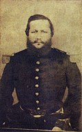
Rover Scout

Article(s): Rover Scout
Request: retouch photo to remove age staining upper left... Chris (クリス • フィッチュ) (talk) 16:37, 5 January 2010 (UTC)
Graphist opinion(s):
![]() Done - Hope this is ok. Fallschirmjäger 16:58, 6 January 2010 (UTC)
Done - Hope this is ok. Fallschirmjäger 16:58, 6 January 2010 (UTC)
- Thank you so much! Chris (クリス • フィッチュ) (talk)
Removing little number
-
 St. John's Episcopal Church in Cleveland, Ohio

Article(s): St. John's Episcopal Church (Cleveland, Ohio); National Register of Historic Places listings in Cleveland, Ohio
Request: Remove the little "3" and the shape in which it's located, currently found in the top left corner; perhaps just make that area into the same color as the sky around it? Nyttend (talk) 15:23, 8 January 2010 (UTC)
Graphist opinion(s): ![]() Request taken by Ivan Akira.: Under what name should I upload the finished photo? Ivan Akira (talk) 00:12, 9 January 2010 (UTC)
Request taken by Ivan Akira.: Under what name should I upload the finished photo? Ivan Akira (talk) 00:12, 9 January 2010 (UTC)
- Just reupload it under the same name; no need for a new filename. Nyttend (talk) 03:46, 10 January 2010 (UTC)
- Done: I hope you'll like it, but I'm sorry that I did huge mess in the File:St. John's Episcopal Church, Cleveland.jpg's File history... I'm really sorry; I don't know why, but previous image that I'm uploaded doesn't previewed in Commons correctly... Ivan Akira (talk) 05:02, 10 January 2010 (UTC)
- Who cares? The image looks fine now, and it's a public domain image, so you're not messing with anything copyrighted in the least. Thanks! Nyttend (talk) 05:08, 10 January 2010 (UTC)
- Thanks for your understanding, I'm really appreciate it. And I promise if I'm taking another request, I will recheck my image integrity and check my internet connections, so nothing bad will happen ever again. Ivan Akira (talk) 05:13, 10 January 2010 (UTC)
- I've done much worse with SVGs... --ZooFari 05:16, 10 January 2010 (UTC)
- Whoa, you have done it too? It's just amaze me (I think it's just me)... but anyhow... I just don't feel really fine to other user, because I make Martin at Commons must waste his time to revert my upload... And I'm already apologize to him too... Ivan Akira (talk) 05:26, 10 January 2010 (UTC)
- I've done much worse with SVGs... --ZooFari 05:16, 10 January 2010 (UTC)
- Thanks for your understanding, I'm really appreciate it. And I promise if I'm taking another request, I will recheck my image integrity and check my internet connections, so nothing bad will happen ever again. Ivan Akira (talk) 05:13, 10 January 2010 (UTC)
- Who cares? The image looks fine now, and it's a public domain image, so you're not messing with anything copyrighted in the least. Thanks! Nyttend (talk) 05:08, 10 January 2010 (UTC)
Haruki Murakami

Article(s): Haruki Murakami
Request: remove excess blackboard to focus on subject... Chris (クリス • フィッチュ) (talk) 04:21, 15 January 2010 (UTC)
Graphist opinion(s): ![]() Request taken by DMS. -- DMS (talk) 15:29, 15 January 2010 (UTC)
Request taken by DMS. -- DMS (talk) 15:29, 15 January 2010 (UTC)
![]() Done : It will take a while for the thumbnail image to update, but if you check the image page you will see the revised version. If you don't like it, you can revert to the original and we can try again. :) -- DMS (talk) 15:48, 15 January 2010 (UTC)
Done : It will take a while for the thumbnail image to update, but if you check the image page you will see the revised version. If you don't like it, you can revert to the original and we can try again. :) -- DMS (talk) 15:48, 15 January 2010 (UTC)
Great! That made it so much better! Thank you!--Chris (クリス • フィッチュ) (talk) 15:57, 15 January 2010 (UTC)
- Thank you! -- DMS (talk) 16:00, 15 January 2010 (UTC)
Crop out pavement
-
 Former post office and federal courthouse in Zanesville, Ohio
 -
 Cropped in to focus on building, shadowed areas lightened


Article(s): National Register of Historic Places listings in Muskingum County, Ohio; George F. Hammond; US Post Office and Federal Building-Zanesville
Request: Simple crop of pavement and perhaps a little on the left side: ChildofMidnight just rejoiced to find this picture (I believe for the Hammond article), but adds the following comment — "HELP!!! someone crop this asphalt out... :)" Nyttend (talk) 21:24, 14 January 2010 (UTC)
Graphist opinion(s): ![]() Request taken by DMS. : Shall I overwrite existing file or upload as a new file? -- DMS (talk) 00:35, 15 January 2010 (UTC)
Request taken by DMS. : Shall I overwrite existing file or upload as a new file? -- DMS (talk) 00:35, 15 January 2010 (UTC)
- If you don't mind, please upload as a new file. Nyttend (talk) 02:22, 15 January 2010 (UTC)
- Done : Cropped in tight to focus attention on the building, rather than the tarmac or the traffic lights. :) If it's not what you want, just say, and I can redo. -- DMS (talk) 03:07, 15 January 2010 (UTC)
- I really don't care; I filed the request for CoM, so I'll ask him/her to offer an opinion. Nyttend (talk) 03:16, 15 January 2010 (UTC)
- OK, no problem. I'll keep an eye on this section. -- DMS (talk) 03:29, 15 January 2010 (UTC)
- Hmmmm... Very interesting. I didn't know we had photo lab! Can I get myself put in the background of historic photos?
- The photo looks properly cropped. For me personally, being picky and always looking a gift horse in the mouth, I might actually have left more of the left side, the blue sky and the trafficlight. I think it's interesting context, and the light sets up some intriguing lines. But I'm somewhat insane. Also I have basically zero experience with architectural photography. But I will say that if it's not possible to lighten up the right side which is in shadow, leaving some light on the left kind of seems to help balance it. But that's my opinion as an aesthete (is that the right word?). On the other hand, for archtiecture purposes, perhaps tighter is better? Some might even suggest cutting out the cinder blocks at the bottom of the building. I'm just not sure. Does that help? ChildofMidnight (talk) 05:50, 15 January 2010 (UTC)
- I think it looks good. I added it to the article for comparison. What do others think? ChildofMidnight (talk) 05:54, 15 January 2010 (UTC)
- Many thanks for the comments ChildofMidnight. Ummm....I took a look, and I think you've added the original version of the photo to the article? Are we talking about the Hammond article? I've created another version of the photo (see above), with a looser crop, and the shadowed area lightened. What do you reckon? Closer to what you had in mind? 'Good/better/best' when it comes to photographs is all highly subjective, I think, so I'd recommend going with what *you* think looks good. Unless that involves painting the building purple, in which case I'd strongly advise against it. :) -- DMS (talk) 15:17, 15 January 2010 (UTC)
- Oops, just realised it's the US Post Office and Federal Building-Zanesville page you've put the cropped version on. It does look good actually - hard crop works well for infobox pics, I think. -- DMS (talk) 15:22, 15 January 2010 (UTC)
- Interesting! Thanks very much for indulging me with the retrim. I think you had it right the first time on the crop (tighter is better, as you said, and centered is good too even though the photographer in me wants angles). And the street light, though amusing, is a distraction (just as you said). The lightening is definitely beneficial.
- That's my final final verdict, so if it's possible to lighten the right side of the first cropped photo (or to crop the more recent one) I think we're in business. :) Thanks again for being patient with me in this process. It's been educational. I will try to figure out what I want first from here on out, before making any future requests. You can be thankful that you don't have to move my couch around the living room to see where it looks best! ChildofMidnight (talk) 16:54, 15 January 2010 (UTC)
- No problem at all. I'll do the original hard crop, with lightened shadowed areas. I'll post again here when that's done and uploaded. I'll upload that over the file at File:Former post office and federal building, Zanesville-2.jpg, and delete the third file. And it's fine CoM - for myself, I find that it's only by trying something out with an image and seeing it in front of me that I know whether it's what I want or not. I don't mind doing several versions to get it right, and I'm sure that's true of others who help here. I'll be back shortly. :) -- DMS (talk) 19:30, 15 January 2010 (UTC)
- Done : Uploaded over the original cropped image. It'll take some time for thumbnail versions to update, but you can check the file in Commons. -- DMS (talk) 19:51, 15 January 2010 (UTC)
- Fantastic. Thanks so much for your help. As I said, this was my first time requesting photo lab work, so it's been educational and your patience and enthusiasm is much appreciated. Take care of yourself, and Go Cowboys! :) ChildofMidnight (talk) 00:39, 17 January 2010 (UTC)
- OK, no problem. I'll keep an eye on this section. -- DMS (talk) 03:29, 15 January 2010 (UTC)
- I really don't care; I filed the request for CoM, so I'll ask him/her to offer an opinion. Nyttend (talk) 03:16, 15 January 2010 (UTC)
College of Southern Nevada
-
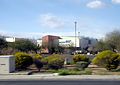 CSN, North Las Vegas NV

Article(s): College of Southern Nevada
Request: If it's possible, I'd like that light pole cloned out. The letters may be a problem but anything would be better. Thanks, --ZooFari 19:53, 15 January 2010 (UTC)
Graphist opinion(s):![]() Request taken by Kingpin13. shouldn't take to long. - Kingpin13 (talk) 20:00, 15 January 2010 (UTC)
Request taken by Kingpin13. shouldn't take to long. - Kingpin13 (talk) 20:00, 15 January 2010 (UTC)
- Done Hope that is okay. I've uploaded over, let me know if you'd prefer a separate file. - Kingpin13 (talk) 20:23, 15 January 2010 (UTC)
- That was fast, thanks! --ZooFari 20:42, 15 January 2010 (UTC)
Montage image replacement
-
 Collage of different types of National Register properties
 -
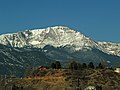 Pikes Peak
 -
 First go


Article(s): National Register of Historic Places; Property type (National Register of Historic Places)
Request: We at WP:NRHP recently realised that the photo of the Grand Canyon, the bottom left image in this montage, doesn't belong here, because (unlike Pikes Peak) the canyon isn't the type of site that should be represented here. Could the Pikes Peak image be cropped to the same shape as the images in the montage and then added to it in place of the Grand Canyon? Nyttend (talk) 19:04, 15 January 2010 (UTC)
Graphist opinion(s): Done, let me know what you think :) - Kingpin13 (talk) 19:41, 15 January 2010 (UTC)
- Looks great! I'm about to leave for the weekend, so I don't have time to do this, but could you give the new image a description like the old one (explaining which is a site, which is a structure, etc.), please? Thanks! Nyttend (talk) 20:47, 15 January 2010 (UTC)
-
 Helsinki's Palace Hotel on left
 -
 Cropped in to show just the Palace Hotel

Article(s): Palace Hotel, Helsinki
Request: Is it possible to get this panorama cropped to show the Palace Hotel located on the left side of the image? ChildofMidnight (talk) 18:47, 19 January 2010 (UTC)
Graphist opinion: ![]() Request taken by DMS. -- DMS (talk) 19:35, 19 January 2010 (UTC)
Request taken by DMS. -- DMS (talk) 19:35, 19 January 2010 (UTC)
![]() Done: Hope this is OK. File name 'HelsinkiPalaceHotel.jpg', uploaded to Commons. -- DMS (talk) 19:54, 19 January 2010 (UTC)
Done: Hope this is OK. File name 'HelsinkiPalaceHotel.jpg', uploaded to Commons. -- DMS (talk) 19:54, 19 January 2010 (UTC)
- Great. Thanks very much! Now I need to expand the article. Some interesting modernist Finnish designers had their furnishings featured at the hotel when it opened. Thanks again. ChildofMidnight (talk) 20:17, 19 January 2010 (UTC)
- You're welcome! :) -- DMS (talk) 20:47, 19 January 2010 (UTC)
Girl Scout cookies
.jpg)
.jpg)
Article(s): Girl Scout cookies
Request: cleanup unWikiuseful extra space... Chris (クリス • フィッチュ) (talk) 18:52, 19 January 2010 (UTC)
Graphist opinion(s): ![]() Request taken by DMS. -- DMS (talk) 19:56, 19 January 2010 (UTC)
Request taken by DMS. -- DMS (talk) 19:56, 19 January 2010 (UTC)
Photo 1: ![]() Done -- DMS (talk) 20:07, 19 January 2010 (UTC)
Photo 2:
Done -- DMS (talk) 20:07, 19 January 2010 (UTC)
Photo 2: ![]() Done -- DMS (talk) 20:18, 19 January 2010 (UTC)
Photo 3:
Done -- DMS (talk) 20:18, 19 January 2010 (UTC)
Photo 3: ![]() Done -- DMS (talk) 20:22, 19 January 2010 (UTC)
Photo 4:
Done -- DMS (talk) 20:22, 19 January 2010 (UTC)
Photo 4: ![]() Done -- DMS (talk) 20:27, 19 January 2010 (UTC)
Done -- DMS (talk) 20:27, 19 January 2010 (UTC)
- Great, thank you so much! --Chris (クリス • フィッチュ) (talk) 00:34, 20 January 2010 (UTC)
- Welcome! -- DMS (talk) 00:38, 20 January 2010 (UTC)
Eduardo Schaerer
Article(s): Eduardo Schaerer, President of Paraguay
Request: Please lighten/restore this image, as it is currently very dark. 84.92.117.93 (talk) 23:28, 22 January 2010 (UTC)
Graphist opinion(s): ![]() Request taken by DMS. -- DMS (talk) 00:19, 23 January 2010 (UTC)
Request taken by DMS. -- DMS (talk) 00:19, 23 January 2010 (UTC)
![]() Done : If you need additional touching up, just say. Looks reasonably good for an old photo though. -- DMS (talk) 00:25, 23 January 2010 (UTC)
Done : If you need additional touching up, just say. Looks reasonably good for an old photo though. -- DMS (talk) 00:25, 23 January 2010 (UTC)
- Looks great, thanks. 84.92.117.93 (talk) 00:41, 23 January 2010 (UTC)
Francisco Solano López
-
 Francisco Solano López, President of Paraguay between 1862 and 1870
 -
 Cropped


Article(s): Francisco Solano López (politician), President of Paraguay
Request: Please remove the strong yellow colour of this image, and otherwise improve the quality of the image if possible. Also, it would be good if you could create an alternative version of this image cropped to include just the head and upper torso that could be used in the President of Paraguay article. Thanks, 84.92.117.93 (talk) 23:36, 22 January 2010 (UTC)
Graphist opinion(s): ![]() Request taken by DMS. -- DMS (talk) 00:45, 23 January 2010 (UTC)
Request taken by DMS. -- DMS (talk) 00:45, 23 January 2010 (UTC)
![]() Done -- not wonderful quality I'm afraid, and much of what I tried just made it look worse (and so, just to be clear, I didn't do them! :) ). If someone else has more expertise in touching up old photographs, please feel free to redo. -- DMS (talk) 00:48, 23 January 2010 (UTC)
Done -- not wonderful quality I'm afraid, and much of what I tried just made it look worse (and so, just to be clear, I didn't do them! :) ). If someone else has more expertise in touching up old photographs, please feel free to redo. -- DMS (talk) 00:48, 23 January 2010 (UTC)
- Definately an improvement, not sure there's really much you can do when the original is so poor. But great work, thanks :) 84.92.117.93 (talk) 01:24, 23 January 2010 (UTC)
Few more Paraguan leaders
-
 Benigno Ferreira, President of Paraguay between 1906 and 1908.
 -
 Eusebio Ayala, President of Paraguay between 1921 and 1923, and again between 1932 and 1936.


Article(s): Juan Antonio Escurra, Benigno Ferreira, Eusebio Ayala, President of Paraguay
Request: As with the above, all these images are of very low quality, and I would be greatful for any improvements, however small, that could be made. Thanks again, 84.92.117.93 (talk) 23:43, 22 January 2010 (UTC)
Graphist opinion(s): ![]() Request taken by DMS. -- DMS (talk) 06:04, 23 January 2010 (UTC)
Request taken by DMS. -- DMS (talk) 06:04, 23 January 2010 (UTC)
Image 3 : ![]() Done : hope this is OK. -- DMS (talk) 06:04, 23 January 2010 (UTC)
Done : hope this is OK. -- DMS (talk) 06:04, 23 January 2010 (UTC)
Image 2 : ![]() Done : not a lot I could do but hopefully an improvement on the original. -- DMS (talk) 06:27, 23 January 2010 (UTC)
Done : not a lot I could do but hopefully an improvement on the original. -- DMS (talk) 06:27, 23 January 2010 (UTC)
Image 1 : ![]() Done : same as with the others I'm afraid. Small improvements, and I won't feel at all upset if someone with greater expertise in this kind of photographic improvement is able to redo them with better results. -- DMS (talk) 06:45, 23 January 2010 (UTC)
Done : same as with the others I'm afraid. Small improvements, and I won't feel at all upset if someone with greater expertise in this kind of photographic improvement is able to redo them with better results. -- DMS (talk) 06:45, 23 January 2010 (UTC)
- Don't worry, its much more than I could do, and small improvements are much better than nothing. Without the original photographs, I don't think there's much that can be done to restore them further. Of course, if anyone else wants to have a go they're welcome, but I'm satisfied with how they appear now. Thanks again for your time, 84.92.117.93 (talk) 16:52, 23 January 2010 (UTC)
- Thanks. And you're welcome. :) -- DMS (talk) 23:26, 23 January 2010 (UTC)
- Don't worry, its much more than I could do, and small improvements are much better than nothing. Without the original photographs, I don't think there's much that can be done to restore them further. Of course, if anyone else wants to have a go they're welcome, but I'm satisfied with how they appear now. Thanks again for your time, 84.92.117.93 (talk) 16:52, 23 January 2010 (UTC)
Jane Zhang

Article(s): Jane Zhang
Request: Trim to focus on subject... Chris (クリス • フィッチュ) (talk) 11:22, 21 January 2010 (UTC)
Graphist opinion(s): ![]() Request taken by DMS.
Request taken by DMS.
![]() Done -- DMS (talk) 23:19, 21 January 2010 (UTC)
Done -- DMS (talk) 23:19, 21 January 2010 (UTC)
- Splendid, thank you! --Chris (クリス • フィッチュ) (talk) 09:54, 24 January 2010 (UTC)
Anti-Japanese sentiment


Article(s): Anti-Japanese sentiment
Request: umm, fix, straighten, remove borders and extra space... Chris (クリス • フィッチュ) (talk) 11:33, 25 January 2010 (UTC)
Graphist opinion(s):
Image 1 : ![]() Done : Apart from cropping, I'm not sure that there's anything that can be done about the image quality. -- DMS (talk) 23:06, 25 January 2010 (UTC)
Done : Apart from cropping, I'm not sure that there's anything that can be done about the image quality. -- DMS (talk) 23:06, 25 January 2010 (UTC)
Image 2 : ![]() Done : Not sure what's "wrong" with this image? Looks OK to me. Perhaps you could say what you want done with this one, Chris? -- DMS (talk) 23:06, 25 January 2010 (UTC)
Done : Not sure what's "wrong" with this image? Looks OK to me. Perhaps you could say what you want done with this one, Chris? -- DMS (talk) 23:06, 25 January 2010 (UTC)
- You got it, just wanted the narrow white edge off. --Chris (クリス • フィッチュ) (talk) 01:24, 26 January 2010 (UTC)
- Oops - just realised I must have looked at this one just after Ras67 cropped it, but didn't realise I was looking at a cropped version. Heh! :) -- DMS (talk) 07:02, 26 January 2010 (UTC)
Image 3 : ![]() Done : cropped, adjusted colour and brightened, and cleaned up. -- DMS (talk) 23:06, 25 January 2010 (UTC)
Done : cropped, adjusted colour and brightened, and cleaned up. -- DMS (talk) 23:06, 25 January 2010 (UTC)
Image 4 : ![]() Done : Ras67 has straightened and cropped this image. -- DMS (talk) 23:06, 25 January 2010 (UTC)
Done : Ras67 has straightened and cropped this image. -- DMS (talk) 23:06, 25 January 2010 (UTC)
- These are great, thank you so much! --Chris (クリス • フィッチュ) (talk) 01:24, 26 January 2010 (UTC)
-
 Michael Buckley (Internet celebrity) being interviewed by Amber Lee Ettinger
 -
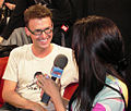 Crop 1
 -
 Crop 2
 -
 Crop 3


Article(s): Michael Buckley (Internet celebrity)
Request: Hi, this is being used as the lede infobox image. Could this be cropped to show only their upper bodies and heads with the microphone? Any other fixes are also welcome! -- Banjeboi 12:20, 26 January 2010 (UTC)
Graphist opinion(s): ![]() Request taken by DMS.
Request taken by DMS.
![]() Done : Wasn't entirely sure how much you wanted cropped, so I decided to give you some variations to choose from. :)
Done : Wasn't entirely sure how much you wanted cropped, so I decided to give you some variations to choose from. :)
All three cropped versions are uploaded to Commons as separate files, rather than overwriting the original. -- DMS (talk) 18:43, 26 January 2010 (UTC)
- That's wonderful! Thank you so much. Agree fully cropping worked best as we only had , well her hair which wasn't terribly helpful. -- Banjeboi 19:23, 26 January 2010 (UTC)