Wikipedia:Graphic Lab/Map workshop/Archive/Nov 2010 Source: en.wikipedia.org/wiki/Wikipedia:Graphic_Lab/Map_workshop/Archive/Nov_2010
Stale
[edit]MacRobertson race map
[edit]
Articles: MacRobertson Air Race
Request: Make a vector map. 76.117.247.55 (talk) 02:07, 6 September 2010 (UTC)
Opinion:
.svg)
Karachi map
[edit]-
 The map should be presented like this great one
 -
An adequate map but not public domain
-
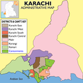 The closest to a proper Karachi map so far


Article(s): Karachi
Request: Create a location map for use in the various articles on Karachi and its many suburbs, like the Mumbai map is currently used.
Many Thanks.92.9.89.252 (talk) 16:46, 14 September 2010 (UTC)
Graphist opinion(s):
Make map colorblind-accessible
[edit]-
 Map of various Arctic cultures during the Middle Ages
Article(s): Six articles here, tons in other languages
Request: Could either the Dorset or the Norse be recolored so that they're colorblind-understandable? I know my history well enough to know (1) that the Norse controlled Iceland during this time, and (2) that they didn't control anything of the Canadian archipelago; therefore, I can recognise which cultures lived where. However, some areas are ambiguous, and it would be nice to be able to understand the map. Could either the Dorset or the Norse be changed to a deep grey? Nyttend (talk) 05:18, 20 September 2010 (UTC)
Graphist opinion(s):
- I changed dorset to be a lighter green, which seems to work for all three common colourblind types. The flood fill missed a few spots, but it should be fairly obvious working out what they are (out of place pixels on the border of a continuous colour). FWIW, GIMP has a 'colour deficiency' filter to approximate what a colourblind person would be able to distinguish (I'm not going to go as far as to say it's what they can see) in View->Display Filters... (Colour Deficient Vision). gringer (talk) —Preceding undated comment added 14:38, 20 September 2010 (UTC).
- That's good to know. I'd like to know WP's consensus on colorblind-adjustment. Please correct me if any of this is wrong: Prot- and Deuter- varieties of color insensitivity are red-green abnormalities that occur in maybe 10% of the population, for which corrective adjustment is very similar. Tritanopia (blue/yellow*), on the other hand, is more like 1 in 10,000 and requires a different type of adjustment. The diminished spectral palette of colorblind-adjusted images has real impacts on comprehension of the other 90%, though a minimal nudge to the slider can allow borders to be distinguished. My feeling is that best practices for WP shouldn consider the first two types as a design consideration, but ignore the third rare third type. Do you concur? Lesqual (talk) 00:49, 21 September 2010 (UTC)
- In the two instances of colour deficient correction that I've taken up (this, and a periodic table showing radioactive danger), correcting for all three hasn't been significantly extra effort compared to correcting for just the most common ones. However, I'm not convinced we should consider colourblindness in our design decisions, because doing that in the first place is excessively time consuming for people with normal vision. It would be more helpful to have some colourblind people to peruse these pages to identify tricky images, and it's likely that only the Protanopia and Deuteranopia insensitive versions would get noticed — although I've got no problem if someone with Tritanopia wants to help out as well. gringer (talk) 20:51, 23 September 2010 (UTC)
- To clarify a bit further, I presume that the ideal map colours are colourblind-friendly (it would be great if a colourblind person could please check this to make sure); these colours should be used in all maps, if possible, to establish a consistent look for maps throughout wikipedia. In the particular example here, it would work as a four-colour area map, because there are only four regions. But doing that would be a different matter requiring significantly more effort (and better suited to an SVG map). gringer (talk) 05:20, 25 September 2010 (UTC)
- In the two instances of colour deficient correction that I've taken up (this, and a periodic table showing radioactive danger), correcting for all three hasn't been significantly extra effort compared to correcting for just the most common ones. However, I'm not convinced we should consider colourblindness in our design decisions, because doing that in the first place is excessively time consuming for people with normal vision. It would be more helpful to have some colourblind people to peruse these pages to identify tricky images, and it's likely that only the Protanopia and Deuteranopia insensitive versions would get noticed — although I've got no problem if someone with Tritanopia wants to help out as well. gringer (talk) 20:51, 23 September 2010 (UTC)
- That's good to know. I'd like to know WP's consensus on colorblind-adjustment. Please correct me if any of this is wrong: Prot- and Deuter- varieties of color insensitivity are red-green abnormalities that occur in maybe 10% of the population, for which corrective adjustment is very similar. Tritanopia (blue/yellow*), on the other hand, is more like 1 in 10,000 and requires a different type of adjustment. The diminished spectral palette of colorblind-adjusted images has real impacts on comprehension of the other 90%, though a minimal nudge to the slider can allow borders to be distinguished. My feeling is that best practices for WP shouldn consider the first two types as a design consideration, but ignore the third rare third type. Do you concur? Lesqual (talk) 00:49, 21 September 2010 (UTC)
Resolved
[edit]Opus Dei expansion
[edit]-
 Map depicting the global expansion of Opus Dei
 -
 Map showing foreign trips of Barack Obama (example map)
 -

-
 Recoloured & corrected


Article(s): Opus Dei
Request: Hello, I would like to request that the map depicting the global expansion of Opus Dei be converted to a standard Wikipedia world map form, such as is used in List of presidential trips made by Barack Obama. The current map looks almost hand drawn, with some countries such as India looking oddly rounded. The most obvious problem would appear to be that only the South Island of New Zealand is depicted, with the North Island seemingly cropped out. Thank you for your time. The Celestial City (talk) 23:48, 10 October 2010 (UTC)
Graphist opinion(s): Check if there are any mistakes in the new map. Wereldburger758 (talk) 08:21, 23 October 2010 (UTC)
- Please excuse my kibitzing, but it strikes me that a chronological progression should be reflected in the coloration, using either shades & tints of a single hue in order of lightness (or saturation), or hues in spectral order of wavelength (from red to violet or vice versa). Odysseus1479 (talk) 18:11, 23 October 2010 (UTC)
- Since there have been no objections and Wereldburger758 is otherwise occupied, I’ve uploaded a new version (see gallery above) with a ‘progressive’ colour scheme. While I was at it I made the following corrections, referring to the original image:
- Added Trinidad, Iceland, Lebanon, & Sri Lanka
- Corrected Costa Rica, Estonia, & Lithuania
- Removed Brunei
- I presume French Guiana is being treated as part of France, so I left it in. Again, please check for errors & omissions. Odysseus1479 (talk) 21:36, 24 October 2010 (UTC)
- Thank you! Really well done, cheers. The Celestial City (talk) 18:13, 29 October 2010 (UTC)
Donington Park - new circuit layout
[edit]-
 Donington Park circuit map
 -
 Proposed new map


Article(s): Donington Park
Request: The circuit layout has been modified slightly. Could somebody please update the graphic - or create a new 'current' version. The problem is, that the grey 'cut through' between turn 9 and 11 is different. It now turns immediatly right (where the full (black) circuit turns left) at turn 9 and then left to run straight into the main straight, instead of going straight on and turning right to join the Goddards loop.
I've found a video here, which shows the new short circuit - skip to about 1:50 to see the corner. Guinness (talk) 18:03, 2 November 2010 (UTC)
Graphist opinion(s):
![]() Request taken by Bamse.: Something like this? bamse (talk) 18:29, 2 November 2010 (UTC)
Request taken by Bamse.: Something like this? bamse (talk) 18:29, 2 November 2010 (UTC)
- Looks about right, thanks, but could you possibly remove the white where you've cleared the old bit and replace it with transparent, otherwise it will look wrong for people who have their background a different colour :) :) - Also, just noticed that "Bridge" has been spelt "Brigge" (not your fault, it was in the original) Could you perchance correct that too :) Guinness (talk) 18:52, 2 November 2010 (UTC)
- Better now? bamse (talk) 22:08, 2 November 2010 (UTC)
- Brilliant, thanks :) Guinness (talk) 23:01, 2 November 2010 (UTC)
- Better now? bamse (talk) 22:08, 2 November 2010 (UTC)
London Road Fire Station, Manchester
[edit]-
 My attempt at a map
 -
 Ordnance Survey map that I used as a base. The relevant bit is far right around the vertical centre (north of the Motorway - (blue road) and building marked "University" and to the left of Building marked "Piccadilly Station" (train station)). The building in question has a segment marked "Ct" on this map.


Article(s): London Road Fire Station, Manchester
Request: Convert to SVG if possible please. Original is a Paint Shop Pro 7 psp file if this is of more use than PNG. Any other improvements you think are necessary. Pit-yacker (talk) 16:29, 29 October 2010 (UTC)
Graphist opinion(s):
![]() Request taken by Chaosdruid.
Request taken by Chaosdruid.
On it - you want it in the same colours as the pdf version ? Also do you want it oriented to north as per standard mapping ? Chaosdruid (talk) 00:33, 7 November 2010 (UTC)
- Hi! That looks much better thanks! IMHO, the colours are fine as they are. If it isn't too much work then a North orientation would be good please. Thanks again for your work! Pit-yacker (talk) 11:48, 7 November 2010 (UTC)
- Let me know when you are happy to switch image over Pit-yacker (talk) 11:50, 7 November 2010 (UTC)
File:WP countries and versions Europe.pdf
[edit]Article(s): Wikipedia
Request: Move "CY" to Cyprus from Crete, pleaseEugene-elgato (talk) 20:08, 8 November 2010 (UTC)
Graphist opinion: PDF's are a pain to edit - that's a relatively recent upload, I'll try contacting the uploader directly and see if they'll fix it. Kmusser (talk) 20:15, 8 November 2010 (UTC)
- Thanks very much- sorry hadn't realized how tricky it all is!Eugene-elgato (talk) 20:29, 8 November 2010 (UTC)
He was super-fastEugene-elgato (talk) 21:33, 8 November 2010 (UTC)
![]() Done
Done
UN convention map could use some updating
[edit]-
 map of member states and signatories to the United Nations Convention against Corruption
 -
 new map


Article(s): United Nations Convention against Corruption
Request: Could the following countries be added?
Bahrain Viet Nam Ukraine Italy Haiti Laos Singapore Switzerland, as well as the caribbean islands bonaire, Sint Eustatius and Saba (in green)
Ireland (the republic) (blue)
Thanks! L.tak (talk) 23:00, 5 November 2010 (UTC)
- see here if needed,here or here for the caribbean netherlands.
- To anyone that takes this on, I'd recommend converting to our standard world map SVG as well. Kmusser (talk) 16:38, 8 November 2010 (UTC)
Graphist opinion(s): ![]() Done I found quite a few mistakes so redid the whole thing. Kmusser (talk) 19:54, 9 November 2010 (UTC)
Done I found quite a few mistakes so redid the whole thing. Kmusser (talk) 19:54, 9 November 2010 (UTC)
- thanks a lot! L.tak (talk) 23:49, 9 November 2010 (UTC)
-
Old PNG map
-

Article(s): Washington State Department of Transportation
Request: I would like to have an SVG image created, with some less... bold colors, maybe just light shading. Source is [1], though I don't see a svg base image, only File:Washington_Locator_Map.PNG... If possible I would like to have it be SVG, but PNG would work too, just something less.. special than the current image. Thanks! Admrboltz (talk) 19:36, 6 November 2010 (UTC)
Graphist opinion(s): SVG file can be found here: King_County_Washington_Incorporated_and_Unincorporated_areas_Sammamish_Highlighted.svg
- Better base for a new map would be File:Map of Washington counties, blank.svg Kmusser (talk) 20:46, 8 November 2010 (UTC)
- SVG map made. The map must be categorized. Furthermore, colours have to be added. In the meanwhile, an png-file can be made from this map. Wereldburger758 (talk) 14:31, 9 November 2010 (UTC)
- Category added, I think that could be used as is, I'm not sure the colors really added much. Kmusser (talk) 14:54, 9 November 2010 (UTC)
- SVG map made. The map must be categorized. Furthermore, colours have to be added. In the meanwhile, an png-file can be made from this map. Wereldburger758 (talk) 14:31, 9 November 2010 (UTC)
Thanks! --Admrboltz (talk) 15:08, 9 November 2010 (UTC)
British Somaliland
[edit]Article(s): British Somaliland
Request: Currently has a map pictured that is linked with the same picture as the current Somaliland. It needs its own map created. Outback the koala (talk) 20:23, 14 November 2010 (UTC)
Graphist opinion(s): Would the original version of that map work? I've re-uploaded it under a different name at File:LocationBrSomaliland.png. Kmusser (talk) 00:56, 15 November 2010 (UTC)
- Yes that would be perfect, thank you! Outback the koala (talk) 08:58, 15 November 2010 (UTC)